If you follow me on Instagram, you’ll see me talking more and more about Figma and sharing some occasional tips in my stories.
I have switched completely and exclusively to Figma for over a year and I’m not going back! I’ve been receiving a lot of questions about why I switched to Figma, how to get started with Figma, and why it’s better than Sketch or Photoshop.
Check out a replay of my 1-hour long free workshop where I explained some basic Figma features and how to use them:
In this video, I went over:
- How to use basic Figma tools like the text tool, shapes, frames, and more.
- How to create a new project and set up a new artboard with grid layout.
- How to manipulate text, change fonts, and more.
- How to use images, edit them, crop them, and more.
Why I Switched to Figma
Let me quickly explain here why Figma is my new favorite design tool.
Disclaimer: I’m not affiliated in any way with Figma and nobody pays me to recommend their product! It’s a pure and honest recommendation of a tool I love.
1. Accessibility
As you know, teaching design and sharing my design tools is a big part of my personal brand. When I first switched from Adobe Photoshop to Sketch, I was a little confused about how I could effectively teach using Sketch if it’s available only for Macs.
A big part of my audience is Windows users and not everyone wants to switch to Mac just to use Sketch.
Figma can work in a browser, so technically it’s available on all platforms and it’ll work the same way no matter what kind of computer you use. You can even access and preview all of your design files from mobile devices like tablets (I believe you can even edit files using Microsoft Surface) and phones.
Pro tip: I would recommend installing the desktop app (it’s available for Windows and Mac) and font helper which will give Figma access to your system fonts and Adobe Fonts as well.
Additionally, Figma is available for free for one user, up to 3 projects. That’s good enough to get started and learn the software. You can also have an unlimited number of files in each project, so basically until you start using it professionally, it’s completely free.
So, that’s a huge plus for Figma!
2. Project Management and Organization
Because all of your Figma files are in the cloud, you can access them from anywhere. Each file has its own version of history, so all of the changes are automatically saved and you can go back in time and reverse it if you want.
That means there is no need for folders on your hard drive full of different files… “_Final_Version_48”.
Project management and organization in Figma is super clean and simple. Now you can keep all of your design projects in one place.
It really helps if you move everything to Figma. I use it to design wireframes, sitemaps, logos, brand guidelines, and websites. The only thing that still keeps me away from Figma is print design, but I’m not designing for print too much these days.
3. Sharing and Collaborating
Having all of your files in the cloud means that you can easily share them online and even collaborate with other designers in real-time on the same files. You can literally see other editors’ cursors moving on your screen as you work together simultaneously – very cool!
I also use Figma to share mockups with clients too. Of course, you don’t want to give your clients access to your working file and let them look over your shoulder while you’re working.
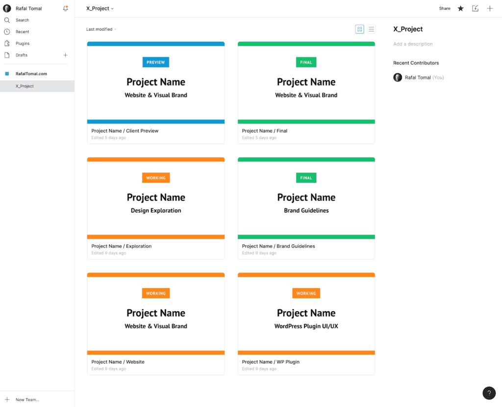
For this reason, I keep two versions of my files; one is the “Working” file where I work and the second one is the “Preview” which is shared with the client (see my tip on better Organizing Project Files in Figma).

Whenever I’m ready to send an update to the client, I copy the mockups from my working file and paste it to the preview file. I create a separate page for each update, so the client can easily go back and see the progress and previous version.
Delivering the final files to developers is super easy as well. You can either export your working file or just give the developer access as “editor” to the entire project.
4. Design Features
Of course, none of the above would matter if Figma didn’t have all of the necessary design features that let us do our work properly. In this area, Figma kills it too.
I love how fast and intuitive the whole experience is. Switching from Sketch wasn’t a problem because both apps have a very similar layout and interface.
There are some differences in the way the symbols work in Sketch and Figma, but you can get used to it pretty fast.
I’ll explore more in detail how to use Figma in my future articles and courses, but one of my favorite features that have been recently added to Figma is Auto Layout, which allows you to stack elements either horizontally or vertically and keep the spacing between them.
That means you can design flexible and responsive layouts that adjust automatically depending on your content.
Just take a quick look at my DesignKit demo to see what possible in Figma:
If you like what you see above, check out my starter template. This is your all-in-one tool for Figma: wireframe kit, web style guide, and design starter template.
Go ahead and check out Figma on your own by signing up for a free account and trying it out. It’s my main design tool now and I’m planning to release more design tools and courses exclusively for Figma, so stay tuned!
Leave a Reply