It’s been awhile since I published a “making of” post, so it’s time to give you a little update on what I’ve been working on recently.
In February 2015, I had the privilege of working with Chris Ducker on a complete redesign of his website and migration from a standard WordPress installation to the Rainmaker Platform.
Chris Ducker is a “Virtual CEO,” founder of Virtual Staff Finder and author of the 4-time #1 bestseller on Amazon, Virtual Freedom.
We mainly focused on refreshing the skin of his website while maintaining most of the current content including his blog, podcast and all the landing pages.
In this post, I’ll take you behind the scenes and show you how we took Chris’s website to the next level by redesigning his old website …
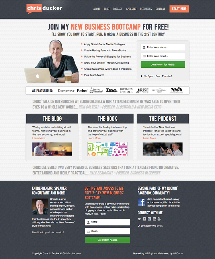
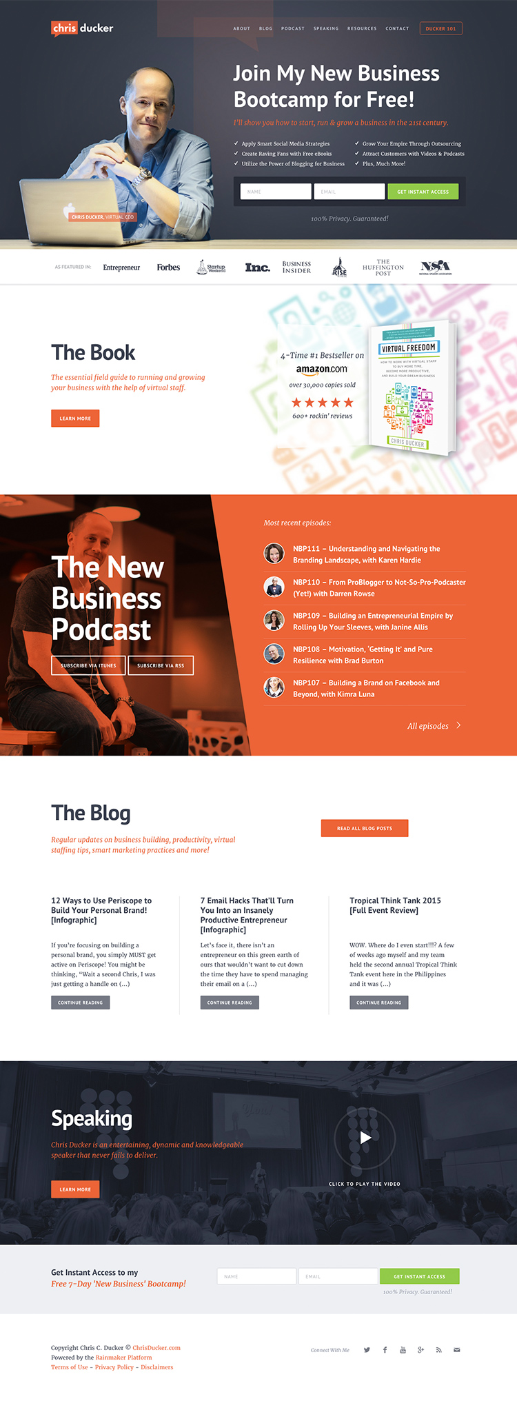
… and turning it into a custom designed Genesis child theme on the Rainmaker Platform.
Project goals
One of the most difficult aspects of working with a client on a new website is when a client doesn’t have copy yet, but gives you the freedom to design anything. Well, you may like that freedom, but at the same time you don’t even know what to design.
This kind of project usually leads to many revisions and frustrations, etc., on both sides. If you’re struggling with something like this, read my previous post where I covered this topic.
Fortunately, that wasn’t the case in this project. Chris wanted to keep all the content he already had. His pages had well-written copy that simply worked and converted. So, I knew exactly what content went on the home page and I could design and plan my layout accordingly.
Chris was also very open to new design ideas, so that gave me some flexibility to experiment with new concepts.
The first stage of the redesign was setting some goals and project requirements with Chris and our Rainmaker Platform team:
- Style – completely update the style and feel of the entire website. The goal was to achieve a new, modern and sleek look with more vibrant colors and flat design. We decided to achieve this by changing the typography, updating the current color scheme and introducing a more spacious layout.
- Logo – while Chris was happy with his current logo, he was open to some small updates. We decided to match the logo to the new colors and typography of the website.
- Opt-in – increase the main email opt-in form conversion. We decided to design nice looking opt-in forms and place them in strategic areas like the hero banner on the home page, as well as keep them prominent both in the sidebar and footer on the sub pages.
- Book – better feature Chris’s book, Virtual Freedom. We decided to add a big book section on the home page right below the hero banner.
- Podcast – better feature the New Business Podcast. We decided to move the podcast as a second section on the home page after the book.
- The Rainmaker Platform – base the entire website on a solid online marketing and sales platform with a stable hosting that can carry a lot of traffic. Chris produces a lot of content on his blog and podcast. The Rainmaker Platform will help him to better manage it while keeping his site always running without worries about any updates or backups.
Style guide
As you may already know, I usually start my visual design by designing the typography first. I believe typography is the most important element of every website and that’s why I want it to dictate the entire style and feel of the design.
For this project, I chose a simple sans-serif font, PT Sans for the headings and one of my favorite serif fonts, Merriweather, for the body text. Both fonts are available for free on Google Fonts.
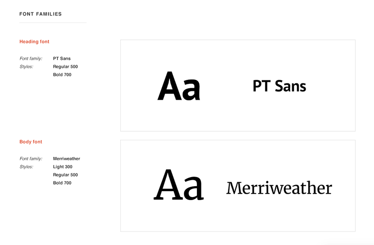
Merriweather comes with many styles: light, regular, bold and italics, which is perfect for the body text.
Remember to never include styles that you don’t really need to save on the page load time. I’m going to use only regular and bold for PT Sans and regular, regular italic, bold and bold italic for Merriweather. This should cover all my needs in this project.
I filled out the rest of my web typography style guide template in order to have a complete look at the fonts I chose.
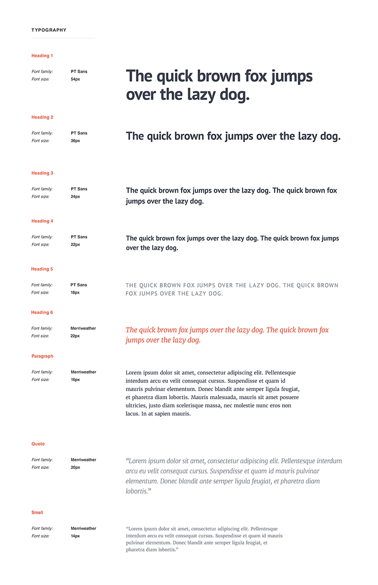
You can notice a simple visual hierarchy between H1 and H4 achieved just by reducing the font size. I chose completely different styles for H5 and H6, as these styles are often used as subtitles to make a contrast with the headings.
The color palette was pretty easy to do in this project, because Chris wanted to keep his original brand feel. However, I wanted to slightly tweak the colors, so they match together better. Here you can see what I changed:
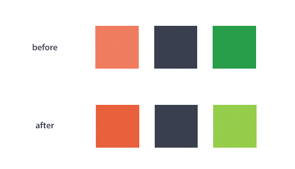
I made the orange a little darker and richer, but toned down the green color and moved it to a warmer hue.
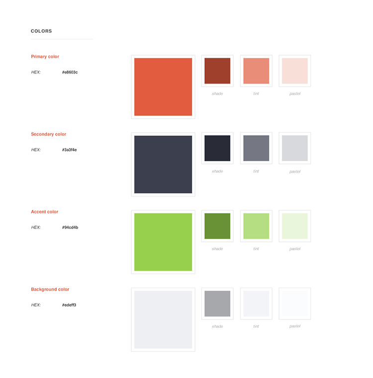
Here is the complete color palette I designed for this project:
Logo redesign
Chris already had a good looking logo that needed a little refinement and polish. One of the main reasons for the redesign was to match it to the new style and colors we introduced in the web design.
Here you can see the before and after the redesign:
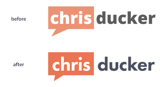
As you may have noticed, I changed the colors of both the bubble and “ducker.” I also added a little more space for “chris” and tweaked the shape of the bubble a little bit.
The new logo is bolder, sharper and goes well with the new brand colors and design.
Remember that what at first may seem like just playing with tiny details is really what creates a good looking design. When put together, all of these slight changes will create amazing final results.
Layout and final mockups in Photoshop
Once I had the typography, colors and new logo done, I could start planning the home page layout. I started as always with a simple wireframe to help visualize all of the ideas before spending more time on hi-fidelity mockups.
Here is the home page wireframe I provided with some points that were supported with my full comments in an email I sent to Chris.
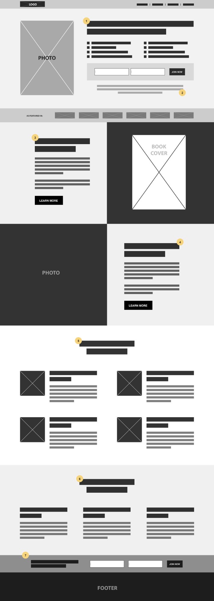
The general idea of the new home page was to feature all the main elements (book, podcast, blog, speaking) of Chris’s website and create shortcuts to learn more about them.
The entire page has a vertical flow that tells the visitor a simple story:
- Hello.
This is the above the fold welcome section. Chris’s professional photograph builds that initial trust. So, here you have a chance to get know Chris and what he has to offer.
- I’m a writer.
Here is a big cover of the book with social proof in the form of Amazon’s 5 star reviews and 4-time #1 Bestseller. This section adds more authority to Chris’s profile. Now you gain even more trust.
- I’m a podcaster.
Free content in audio format. You can see a small picture of the interviewed person from each episode. There is a possibility you may recognize someone you follow (who wouldn’t recognize Darren Rowse here?) and click to listen to the full episode.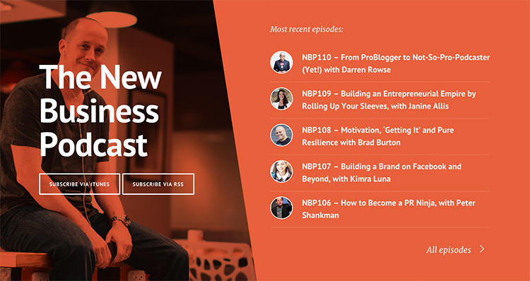
- I’m a blogger.
Even more great and free content. A quick look at the latest three posts and you can read more if you like them.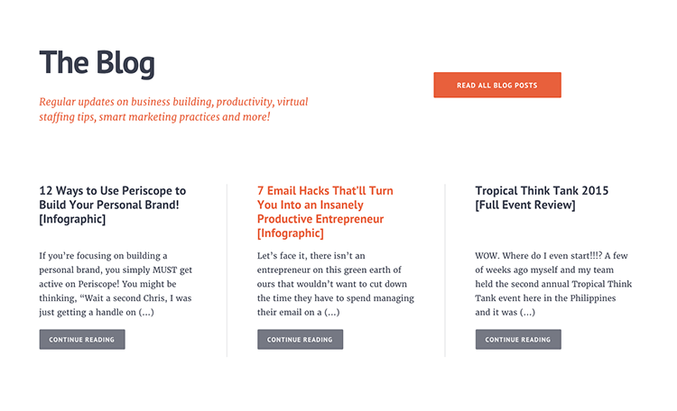
- I’m a speaker.
Do you host conferences? It’s a good place for this call to action, because at this point you’ve already learned enough about Chris Ducker and you know he has expertise and authority.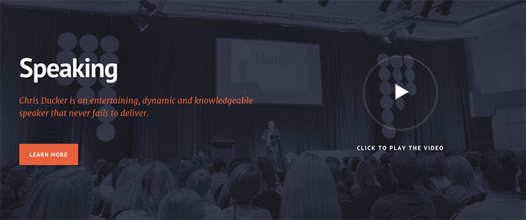
So, every section here is focused on just one thing, but you can see how they all cooperate well on this page. Also, notice that there is always an easy way for visitors to take the action (“Learn More”, “Read all blog posts”, “All episodes”) if they get interested and want to explore more.
There is a sign up form both at the very top of the intro section and at the bottom right before the footer. These are two very good locations for your email opt-in forms on the home page.
Have you noticed an interesting thing about the sign up forms? Those are the only places where I used green buttons.

It’s a busy page with a lot of content and colors. If I used just orange for these two buttons, it would get lost. It wouldn’t have as much impact as the green color does.
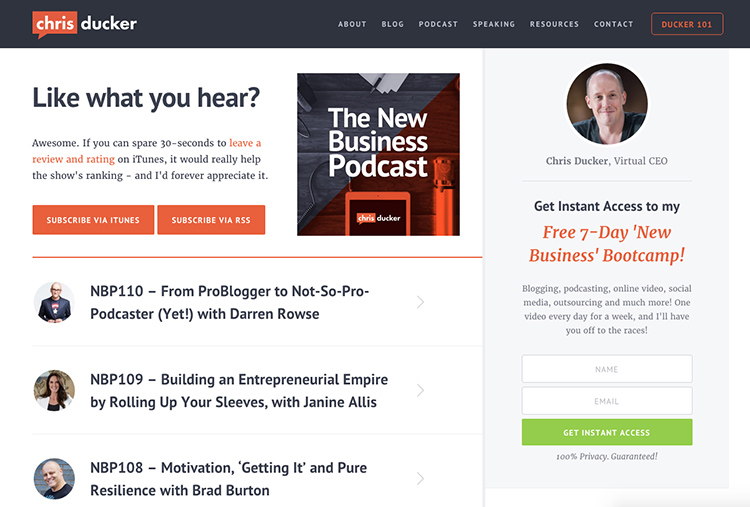
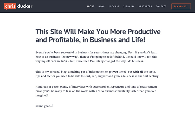
This project included a couple of more mockups before I got into coding the Genesis child theme. See below for some quick previews of the podcast page and a single page without sidebars.
Code the Genesis child theme for the Rainmaker Platform
Please notice that this section may be hard to understand if you don’t know how to code Genesis child themes. I’m going to show some pieces of the code without going too much into details, as I’m assuming you know some basics. If you’re not into the code, you can skip this part.
As I mentioned before in one of my posts on how I moved my own website to the Rainmaker Platform, coding themes for Rainmaker doesn’t really change from coding a Genesis child theme for the regular WordPress installation.
This theme has just three custom page templates:
- Home page
- Podcast archive
- Blog archive
Let’s go through some of the more interesting parts of the theme and how I got it done.
1. Home page content
The home page template is a completely custom coded page. I replaced the standard page content with my own custom code:
remove_action( 'genesis_loop', 'genesis_do_loop' );
add_action( 'genesis_loop', function() {
?>

// your custom home page HTML code goes here

<?php
});
This helps me to keep the home page’s HTML markup untouched and protect it from unwanted changes in the admin. However, to make the individual sections editable, I filled it out with widget areas whenever I could.
I registered a bunch of widget areas in the functions.php file:
genesis_register_sidebar( array( 'id' => 'home-intro', 'name' => 'Home - Intro' ) );
genesis_register_sidebar( array( 'id' => 'home-book', 'name' => 'Home - Book', 'before_title' => '<h2>', 'after_title' => '</h2>' ) );
genesis_register_sidebar( array( 'id' => 'home-book-info', 'name' => 'Home - Book Info' ) );
genesis_register_sidebar( array( 'id' => 'home-podcast', 'name' => 'Home - Podcast', 'before_title' => '<h2>', 'after_title' => '</h2>' ) );
genesis_register_sidebar( array( 'id' => 'home-blog', 'name' => ‘Home - Blog', 'before_title' => '<h2>', 'after_title' => '</h2>' ) );
genesis_register_sidebar( array( 'id' => 'home-speaking', 'name' => 'Home - Speaking', 'before_title' => '<h2>', 'after_title' => '</h2>' ) );
And used genesis_widget_area() function to display the content in a desired location. For example:
genesis_widget_area( 'home-intro', array( 'before' => '', 'after' => '' ) );
2. Recent podcast episodes and blog posts
I used a genesis_custom_loop() function to display the five most recent podcast episodes:
$query_args = wp_parse_args(
	genesis_get_custom_field( 'query_args' ),
	array(
		'showposts'        	=> 5,
		'post_type'		=> 'podcast'
	)
);
genesis_custom_loop( $query_args );
And similar for the recent blog posts:
$query_args = wp_parse_args(
	genesis_get_custom_field( 'query_args' ),
	array(
		'showposts'	=> 3,
	)
);
genesis_custom_loop( $query_args );
Then, it’s all about styling once you have the list of posts in place.
3. Blog archive – feature first post
On the blog archive, you might notice the first post has a little excerpt while other posts are just titles. I used $wp_query->current_post to recognize which post is first and remove content and post info from the rest of them. I also added a class “no-excerpt” so I could change the styling of those posts as well.
Here is the code I added to the blog archive template file:
add_action( 'genesis_before_entry', function(){

	global $wp_query;

	$current = $wp_query->current_post;

	if( $current > 0 ) { // skip the first post

		remove_action( 'genesis_entry_content', 'genesis_do_post_content' );
		remove_action( 'genesis_entry_header', 'genesis_post_info', 12 );
		add_filter( 'genesis_attr_entry', function( $attributes ){

			$attributes['class'] = $attributes['class']. ' no-excerpt';
			return $attributes;

		});
	}

});
That’s it! You can see the final results at ChrisDucker.com. Feel free to post your questions in the comments section below.
[hide_from accesslevel=”ebook”]
Want to learn more about my design process?
It’s quite a long post, but we just scratched the surface. I was trying to keep this post brief, because there is still so much more to explain and show from behind the scenes.
If you’re interested in learning more about my design process, be sure to check out my ebook, The Essential Web Design Handbook. You’ll have a chance to see step-by-step how I made one of my projects with all of the details and thoughts behind making important design decisions. It’s just design – from the initial idea to the final Photoshop mockups. No coding!
[/hide_from]
Hi Rafal
I’ve been wondering who designed Chris’ new site – now I know 🙂
It’s not only a fantastic piece of design, but I interviewed Chris on my podcast a while back and he’s a great bloke who genuinely wants to help people – and the stylish, understated, and accessible look of your design does actually complement his personality – which is no mean feat in design terms.
As an online branding vehicle and an easy to use website – it’s really well done. I absolutely love it – great work 🙂
Cheers
Loz
Thank you, Loz!
I agree. Chris is a great guy!
Great post Rafal. Thanks for sharing your process, it’s always good to see how others designers work.
Thanks!
This was such an awesome read Rafal!! Really great seeing a peek into how you go about completing a project and that redesign is just stellar! Thanks for sharing.
Thanks Sasha!
Love these kinds of posts where we get to see what goes on behind the curtain. Thanks for sharing! And the subtle changes to the logo = brilliant!
Thanks Carolyn!
Great write up, Rafal! You and Brian Gardner should put together a course on the specifics of designing/developing for Rainmaker and how it differs from a normal Genesis design/dev process. I know lots of people would be interested in purchasing it!
Thanks for the tip. It’s definitely something we should think about, but first, I need more hours in my day! 😉
I have one question. The query args you used. To my knowledge you cannot use the same name for multiple queries?
So did you really just use that php code for genesis to create the custom queries for the podcast and blog posts or did you rename the queries into more specific names?
Cause if this is all I have to do to create multiple queries on the frontpage with different content then oh my, it´s even easier than I thought! Or is this way of doing it only for rainmaker? it will not work on the genesis ordinary themes?
All in all, great writeup. Loved the code parts.
Henrik,
That’s the actual code I used on the site. You can use ‘$query_args’ for both loops as long as you call genesis_custom_loop() function right after.
Otherwise, you would need to change names; for example:
$query_args_podcast = wp_parse_args(
array(
‘post_type’ => ‘podcast’
)
);
$query_args_blog = wp_parse_args(
array(
‘showposts’ => ‘3’
)
);
Then you can use later in the code:
genesis_custom_loop( $query_args_podcast );
genesis_custom_loop( $query_args_blog );
Ah, nice. Only used to doing it with wp_query in a “normal” way. So haven´t seen the genesis way, but then I understand.
Thanks a lot for the answer Rafal!
Hi,
What a great insight! Thank you for this article.
Would you know if there is a book on coding Genesis themes? Your book is great for design but what I am trying to find is how to transfer visual part that you create in Photoshop to the new Genesis theme.
This article helps a lot but there are still pieces missing and there are some terms that I don’t understand like what’s the thing about number 12 (genesis_post_info’, 12) …
Great post Rafal. It saved my time. Love the new design of chrisducker.com. Very clean and good design.
Thanks so much for this article. Great to see your process with typography, colors and design snippets. I also like how you show the goal of each section. It has given me ideas for the story I want to tell for a B&B site I’m working on. Very helpful!
This is badass. Great work on this post and chris’s website! I will be using this as a guide for future site redesigns. Thanks man!
Hi Rafal,
This is a great revelation thanks for sharing this to us. I’m just a newbie guy from the paradise of Philippines, this is quite helpful for me as a newbie to show what genesis framewrok can do and make such website like this. The wireframe, color scheme, typhography are perfetly awesome.
Just a quick question. Did you just make this from scratch or you chose a genesis theme that was close to your wireframe?
This is awesome, Rafal! Wow! I love it. Now, could I ask to steal just one thing from here? The newsletter form before footer area! Can you share the CSS to achieve that? Thanks.
Kabolobari,
You can look into the CSS/HTML code of any live site and get CSS you need. If you use Google Chrome, here you can learn how: https://developer.chrome.com/devtools
Great, thanks. And thanks always!
Hi Rafal
I just reviewed your blog post hoping I could learn something that I could apply to my own website. I’m wodering how you did your custom home page with this site. Would that be alright if you can share your actual code with your custom homepage and how did you incorporate your registered side bar to it. I know this is out side scope of your blog post but your answers will help me a lot. I ask because I’m willing to learn from the expert.
remove_action( ‘genesis_loop’, ‘genesis_do_loop’ );
add_action( ‘genesis_loop’, function() {
?>
// your custom home page HTML code goes here
 ‘home-intro’, ‘name’ => ‘Home – Intro’ ) );
genesis_register_sidebar( array( ‘id’ => ‘home-book’, ‘name’ => ‘Home – Book’, ‘before_title’ => ”, ‘after_title’ => ” ) );
genesis_register_sidebar( array( ‘id’ => ‘home-book-info’, ‘name’ => ‘Home – Book Info’ ) );
genesis_register_sidebar( array( ‘id’ => ‘home-podcast’, ‘name’ => ‘Home – Podcast’, ‘before_title’ => ”, ‘after_title’ => ” ) );
genesis_register_sidebar( array( ‘id’ => ‘home-blog’, ‘name’ => ‘Home – Blog’, ‘before_title’ => ”, ‘after_title’ => ” ) );
genesis_register_sidebar( array( ‘id’ => ‘home-speaking’, ‘name’ => ‘Home – Speaking’, ‘before_title’ => ”, ‘after_title’ => ” ) );
Is there a theme like this within the rainmaker theme – I love the layout!
I think the Altitude theme would be the closest when it comes to layout: http://demo.newrainmaker.com/altitude/
Thanks so much Rafal!
Does the Altitude Theme have the ability to put the latest blog posts on the home page too?
Hi Rafal, I found your blog searching about “genesis logo”. I love your blog. I’ve learned so much and I’ll buy your book very soon. I like the way you approach design.
Could you tell me what font did you use to the logo?
Thanks!
Hi Rafal, this is really impressive. Do you think we can do the same thing with a theme like Breakthrough Pro or Academy or Authority Pro ? Another theme from Studio Press ?
Thanks