In a previous post I talked about why should you Start The Visual Design Process By Defining The Typography First. I promised to share some styles that I’ve created for myself but haven’t used yet.
These are very simple examples of three different typographical styles. I didn’t want to go too deep into designing all content elements like lists, quotes, all the subheadings, etc.
Instead, I’m giving you ideas and just the beginning of what you can use to design a really nice looking website.
Notice a few features of these typography styles:
- Big headings – if you design a content-heavy website like a blog, make sure your headings are prominent and there is no question where the blog post starts.
- Contrast – it’s true the light gray body text can look pretty cool but I’m always trying to avoid it and instead make sure my text has a good contrast with the background so it’s easily readable.
- Baseline grid – I based the text on a 6px baseline grid. It might be difficult to keep a perfect baseline grid throughout the entire website but it should help you to maintain this style and easily apply it in any project.
- Web-safe fonts – finally we have the technology (browser support) and access to hundreds of free, optimized for web fonts. I used some of most popular fonts from the Google web fonts.
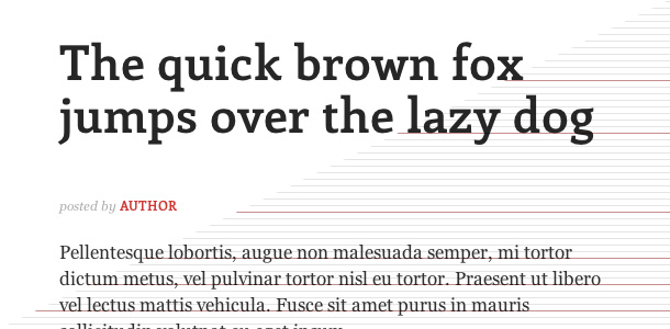
“Enriqueta” + “Georgia”
This is a bold and high-contrast style. Notice the red highlight color that can be used for links, bullets, buttons, etc.
Click here to see the live HTML/CSS demo of this style.
Link the Google Font:
<link href='http://fonts.googleapis.com/css?family=Enriqueta:400,700' rel='stylesheet' type='text/css'>
CSS code for this style:
h1 {
	color: #262626;
	font-family: "Enriqueta", serif;
	font-size: 44px;
	line-height: 48px;
	margin: 0 0 30px;
}

h2 {
	color: #262626;
	font-family: "Enriqueta", serif;
	font-size: 32px;
	font-weight: normal;
	line-height: 42px;
	margin: 0 0 24px;
	padding: 12px 0 0;
}

h3 {
	color: #c73036;
	font-family: "Enriqueta", serif;
	font-size: 18px;
	font-weight: bold;
	line-height: 24px;
	margin: 0 0 24px;
	padding: 12px 0 0;
	text-transform: uppercase;
}

p {
	color: #2f2f2f;
	font-family: Georgia, serif;
	font-size: 17px;
	line-height: 24px;
	margin: 0 0 24px;
}

.post-info {
	color: #aaaaaa;
	font-family: Georgia, serif;
	font-size: 12px;
	font-style: italic;
	line-height: 12px;
	padding: 24px 0;
}

.post-info a {
	color: #c73036;
	font-family: "Enriqueta", serif;
	font-style: normal;
	font-weight: bold;
	text-decoration: none;
	text-transform: uppercase;
}
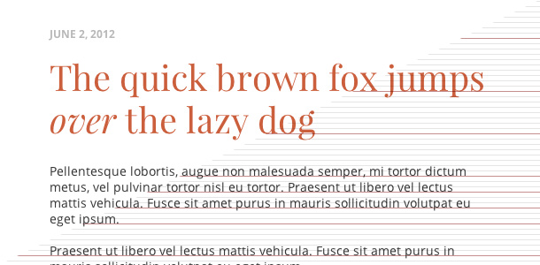
“Playfair Display” + “Open Sans”
This is an elegant style with a combination of sans-serif and serif fonts. Since the heading font is not so strong, I used the color to highlight it.
You can easily replace the “Open Sans” font with another sans-serif standard font if you want to improve the performance of your website. Keep in mind that every external font that you include increases your website’s load time.
Click here to see the live HTML/CSS demo of this style.
Link the Google Font:
<link href='http://fonts.googleapis.com/css?family=Playfair+Display:400,400italic' rel='stylesheet' type='text/css'>
<link href='http://fonts.googleapis.com/css?family=Open+Sans:400,700' rel='stylesheet' type='text/css'>
CSS code for this style:
h1 {
	color: #c65c3f;
	font-family: "Playfair Display", serif;
	font-size: 40px;
	font-weight: normal;
	line-height: 48px;
	margin: 0 0 26px;
}

h2 {
	color: #363636;
	font-family: "Playfair Display", serif;
	font-size: 26px;
	font-weight: normal;
	line-height: 36px;
	margin: 0 0 18px;
	padding: 12px 0 0;
}

h3 {
	color: #c65c3f;
	font-family: "Open Sans", sans-serif;
	font-size: 16px;
	font-weight: bold;
	line-height: 18px;
	margin: 0 0 18px;
	padding: 12px 0 0;
	text-transform: uppercase;
}

p {
	color: #363636;
	font-family: "Open Sans", sans-serif;
	font-size: 14px;
	line-height: 18px;
	margin: 0 0 18px;
}

.post-info {
	color: #b8b8b8;
	font-family: "Open Sans", sans-serif;
	font-size: 12px;
	font-weight: bold;
	line-height: 12px;
	margin: 0 0 18px;
	text-transform: uppercase;
}
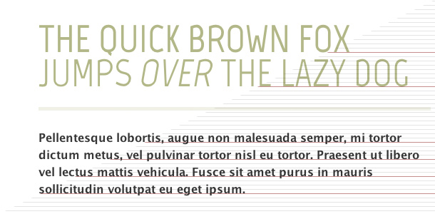
“Marvel” + “Lucida Sans”
This is a modern and light typography style. Keeping the perfect baseline grid might be hard because of different rendering engines in browsers but you can notice how the text in the sample quote is nicely aligned with the paragraph lines.
Click here to see the live HTML/CSS demo of this style.
Link the Google Font:
<link href='http://fonts.googleapis.com/css?family=Marvel:400,700,700italic,400italic' rel='stylesheet' type='text/css'>
CSS code for this style:
h1 {
	border-bottom: 5px solid #f0f1e7;
	color: #b2b888;
	font-family: "Marvel", sans-serif;
	font-size: 54px;
	font-weight: normal;
	line-height: 48px;
	margin: 0 0 26px;
	padding: 0 0 24px;
	text-transform: uppercase;
}

h2 {
	color: #b2b888;
	font-family: "Marvel", sans-serif;
	font-size: 28px;
	font-weight: normal;
	line-height: 30px;
	margin: 0 0 18px;
	padding: 12px 0 0;
	text-transform: uppercase;
}

p {
	color: #363636;
	font-family: "Lucida Sans", sans-serif;
	font-size: 16px;
	line-height: 24px;
	margin: 0 0 24px;
}

blockquote {
	border-left: 5px solid #f0f1e7;
	color: #b2b888;
	float: right;
	font-family: "Marvel", sans-serif;
	font-size: 20px;
	font-style: italic;
	line-height: 24px;
	margin: 0 0 24px 30px;
	padding-left: 30px;
	width: 150px;
}
Conclusion
I hope you’ll find these typography style examples useful. You can also use them as a guideline to create your own styles for any future projects.
Just remember to avoid combining too many fonts and colors. Try to keep it simple and aesthetic. Always keep in mind the overall style that you’re trying to present with your typography.
Learn even more…
If you really like the idea of the baseline grids, I would recommend reading Wilson Miner’s article published on alistapart.com.
Also, see the baseline grid template created by teehanlax.com.


I enjoy this type of post. it s simple but rewarding and allows me a few minutes of each day to get a bit of inspiration from other designers. Thanks!
I’m glad you spent a few minutes of your day on my blog 😉
Very nice! These are great combinations amd I appreciate that you provided the actual CSS.
Thanks Dorian!
Hi Rafal
Love the “Playfair Display” + “Open Sans”
Looks good with the colour you’ve used.
I’ve always admired good typography, but you are starting to turn it in to an art form.
BTW – are you following the European football?
England play Sweden tonight.
Hi Keith,
since we have access to so many beautiful fonts free to use on the web, we need to make it an important part of the design.
Yes, I’m watching Euro 2012. My country has the last group game against Czech Republic tomorrow.. I can’t wait to see it 🙂
Good luck with the game Rafal.
England just beat Sweden, but it was a poor game.
Very nice, self explanatory post, 100% useful, this is certainly an example post to be referenced!
Thanks George! 🙂
Love these examples and after your last post I started playing with some new typography sets to have ready. I love the Playfair Display and Open Sans combo. Also thinking about trying out Marvel. Thanks for the inspiration!
Great! I’d love to see your web typography ideas 🙂
Thanks, Rafal, I am a novice wordpress developer (using Genesis). You make it simple and beautiful, thank you, Your effort is an immense help and a gift.
Love the combinations if font. Elegant yet readable. I personally use Proxima nova for body and Skolar for headings.
I like the first choice especially, Enriqueta font seems good for heading.
thanks for sharing – I really appreciate the ‘learn more’ links at the end 🙂
Going to enjoy seeing what you do here – great information. Thanks for sharing.