I was recently asked to design a new website for Bill Erickson – a WordPress consultant, an entrepreneur, and a founder of The Creative Space and BIL Conference. Bill is also a well-known developer in the Genesis framework community.
You may have already seen this project in my portfolio. I decided to write a quick “making of” article and explain the entire design process step by step.
My typical design process includes:
- Brainstorming and sketches
- Creating wireframes
- Choosing colors, typography and visual design style
- Designing the first home page concept
- Designing the sub pages
- Delivering the final design files
Of course, each of these steps is supported by conducting research, contacting the client, getting feedback, applying a round of changes, etc. However, in this post, I’m going to focus on some more important steps and design decisions we made.
Let’s begin…
1. Brainstorming
This is my first step of the design process. By this point, I’ve already gotten some project info and have gone through a bunch of questions/answers with a client.
I usually start the brainstorming with a pen and my sketchbook.
I didn’t go for any inspirations at this step. I didn’t want to influence my initial ideas with some other projects. So, I started with a few quick general layout thumbnails to help myself visualize the entire home page:
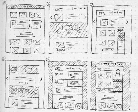
Based on that I tried to pick one, or rather, a mix of a few ideas and create one bigger sketch with some more details.
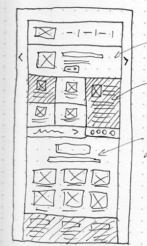
Also, at this stage I considered the mobile version of the site and made sure the layout I came up with would be easily responsive.
2. Wireframe
I never show any of my sketches to the client. First, I convert my sketches into a digital wireframe. I use Photoshop and my own wireframe kit PSD for this.
I drag and drop all basic elements from my wireframe PSD into the project. I’m trying to keep the actual dimensions of the page, sidebars, etc. These are not perfectly accurate yet but very close to what it will be in the final design concept.
This is the first home page wireframe sent to the client:
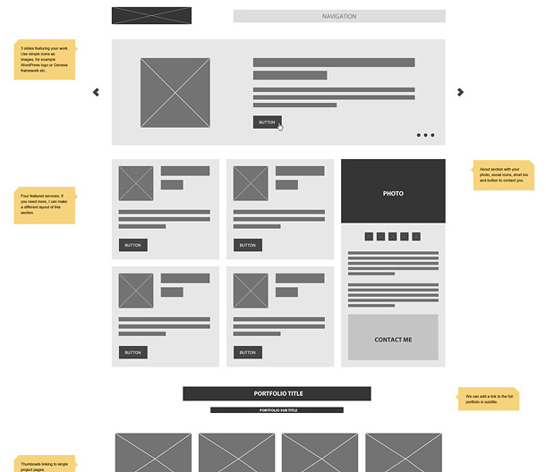
Note: be careful with sending wireframes to clients. In this case, Bill is a professional web developer and has a lot of experience working with designers. I didn’t have any problems with showing him the website’s wireframe. However, some clients may not understand the wireframe concept, so make sure to explain the entire process to them. In some cases, you may want to skip showing wireframes to clients. However, it’s still good to do it for yourself.
After getting some feedback from the client and applying some changes, we’re good to move to the next step.
3. Colors and typography
If you read my previous blog post, you know why I always start the visual design process with defining the typography first. In this step, I create a simple guideline of colors, typography and general visual design style.
That’s the moment when I open my browser and start searching for some inspiration. I’m looking for some other projects that might contain a style that would be close to the project I’m working on.
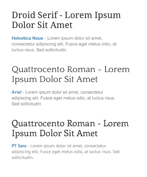
I knew that Bill was looking for something simple, clean, and minimalist and he also wanted to keep his current color scheme as well as similar typography set. I took his original color, fixed it a bit and combined it with some gray scale colors.

Next, I tried a few different typography combinations in the colors I chose and picked the one I liked the most:
In the last step, I created a simple guideline file using both the colors and typography I chose. I designed a sample headline, body text, button and a content box.
4. Design concept
This is my favorite part of the web design process – creating the first home page design concept. Based on the approved wireframe and my design style guideline I created this concept:
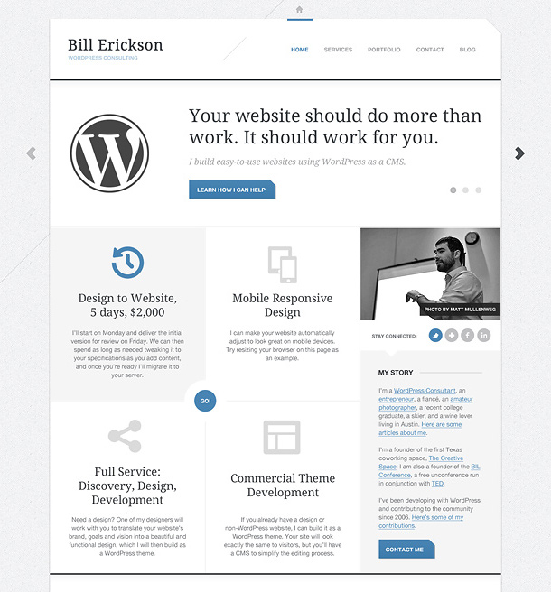
Also, that was the second moment when I sent the design update to the client. I want my client to see the typography and colors used in the actual design concept, so it’s easier to visualize how it all looks.
After some feedback from Bill and exchanging a couple more emails we made some changes to the original concept:
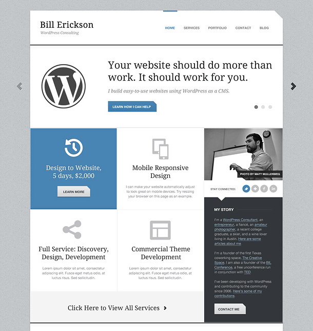
I’m really happy with the changes we made and as you can see we managed to find a good solution that both looked better and was exactly what Bill needed.
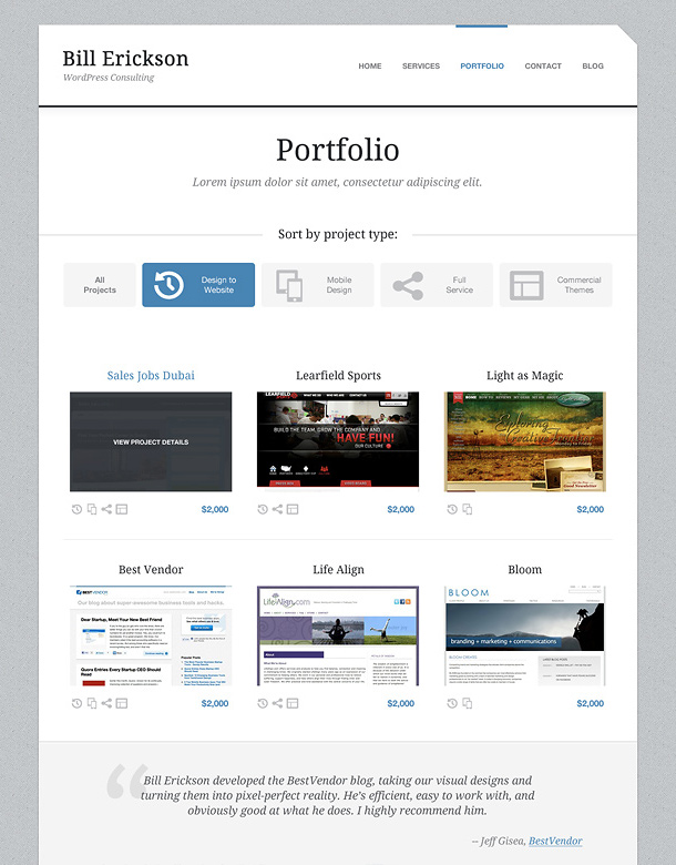
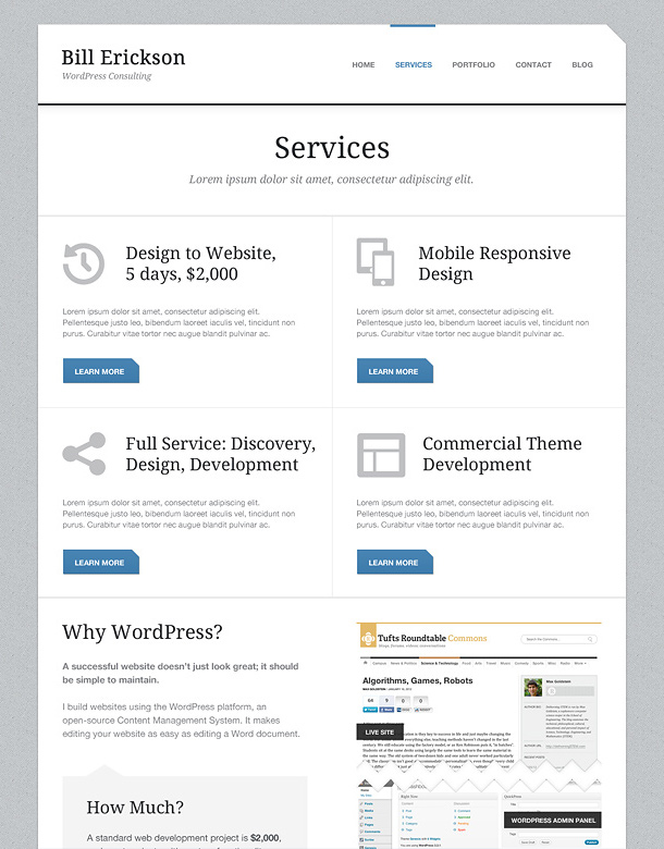
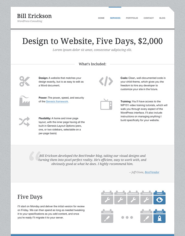
Of course, the project was not over yet. I was hired to design a few more pages like: Services, Blog, Contact and the landing pages.
5. Deliver the final project
Once all the designed pages were approved by Bill, I had to prepare the final package that included all PSD files and fonts used in the project. I always make sure my PSD files are cleaned up and that all layers are properly named and organized.
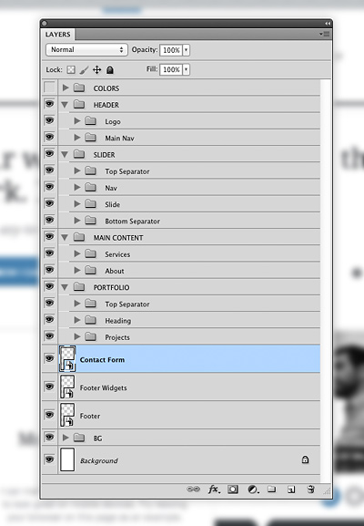
Note: I use the “Links” Photoshop extension to share some smart objects between the PSD files. It’s very helpful especially if you work on a few sub pages. Thanks to this extension you can share some common elements like navigation or footer. If you need to make any changes to these elements, make them only once and update automatically in all PSD files. To find out more, read Mark Steinnruck’s article “Linked Smart Objects in Photoshop”.
If you have any questions about my design process, please leave your comments below.
Also, I’d like to hear your feedback about this kind of blog post, and if you like it, I’ll post more “making of” posts in the future.
Hi Rafal!
Thanks for sharing the entire process, I had a look at Bill’s site few days back and I kept browsing each and every section of the website. Everything looks so good.
Would be great if you can share more of your experience.
Thumbs up for the nice work.
Cheers!
Thanks Puneet!
Awesome. I love the design you did for Mr. Erickson and really appreciated getting a chance to peer into the mind of such a talented designer and the process used to create your design.
More please! 🙂
Thanks! Yes, there will be more “making of” posts for sure 🙂
First, I love Bill’s new site. The design and functionality is great, well done.
Also. I would love to see more “making of” posts. Articles like this are a huge inspiration for me when it comes to refining my own design process.
Hi Quincy,
I’m glad you like it!
Bill’s new site looks great and that caricature is hilarious! I benefit tremendously from posts like this so I appreciate the detail with which you walk us through the process.
Thank you, Dorian! 🙂
I like looking at other people work process and I thought it would be interesting to show my own.
Hey Rafal! Great job on Bill’s new site. I checked it out the first day it was live.
I think you should continue to publish more “making of” posts. Always nice to see how others get the job done.
I saw you post on Twitter about someone stealing your content. At least they can’t take this away from you 🙂
I’ve been already working on a few new projects that will be perfect for another “making of” posts.
Thanks!
Thank you so much for these “peeks” into your process; I find them truly valuable.
Any details you could share regarding the initial questions you ask the client would be greatly appreciated as well.
Take care,
Greg
I just wanted to go quickly through this particular project. I’ll try to give more details about each design step in separate blog posts.
Thanks!
Thanks for the insight in to your design process.
Love the site and Bill is one high calibre client to have.
Many congratulations.
Thanks Keith!
Great to read about other peoples project workflows – there’s some valuable info here – thanks Rafal. Would be good if you could also share some of the general questions you ask your clients before starting on any work.
I’ll try to write another blog post especially about dealing with clients.
Bill’s website design is cool, no doubt about it. However, the design process shared by you is even cooler for someone trying to expand as web designer.
Hope you share more such insights, probably more details on how you make wireframes and then making the actual design layout – that would be real interesting for upcoming designers 🙂
Thanks! Sure, I’ll try to share more practical examples and step-by-step guides.
Great info! I would love to see more posts like these.
Could you share more info on your wireframe kit?
Thanks!
I’m going to share it soon. Thanks!
Hey Rafal, this is helpful. I’m curious, what do you collect from the client before you begin the designing process (e.g. images, copy, etc.)?
I’m trying to get as much information as possible. It’s perfect if I have a full website content that I can easily use in my design. Also, I usually ask for any unique graphics like logo, photos, etc.
I suppose that’s one benefit of being the re-design/re-branding guy rather than the web designer/developer guy. Thanks for the response. I come back to see what you have to say every time.
I am not a trained designer, but I have been studying principles for the past year. Finally starting to work on my own design using Twitter Bootstrap. What is kicking my but is figuring out how to do colors and typography.
People discuss it, but it is almost always written for professionals. Where is the guide for the blogger that wants to make things readable, responsive, and pretty. If you did another tutorial I would love to see you tackle these issues.
Thanks Susan, I’ll think about it.
Thanks for posting this Rafal, I know that kind of process could be exhausting, but that is what you are doing, and so am I if I want to be like you, as good as you 😉
Thanks for taking the time to share some of your process! Like the other readers, I appreciated seeing a “peek” into your workflow. It especially helped me to see how you named your Photoshop layers…using the terms a WP programmer would recognized (slide, footer widgets, etc.) Looking forward to your next post!
That is one of the most user-friendly designs I’ve seen. Whitespace, easy-to-read text (though I personally think the My Story sidebar gray text is a little tougher on the eyes).
Love the hover effects, icons, corner cutouts and all the details.
Thanks for posting the “making of” to boot.
wow. i am blown away. i have never seen such a detailed designing process (at least for me). I have downloaded your wireframe which i will be using on my next projects. Thanks Rafal for being so helpful. Peace
Cool process bro. Thanks for posting your design process. I learned alot from it. Your really very talented web designer.
I am stoked to learn of the PS linking plugin! That will save me so much time.. Great work on Bill’s new site
I had a chance to talk to BIll Erickson once on a genesis project..Bill is cool and you did a magnificent job..You ask if you should do more blog post like this..
Yes! I personally need all the help I can get and you don’t if know how great it is to gain insight into a top designers process..Its beyond great to read this.
You did a great job with Bill’s site. When I first saw his redesign a month or so ago, I really liked the simplicity and ease of navigation. And I just wanted to also thank you for the wireframe kit. I tried the Adobe wireframe app on my tablet and didn’t like it so I made a very basic wireframe template, but the one you provided is awesome. Thanks!
Hi Rafal, i just wanted to ask is there any app or utility which you use to mock different typography combinations? Thanks
Wow, nice redesign, Rafal!
I really really love the layout. I wonder that I can create my customized theme, but unfortunately I don’t have any speciality in that case.
Thanks for sharing, Rafal! Your blog is awesome!
Dear Rafal,
I loved your organised design process, i.e.. it is very very correct approach of designing. thanks for sharing this!
Rafal you’re definitely one of the best, yet is cool to learn how to improve the process of work with the client. I enjoyed very much this post.
Loved the article and design! Do you have another blog post that’s similar to this.