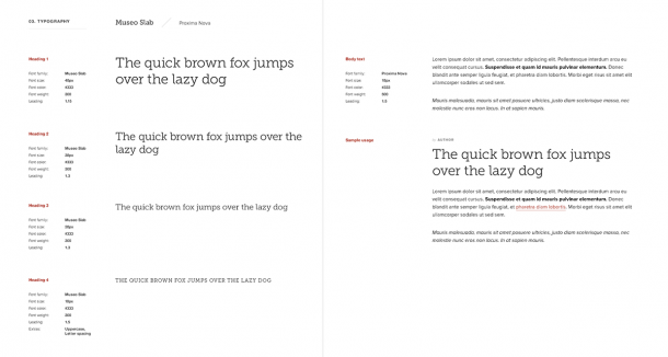
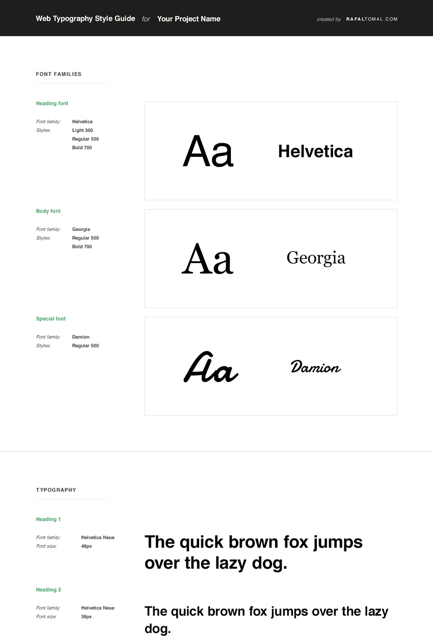
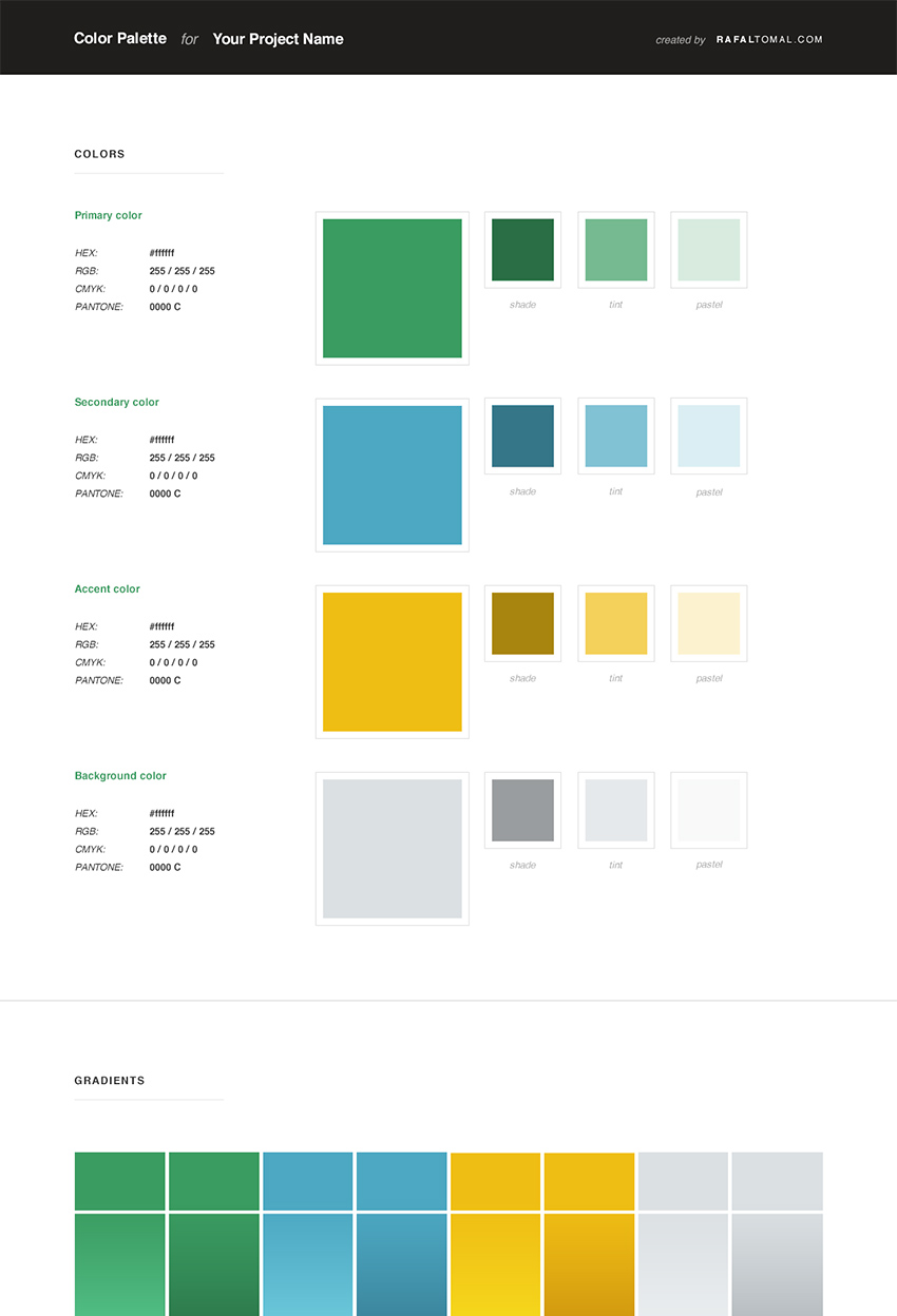
In this post I’ll share with you my web style guide template. A web style guide is a document where you specify elements like logo treatment, color scheme, typography, buttons, form fields, or anything else that you think is important for the website project you’re working on.
I don’t want to give it away that easily and let it be another freebie that you can download, add it to your “resources” folder and forget about it. So, please read first what I have to say about a web style guide and why it’s such an important part of the web design process these days.
Here is why…
Do you remember my typography first rule?
One of my first posts in this blog was “Start The Visual Design Process By Defining The Typography First”. It’s been a part of my designing process for a long time and it still is.
As we know, a typical website is almost nothing without the text. So, what we really call the web design is nothing more than 90% designing typography.
Your web style guide is the place where you want to have your typography well defined and described. It’s also a good exercise that in many cases will help you evaluate your own decisions on choosing and mixing the right fonts.
If it doesn’t look good in your web style guide and you don’t like how different headings and paragraphs look in a clean slate template, it’s not a well designed typography. You need to remember that your text must be universal and flexible enough to accommodate in different situations and designs.
So, start with designing some sample typography, make it a part of your new web style guide and let it be the foundation of your entire website.

The web design process has changed
The process of designing websites is changing. It’s really hard these days to create a couple of static mockups in Photoshop and let it be a strong base for the entire website development process.
I’ve been creating pixel-perfect complete page designs in Photoshop for so many years but I started changing my process and in many cases slowly giving up Photoshop and moving directly into “designing in the browser”.
I still believe that designing in Photoshop is an important part that helps me to be more creative and mock up something really quick before thinking about how to handle it in the code. However, having a strong and a well-designed web style guide helps to make your design more flexible, responsive and define how to use your design in different scenarios.
Thanks to a solid web style guide I recently cut about half of my Photoshop mockups and started doing all the work in CSS much earlier in the project.
Being a designer and a front-end developer in one lets me easily manage this but if you’re focusing only on your design job, make sure to prepare a good web style guide for your developers. They’ll appreciate it and you will be happier seeing the final results.
You might need to start optimizing your process today because creating static and pixel-perfect mockups in Photoshop starts becoming useless these days when everything needs to be responsive and flexible.
A good design is consistent
One of the main rules of a good design is consistency. Making your website design consistent helps to make your visitors familiar with specific design elements while browsing the site and moving from page to page.
Consistent spacings, typography and web elements make your work look professional and create a positive user experience.

It’s easy to lose focus when working on the same design for a long time or while moving from project to project. That’s where your web style guide can help you stay on the right track.
It’s your cheat sheet that will always remind you about the style of the current project. It’s your visual language that will also help you to communicate with other designers or developers who work on the project.
Download the web style guide template
Now that you have some background behind what the web style guide really is and how it can help you design your websites, go ahead and download my free PSD template.


This file is no longer available.
Check out my other design tools.
Before you use it please read this short note:
This web style guide template may be used in personal & commercial projects of any kind without restriction. However, it may NOT be redistributed or made available “as is” anywhere, but may be incorporated into works, such as templates, applications or other materials which are themselves sold or redistributed online in places such as the Envato marketplaces or other such sites.
Any form of spreading the word about my website RafalTomal.com is appreciated. Attribution in the form of a link to this website would be nice, but is not mandatory.
Thanks Rafal for giving away the PSD template. Your ethics seems to be concentrating more on typography and yes it is important but how long for a news website. I have seen this around the web that modern typography is replacing 14px font to 16px. How much that affects on news website where lot of content needs to show up on screen rather than filling up screen with 16px fonts.
It all depends on the website layout. I found many news sites that are 100% wide these days. It helps to use a large body font on wide screens and of course scale it down responsively for smaller screens.
Awesome! Thanks Rafal!! Very useful!
Dziękuję 🙂
I’m a big fan of your work, Rafal!
I hope the community makes good use of your generous information. Cheers!
Very useful PSD and I always enjoy reading about your process. Thank you for sharing!
Really great post, Rafal. Thank you! I have a similar work style when I design except I’m not as proficient in front end. The guidelines help me all the way through the project!
Awesome job Rafal. I would really like to understand if you use a grid when developing the overall design and layout? Thanks.
It’s really great bro.
I am re-learning the design process and realize how badly I need to update my workflow. So glad I came to your blog (and read this post), tucked away in my bookmark tabs from yesteryears 🙂
Of course Rafal, I have a question! 🙂
You have this PSD, you have the fonts downloaded onto your PC for this?
And also, do you use a grid system to get going?
All the best man, good luck and God bless.
Momekh,
Yes, I download all fonts that I need to use in my design mockups.
I use grid system very often but it all depends on what project I’m working on.
Thanks a ton for the answer Rafal!
Rock on… 🙂
Thanks you for share :), It is really helpful for me
Thanks for psd but i have a question that if i am converting a psd to responsive html which option is better bootstrap framework or self made css and media query.
Most of my websites are based on the Genesis framework, so I need to use html markup that is provided by Genesis.
If you’re free to choose, I would say go with bootstrap framework. It will save you a lot of time.
thanks
Thanks for sharing! Picking this up on my own so its really great help…
I agree with you. Typography plays an important role in a webdesign. Many website seem to exactly lack this quality which leads to cluttered or an unappealing website. Moreover, I feel a website since has equal weightage to its content and the design, I strongly feel that the typography used can bring clarity in the message and the information shared. I am pleased to read your post and thanks for sharing the PSD templates. I guess will try out the option of designing in the browser directly, but not too expert at that.
Great work and thanks for sharing!
Would you consider adding a section referencing components visual styles (Buttons, Form Elements, Iconography, … )? Or is it preferred to keep it separate?
Dear Rafal
What is the plugin you use for social icons under the post?
Thank you in advance,
Lobo
Bump – I already use Genesis and I want to know how to use these icons. Thanks.
Thanks Rafal!! Very useful!
I’m a web design beginner. I just started my first project about a week ago. Your blog posts are very helpful especially to an newbie like me. Thank you very much.
However, I’m at a loss. I can’t find the web style guide PSD template. I have signed up and found resources in the Designer’s Area but there’s no web style guide.
Regil,
There are now two templates in the Designers Area: Web Typography Style Guide and Web Color Palette Guide.
All are use full it Design is different and attractive.
Thank you for all your helpfulness.
As a mature student your guidance is really useful.
How much amazing!! very professional and creative post, thanks for sharing your technique with us. Please keep it continue for help us.
Great resource to have on-hand as I’m about to start a new project. I needed something to help in creating uniformity – much appreciated!