Before I turned to WordPress and blog designing I used to design mostly business websites. I worked on hundreds of different sizes and types of business sites. The primary goal for all businesses was always the same: to get a lead.
I used a variety of call to action banners to get some attention. I experimented with different typography, buttons, stock photos and contact forms.
Pretty soon I had a set of proven techniques that I knew I could use for almost any type of business site in order to improve the conversion rate.
What does it have in common with the email newsletter sign-up box on your blog?
When I started designing blogs, I was missing that call to action banner. I felt like the blog didn’t have any point where we wanted to direct the visitors.
My experience with some smart and successful bloggers quickly taught me that the email newsletter sign-up form is that missing part that I was looking for. This is where we generate “leads” for the blog sites.
Let’s see how to make your opt-in form more effective and improve its conversion rate.
1. Location: Find a Perfect Spot
There are a few popular locations where your email newsletter sign-up box can be displayed.
I would recommend sticking with those standards because your visitors most likely prefer to follow the same patterns. They expect to find your email newsletter sign-up box in the same place like on their other favorite blogs.
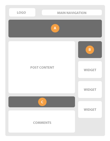
(A) Below the header
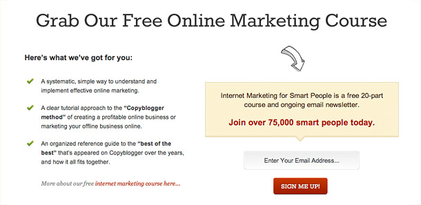
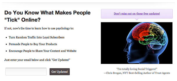
This particular spot can bring a high conversion rate to the newsletter box. You can make a big, full-width box on your home page and a smaller, alternative version of it on your single blog posts.
The home page box can give you a lot of space that you can use to convince people to sign up. You can use your own photo to add some personality, or present a free bonus for new subscribers to add some value, or just list some benefits of your newsletter.
See examples:


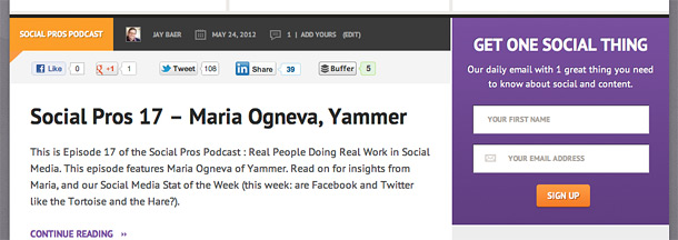
(B) Top sidebar widget
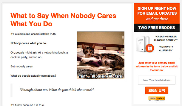
This is a popular place where almost everyone looks for the email newsletter sign-up box. Just make sure to place it at the top of the sidebar and that it’s prominent enough.
See examples:
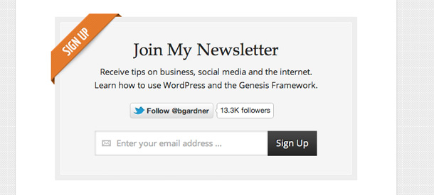
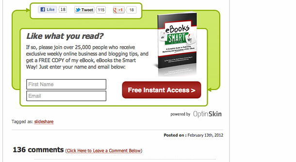
(C) After the post content
This might be your last chance to ask someone to subscribe to your email newsletter. It’s a perfect moment to call someone to take action before leaving your site (maybe forever?).
See examples:
2. Colors & Layout: Break the Pattern
The best idea is to use your brand colors or your website color scheme. This will build some trust and your visitors will know that the email newsletter is a part of your blog.
It doesn’t mean that it has to be boring. You can still make it interesting by adding some extra space, contrasting colors, textures and extra custom graphical elements.
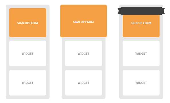
If you decide to place your opt-in form in the sidebar, it can be less visible because of other widgets displayed in the same column. You need to break the pattern and make your entire newsletter box more prominent.
Of course, this won’t work if you’re trying to feature all your widgets in the sidebar. You need to create a solid pattern with your other widgets so it can be used as a background for your email sign-up box.
Then, when you make your newsletter box a bit different it will make the contrast even deeper and it will really stand out from the sidebar.
You can break the widgets pattern or generally improve the visibility of any sign-up form by a few simple techniques:
- Use contrasting colors
- Have more space around the sign-up box
- Have more space inside the sign-up box
- Use different sign-up box sizes
- Include extra graphical elements (arrows, pointers, ribbons etc)
3. Accent: Make It Stand Out
Yes, some extra graphical elements can really get some attention and help your email newslettter box appear more prominent.
If you have some free bonuses for new subscribers, show them. Add some color bursts or ribbon graphics saying that there is a free PDF or a free file to download that everyone is waiting for. The actual image of a real book works pretty well for free e-books.
Even if you don’t have anything special to offer your new subscribers, you can still use some elements like arrows or hand-drawn typography to focus your visitors’ attention.
See some examples of opt-in forms using extra graphical elements to enhance the visibility:
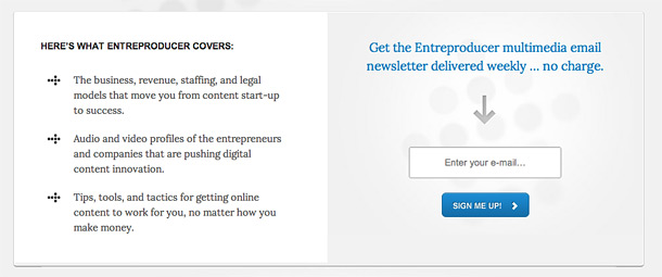
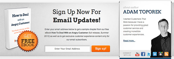
Note: if you need some graphic elements like ribbons, bursts, buttons, icons, etc. to promote your content or products, make sure to check out the Premise plugin for WordPress. I’ve created a pretty big package (1,100+ custom unique graphics!) and it’s all included in Premise and free for you to use in all your projects.
4. Sign Up Form: Don’t Make People Think
So we already got some attention to the email newsletter sign-up box and the visitor is pretty much convinced to sign up. Your job now is to make this last step as easy and quick as possible.
Don’t ask for too much. Do you really need someone’s name? You usually just need an email address, so you want to focus on that. Try to make the input box bigger and add some more space into it. You can also add a little email icon so it’s obvious what you’re asking for.
Then, create a simple and nice looking sign-up button. Try to make it contrast with the email newsletter box background. The button should look “real” and “clickable.” Of course it should coordinate with your blog pattern, but make sure it is clear to subscribers that it’s clickable.
Don’t make people think even for a little while: “Where should I type in my email address?”, “I typed in my email address and what now?”, “What is this box for?”, etc.
Never Stop Experimenting
I hope some of these ideas and examples will help you improve your mailing list conversion rate. I’d also like to encourage you to do your own experiments and tests. Try using different locations, colors and layouts. You may discover some interesting results by changing a small detail in your sign-up forms.
To prove that these techniques really work, I tried to use some examples of well-known blogs. I had the opportunity to work on some of them and we noticed an increased number of subscribers in all cases.
Also, here is a comment from one of my clients, Adam Toporek whose new blog I designed:
“In the first year of the original blog, we had a handful of people sign up for our mailing list. Since launching Customers That Stick with the strategically placed newsletter sign-up boxes, in the first two months we attracted 10X more sign-ups than we did in the whole first year.”
The best playground is always your own website, so start today and feel free to share your own discoveries with me in the comments section below.
Grate article now I’m gonna have to apply all this to my new website, and just like always I will need your help 🙂
Starbucks? 🙂
Your design great … why don’t you include such a subscription box here.
My blog is my playground. I want to try out some other ideas.
This is an excellent article. I’ve been thinking of switching to Generate theme (based on Chris Garrett’s suggestion) and this sealed the deal for me.
Thanks John! Yes, the Generate theme is a good choice to build a serious mailing list. It just works 🙂
The one area I’m not using an email sign-up form, but should be, is on the footer of my posts. Otherwise, the “feature box” area on the home-page (using the Balance Theme) converts very well.
Solid advice Rafal and dig some of the examples you shared. Always like to see what others are doing to pick up some ideas 🙂
If you add an email sign-up form after the post, make sure you can track sign ups from that form. Then, you can compare the results after few months and see which form converts better.
I’m glad the Balance theme works for you 🙂
Ricardo,
I think you should put an email sign-up form at the bottom of your posts and post a case study of the results. I bet you will see an increase in subscriber counts.
Great post. Super useful. Thanks for the plug too, Rafal!
Thanks Jay!
On the technical side, I’m curious if these are theme-dependent. Could any SMB who can’t afford a custom theme or some of these frameworks, do these via the variety of plugins and widgets available? On the comms/design side, I’m not sure A, B, and C are necessary – esp. if they’re all dressed up with ribbons and colors. Thinking there is too much of a good thing.
And as a PR, I’d say this is all well and good – but make sure when people do subscribe, you have something that’s opt-in worthy. FWIW.
Davina,
A small business may not afford a custom website and pay $5,000 but I’m sure any SMB can afford a WordPress theme that costs $80. If you look at our StudioPress themes: http://www.studiopress.com/themes you can find a few ready-to-go solutions with built-in email newsletter sign up form widgets.
Also, as I mentioned in one of the examples, you can use OptinSkin.com plugin to display the email sign-up form in any theme.
Thanks for sharing your thoughts! 🙂
Rafal,
When it comes to email opt-in boxes on blogs, I feel like Jekyll and Hyde. The graphic designer part of me likes Chris Brogan’s bold and beautiful ribbon banner. My Hyde side tends to lean on the psychology of the clean minimalist approach that Social Triggers uses.
Presently, I’ve got a super basic opt-in box on my blog that came with a “coming soon” page. However, seeing Optin-Skin run on Pat Flynn’s Smart Passive Income blog has pulled me in and I’m going to deploy it on my blog and some other ones I’m working on.
I like the ability to put the opt-in box where ever I want (personally, I like it when it fades in at the bottom of a post.) Also, I think offering your reader the ability to opt-in for a newsletter at the bottom of a post is a GREAT idea too.
I’ll have to report back to you and let you know how my experiment goes.
Colleen,
it’s all about the balance. If you have a minimalist looking website, you may not need to use heavy colors and ribbon banners.
Thanks for joining the discussion! 🙂
I’ve been working on my simple blog design. Now I’ll use your suggestions and test other ideas to see how the conversion rate pans out. Great and helpful information.
Great! Feel free to share with us your results.
Looking at the Streamline child theme: are the two signup boxes the same — meaning do you receive the same content or if you use one signup box you get x content and y content if you use the other?
Is that signup box for email list managers (AWeber, MailChimp, etc.) or is it a customized Feedburner email signup box?
These are two different widget areas and it means that you can add completely different widgets in both places. The standard Genesis email sign-up widget is only for Feedburner.
There is a plugin that works same way with the Aweber forms: http://designsbynickthegeek.com/plugins/aweber-box-streamline
MailChimp provides you the form code and you can probably customize the design using their settings. Then, you can just paste the generated code into the text widget to display it on the website.
MailChimp also offer a plugin for this purpose http://wordpress.org/extend/plugins/mailchimp/
Nice, thoughtful article Rafal. Thanks for sharing what you’ve learned.
Thanks Ethan! 🙂
That one Brian Gardiner designed looks great and he’s also written an entire tutorial on how to make it!
I really like the Entreproducer.com opt in box but how do i create a button using shortcodes in Genesis? Is there a tut for this?
Or
Could i have the css and php for the Entreproducer.com opt in box ?
I really like
Brad,
some themes already have nice looking buttons like the Entreproducer.
You can display a standard email newsletter sign-up box and use CSS to change the layout, colors etc. You can look into the source code of the Entreproducer.com and see the CSS behind the box.
Ok Thanks Rafal, i’ll use Firebug for this and write a post about how i did it.
Just updated my Subscribe box as per Brian Gardners ‘s CSS.
http://www.wmwebdesign.co.uk/video-for-the-genesis-theme-framework-for-wordpress/
The dash of orange is a great eye catcher so I’m hoping to get an increase in subscribers.
Hey Keith,
great job! Also, I would recommend to improve the “Go” button.
Let me know if you noticed better results.
Hi Rafal,
I’ve been following Copyblogger’s work for some time now and today I have to say this article of yours is very useful as it is backed with great examples of what you mean.
I will certainly apply some of your suggestions very soon.
Regards!
Great tips… as a matter of fact, in keeping with the spirit of this post, I just subscribed!
The entreproducer optin -box is terrific!!
I´m new to wp and genesis and wonder what I ned to do to create the whole white box including the optin-form.
Is this a widget area in the middle of the page?
Cheers
Okay, I am COMPLETELY NEW to this and have been searching literally for the past 2 days looking for info on how to install a optin offer or header or now, newly acquired verbiage of “call to action button”. I really like the “Chris Brogan” example above. Can you please help me by telling where I can either learn how to make it or find someone to make it. ??
Hi there would you mind letting me know which webhost you’re working with? I’ve loaded your blog in 3 completely different internet browsers and I must say this blog loads a lot quicker
then most. Can you suggest a good internet hosting provider at
a reasonable price? Cheers, I appreciate it!
This is my choice: http://websynthesis.com/
Amazing design sir. I like this Designs 🙂
This website was… how do you ѕay it? Relevant!! Finally I’ѵe found
something that helped me. Cheers!
I haven’t read all the above comments, but seriously, your wording directly under email sign-up box was one of first things I noticed…choosing to chunk the usual formal lingo used in all sign up or contact forms. Sets an awesome tone & almst always makes me smile. 🙂
Ok, Rafal, lemme just get this off my chest and I’ll never speak of it again. Despite being a happily woman and all, you, young man, had me at hello when I loaded your site. The font size, white space, verbage, color palette, all made me ’bout swoon! Your design decisions sooo closely resemble the ‘dream site’ my heart longs for… but mine often ends in a mild tantrum as I huff off the computer. :).
No worries, though.. I shall plug along and peruse some more stuff. Your blog posts really are helpful..you’ve a good knack for ‘teaching’ as well. Glad to have found your site.
it is an excellent post,really it helped me to improve my subscribers. my experience with the newsletter box below header area.that works fine.content above the fold works fine.below the header newsletter widget attracts people to sign up.thank Rafal Tomal
I enjoy this type of post. it s simple but rewarding and allows me a few minutes of each day to get a bit of inspiration from other designers. Thanks for blueprint.