You may see big hero banners on almost every modern website these days and I really like this trend. I think intros with big typography positioned in the middle of the page work so well because they’re simple and keep you focused.
There is usually one title, one message and one call to action. There are no distractions around and it immediately invites you to explore the website. It’s very powerful and that’s why it has to be designed right.
There are of course many design elements involved in it like layout, colors and background image. However, the copy message is most important here. That’s why I simply can’t stop emphasizing the importance of typography design in websites.
The truth is that if you can master designing beautiful and readable type, you can do great designs just by doing that ONE thing (I guess the “The ONE Thing” book by Gary Keller had a huge influence on me… check it out if you haven’t read it yet).
I put together the 5 best practices and ideas on how to make your hero banner typography look amazing:
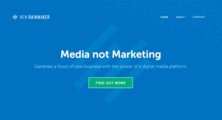
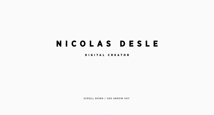
1. Make super bold titles.
Use bold to get some attention or make it super bold to make a real impact. Very bold letters will cover a large amount of space which can’t be unseen. It’s great especially for short titles and when you use sans-serif fonts.
Let’s see some real life examples:
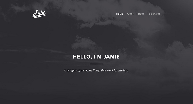
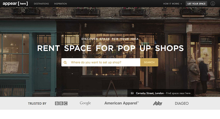
2. Use subtle cursive serif font for subtitles.
This is a pretty cool technique to make your titles look really sexy. Opposites attract in real life and in web design too. Our eyes love contrasts and you can use this method in designing typography.
Try to make a very subtle and cursive serif font for subtitles in contrast to your powerful, big, sans-serif title. A combination of these two can give you some really amazing results. You could use the same principle and mix a thin and small sans-serif subtitle with a big and bold serif title. Either way you can attract people by making this beautiful contrast.
Let’s look at these examples:
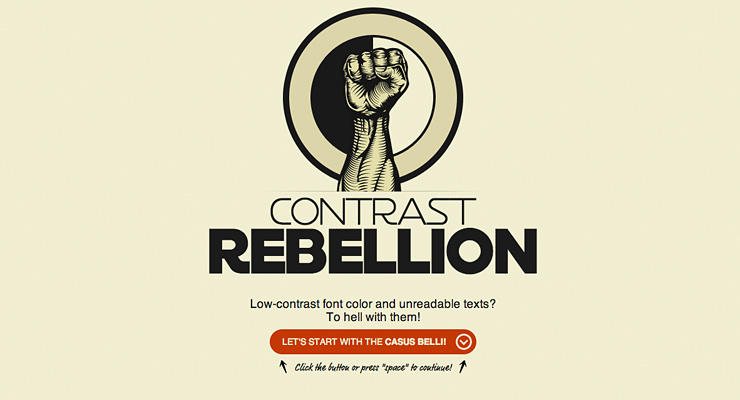
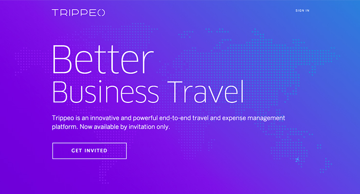
3. Give some extra letterspace when using uppercase.
Uppercase letters are great for big titles. You can add some unusual letterspace to enhance the prominence of your title. It’ll look great especially if your headline contains just a couple of words or sometimes even a single word.
However, remember to be very careful when letterspacing lowercase text. There are a few exceptions when it’s necessary (to improve readability) but let me remind you what Robert Bringhurst (the author of “The Elements of Typographic Style”) says about letterspacing:
“A man who would letterspace lower case would steal sheep, Frederic Goudy liked to say. The reason for not letterspacing lower case is that it hampers legibility. But there are some lowercase alphabets to which this principle doesn’t apply. Moderate letterspacing can make a face such as lowercase Univers bold condensed more legible rather than less.”
Check out some beautiful examples of uppercase headlines with some extra letterspace:
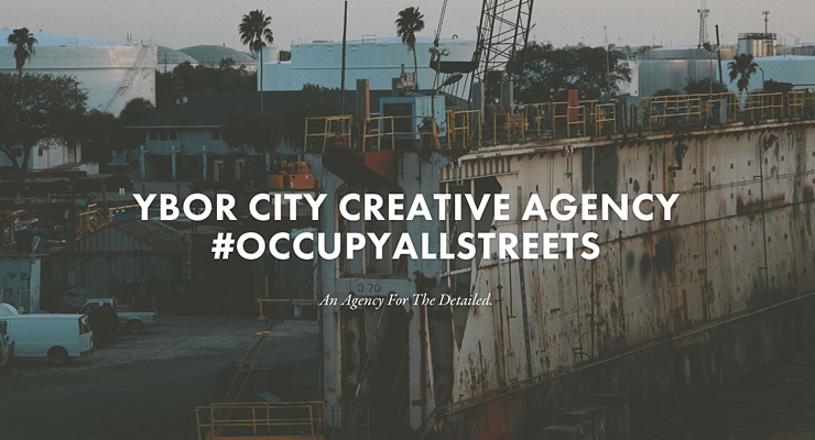
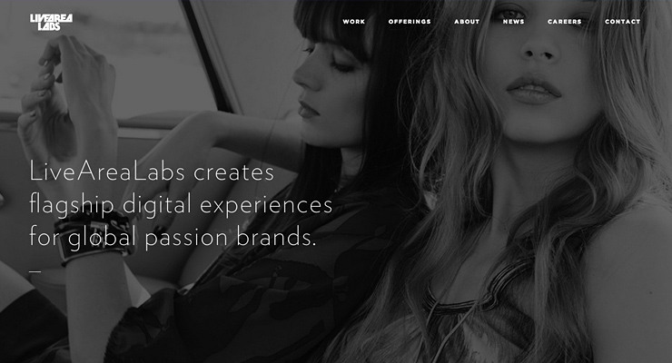
4. Use a big and thin font.
This might be completely opposite to the first point but it doesn’t mean that it’s not right. Both options can look great if designed well. Big and thin fonts will be great especially if your headline is a bit long and using bold letters could be too heavy.
There are some great sans-serif fonts that come with 100 and 300 font weight like: Open Sans, Museo Sans, Lato or Quicksand. If you want to quickly find some more free web fonts, go to Google Fonts and choose the “Thickness” level in the left hand side sidebar.
Let’s look at how thin fonts look in real life:
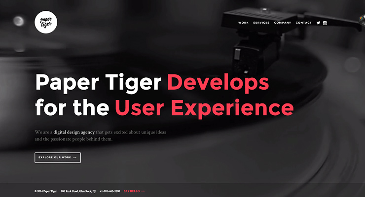
5. Add some color to single words.
By changing the color of a single word or a part of the headline, you break the visual pattern of what will be easily noticed by the human eye. I love this technique because it can get some quick attention and can even emphasize the importance of the message by putting more weight on a particular keyword.
You can even add some animations to these words or make them clickable for extra interaction if your users find it very interesting and are willing to explore it more.
Check out these great examples:
What are your typography design techniques?
I’d love to see some of your ideas and design techniques. Feel free to share them in the comments section below. If you have just designed a typographic hero banner for your own website, share a link and I’ll be happy to review it and leave my comments.
Thanks Rafal — this could not have been more timely. I had just finished a post on website typography in which I linked through to your other articles on this subject as examples of technique and process. I have posted another link to this article to round things off. Thanks again and keep up the great work 🙂
Thanks, Tim!
Big and thin font always look good.
Big and bold too 🙂
Great post, Rafal. I love these sort of “showcase” posts that breakdown various design techniques used.
Thanks! I’ll try to write more posts like this one.
Always worth reading your blog posts Rafal. This kind of typography is very effective, previously I was thinking to do the same with my website but it can not apply to all the sites so I dropped this idea.
Keep blogging 🙂
Thanks, Rohan! Keep experimenting with typography 🙂
Great article, really helped my get some variations for header typographic area
Hi, you are using very beautiful social share buttons in post, please tell me how to get this plugin ?
Regards
Anas,
This is our own plugin we made at StudioPress.com. It may be available to everyone pretty soon.
This is good post for making the banner ads and showcase banners are helpful for make new banner ads. Thanks for Sharing.
The elements of basic typography have been explained really well. Well written blog; keep posting.
Great explanation Rafal. The 5 tips are spot on. I mostly use Thin Font with little bolder Font, they make a great pair. Coloring some words is also a good idea, I will try it next time I design any banner.
Preston
Really great tips explained with great content. Thanks for sharing this with us.
Great post. These helps me much. You show the best and easy way to make amazing design. Thanks for sharing.
The Hero banner it is very amazing and you are presenting many different design i modified to your ideas.