What does it really mean when we think about designing for better user experience?
We often talk about readability, usability, how it should work, and how it should behave. We focus our attention around the users, their problems and needs. We test, research, optimize, and repeat.
It’s all correct but there is one more big point that seems like we sometimes forget. UX design is not there just to serve users needs but also to serve business needs.
Jeo Natoli in his book, Think First, calls it a “value loop”:
value loop: creating something that delivers value to users, so that value also comes back to the product’s creator in the form of increased use, efficiency or good old fashioned dollars and cents.
So, you have to constantly keep thinking about the business needs when designing for user experience. You should really look for that sweet spot between both worlds.
Ok, it all sounds pretty good in theory but how does it translate into real life situations?
Let’s look at some examples
I always like bringing some real examples, because that puts all the ideas into some perspective that you can easily relate to.
I’ll try to make it quick and simple, but of course some of these may be way more complex than it sounds.
So, let’s say you’re designing a web app. Designing an effective user onboarding can be the easiest example to show how UX can benefit both the users and your business.
User onboarding can be an email sequence, guided tour, or just a simple welcome message explaining some features of your app. Actually, it can really be anything that can help users to be successful in using your product.
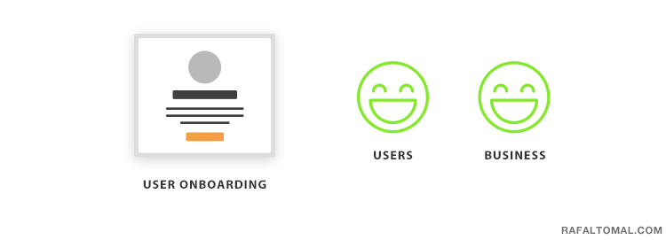
For users it can be a huge time saver, and overall a good experience since they feel welcomed and guided through the process. It means better retention for your business and fewer support tickets to answer.
Simple, right?
Another example could be designing access to your customer support. The goal is clear: to help solving user’s problems as fast as you can.
If you were looking just from the user’s perspective then probably giving a quick and easy access to your support team would be the best solution.
You could add a live chat and always have someone available 24/7 whenever your user has a question. You could add a “Get Help” link at the top in your navigation and everywhere around the site so it’s easy to find it and file a support ticket.
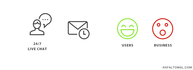
However, this could kill the business because the support cost would skyrocket.
You need to find a solution that helps your customers while still being cost effective. That’s where the real challenge is.
So, your solution could be adding a knowledge base with tutorials, guides, and frequently asked questions. You could help users find answers for their problems on their own to limit the need to contact the support team.
The challenge here is to make sure that such knowledge base is frequently updated, comprehensive, and it’s all supported with an advanced search functionality.
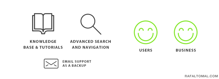
Then you can keep optimizing and improving it, so users can find answers faster while maintaining a lower volume of support tickets.
If executed well, it would be a win-win situation with benefits for both users and business. You have to sacrifice a little bit on both sides but it’s all good as far as you find the middle ground.
Of course, keep in mind that every business is different. In some cases, providing accessible support can bring so much value to customers that it would pay back to the business in a long term and cover such a level of customer support.
I’m not giving any final solutions here, just some examples.
How about increasing sales?
There are many examples how good UX could help increasing sales if we think about designing your sales page, shopping cart, checkout page, or even your service questionnaire form.
I like looking at the bigger picture when designing websites. How do users behave on your website and what are they looking for? What path do they take from the moment they enter the site to when they purchase your product?
Let’s imagine designing a new home page for a company that sells some digital products.
The current home page displays some of the most popular products with a prominent “Buy Now” button and a secondary “learn more” link.
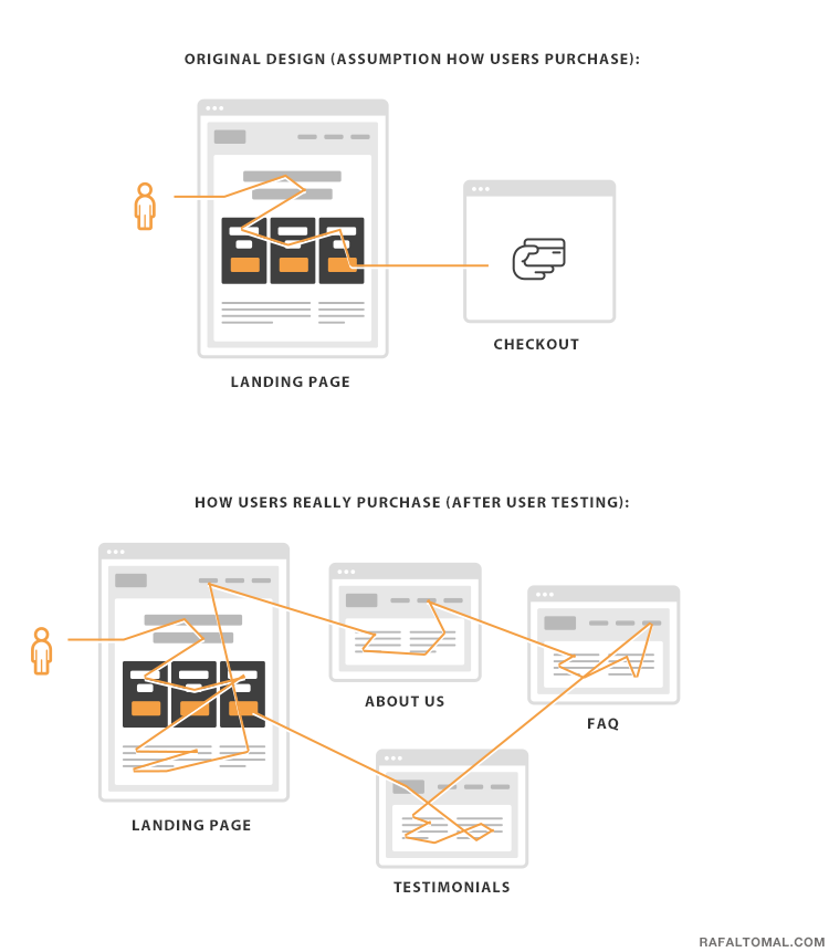
A false assumption could be that if you put the “Buy Now” button right in front of your users, they just cannot miss it.
If you start watching your users’ behavior, you may realize that they actually wander around your site, read more about the product, and look for some specific information before they’re ready to purchase the product.
The more expensive the product the more information it needs, of course.
So, your redesign could put more information on the home page, and link to product sales pages with all the features, screenshots, social proof, and the actual call to action somewhere in the middle and at the bottom of the page.
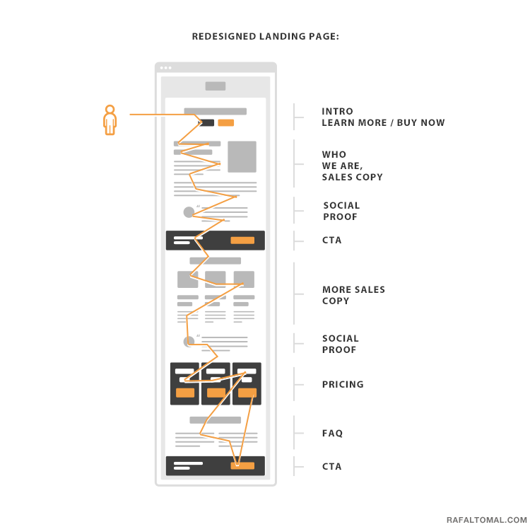
That way your users can easily get all the information they need to make a purchase decision (benefit of users), and the business gets more sales, a higher conversion rate, and better customers (fewer refunds since customers are better educated about the product).
It could all be done by just observing the users, enhancing their experience, and providing them with what they really need instead of trying to force them to walk a completely different path.
Again, in some cases, your user testing could show something completely different. It could appear that users are so well-educated about the products you’re selling that they don’t need to learn more about it and are looking for the fastest way to purchase it.
That’s why it’s so important to learn more about your users, their needs, and their behavior on your website. You should never make any assumptions based on someone else’s research or testing.
I think it’s worth remembering that user experience design wouldn’t really make any sense if it didn’t give value back to the business.
It’s also a never finished work, because you can keep measuring, optimizing, testing, and iterating new solutions.
Fortunately, it’s a well invested time.
Nice article. Thanks Rafal. What tools do you use for user testing?
I currently use hotjar.com
Awesome article, Rafal! I’ve learned so much from it. Very simple and very informative. Thank you a lot! (And sorry fo my english, I am on beginer level).
Thanks for sharing! It’s very useful!
Awesome article Rafal ! Indeed user experience design is a key factor in a business promotion as it improves the usability, accessibility and pleasure provided in interaction with the product. Thanks for sharing.
–Codingplex
Awesome article Rafal ! Indeed user experience design is a key factor in a business promotion as it improves the usability, accessibility and pleasure provided in interaction with the product. Thanks for sharing.
Hello, Rafal!
Well written article. Worth to read. Enjoyed and learned a lot while reading. User experience is the key to business success. Better the experience they users get from your website more will be the leads and sales.
Good it is not about this article, it’s awesome! Your thoughts and approach are definitely making me think in a different way. And I do like it!