Do you remember Typespiration.com? It was my small side project that I launched back in 2012. It got a lot of traction in a very short time, but then things got complicated and I left that project alone for a couple of years.
So, I decided that it’s time to give it a second chance and relaunch it this year, especially since I truly believe it has a huge potential.
Before I explain what happened to the previous version, let me quickly tell you what Typespiration is for those of you who haven’t heard about it before.
What is Typespiration.com?
It’s a showcase of inspirational web typography designs. However, unlike other web galleries out there, the showcase doesn’t include just screenshots of other websites.
All of the designs are actually live free web font combinations with color palettes and ready-to-use HTML/CSS code. If you like the design, you can quickly copy any colors from it, a font combination or the entire CSS code and use it in your own project.
It’s all comes in a very convenient format that also teaches you some good web typography design practices. Of course, it’s not a complete web typography style guide that will serve your entire website. It’s just for inspiration, and you can take it from there and make it yours.
Currently, I personally design every single font combination (yes, I have too much free time on my hands ;-)). All free. There are just four new designs right now, but so much more is coming soon.
What happened to the previous version?
When I launched Typespiration.com the first time in November, 2012, I invited all designers to sign up and submit their designs, so everyone could contribute and create the showcase.
It sounded great in theory and so many good designers signed up and posted some beautiful examples. This approach also had a dark side. 80% of submissions were made by people who were not even designers or who just wanted to spam the site or hack it (and they succeeded).
I had a beautiful vision in my head when I launched Typespiration.com, but the reality hit me in the face really hard. Instead of focusing on adding my own designs and promoting the site on social media, I had to go through a couple hundred submissions every week and decide who was going to be a good match for the site.
I made some bad choices and some people took advantage of it. The site got hacked a couple of times and I had to spend a lot of time to recover it. That was the price I had to pay for using a cheap hosting and not updating WordPress and plugins regularly.
As a result, I lost my motivation to continue working on the site, stopped accepting new submissions and left it alone for a couple of years.
What’s the new version of Typespiration?
So, I went back to the drawing board and started planning a new version of Typespiration. I thought about what I did wrong and what I really wanted from this website.
I started this project because I enjoy designing web typography. I decided to make it the main point of the new site and that it’s going to be just me and my designs in the beginning. It’s my side project and I prefer designing than reviewing other people’s work, so why not just do it?
I built the new site entirely around that idea. Instead of spending time on the about page, contact forms, and blog posts, I decided to focus entirely on the showcase. I spent extra time making sure the designs were presented in a nice format and it’s all very functional and usable for users.
Here are some of the new features you can find:
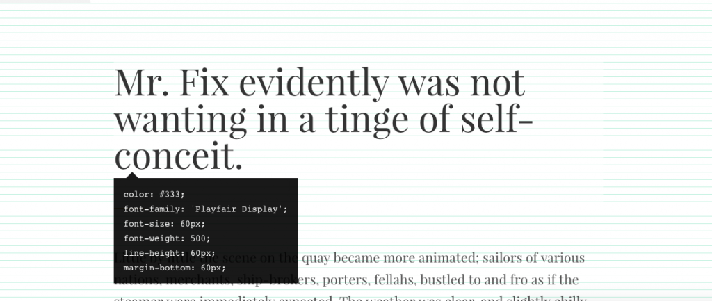
- Baseline grid view. You can show a simple 12px baseline grid. Once the baseline grid is turned on, you can and hover over the text to take a quick preview of the CSS code:

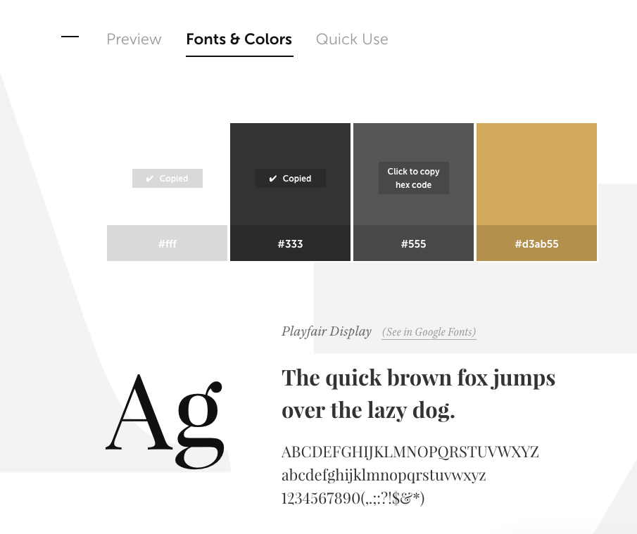
- Fonts & Colors. A quick look at the beautiful style guide where you can access the fonts and copy color hex codes:

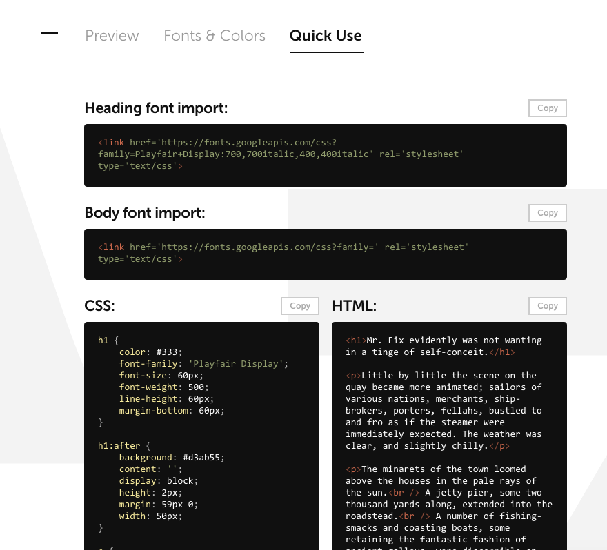
- Quick use. All parts of the design are available as a code ready to copy and paste in your own project:

Also, typography designs need some content. I didn’t want to use a classic “Lorem Ipsum,” because it’s so boring and overused.
Fortunately, my friend, Robert Bruce, let me use his smart and intriguing short stories for some of the designs. So, even if you don’t like the design I made, you can always enjoy the story Robert wrote (watch out, these stories are really addictive… ;-))
For some other examples I used Fillerati to generate random fragments from popular public domain books.
The new website is hosted on a secure and fast hosting, websynthesis.com, so there should be no problems with hackers as long as I keep it updated.
What’s next?
Now I’m going to focus on designing new examples and posting them regularly. My plan is to post at least 2-3 designs a week. I really want to just enjoy that creative part of choosing typefaces and setting typography designs.
In the future, I’ll want to invite some other designers, but it’s going to be by invitation only. I’ll want to also add a blog and write articles, ebooks or online courses focused on teaching web typography. Yes, it has a lot of potential and it can provide so much value.
I’m hoping to build an impressive showcase of designs and grow a big community around the site. You can follow Typespiration on Twitter today and join our Facebook page and discussion group, so you can learn more about typography, ask your questions and even share your own designs. Also, make sure to sign up for the newsletter on Typespiration.com, so you won’t miss anything!
Hello Rafal—I checked out the new site and it looks awesome. And it’s very useful. As a typography lover I really love initiatives like this. I can’t wait to check out more designs. Really helpful. Thanks so much!
Rafal – this is brilliant! Typespiration is so brilliantly designed. I love it and have signed up. Can’t wait to see more.
Hi, Rafal!
Great news! Typespiration is an awesome source for web designers. Will use it in future for sure.
Have a great day!
Thanks for sharing this great news with us! 🙂
Just catching up on my RSS backlog… The relaunched site for Typespiration looks great, Rafal! How are you choosing the color combinations? Is there any science behind it or is it just what you happen to like in the minute?
This is a really cool tool to use. The site looks great promising. The designs are really innovative. All set to use it in my new blog. 🙂 Thanks.
Good. I think its code would be now more stable than previous. I will test from my side to check if all things are working fine without any problem.
This is really cool tool to use.I liked it.
Typespiration, hmm, really very useful tool for us, high recommend this great site!
This is great, you are good, i like your post and i still waiting our next post
Great post! I like all the details and the ideas!
This is a really cool tool to use. The site looks great promising. The designs are really innovative
Cool. Love to use this tool. Thanks for sharing this.