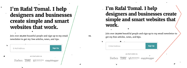
Don’t just let the text flow and fill the entire horizontal space you have. Pay attention to how the text wraps – especially in your headings, calls to action, and other important parts of your design.
Create a smooth shape and direct your user’s eyes toward the call to action:

… or just make it easier to read:

You can fix it by breaking the lines manually using <br /> tag or setting a max-width for the wrapper. For big headlines, you can manipulate the font size or change the letter-spacing to achieve the desired effect.