In tip #21 I mentioned that photos of excited and happy people work better than directional cues, but it doesn’t mean directional cues are bad!
Directional cues like arrows, pointers, lines, eye-directions, gestures, etc., are great to support your design and get even more attention where you need it.
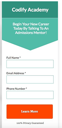
Some directional cues can be very subtle like a triangle cutout in the form box pointing at the first field indicating where to start, or an illustration where the composition looks like an arrow, thus forcing your eyes to look in a certain direction.
Example:

Be creative and test different ideas.