• Skip to main content

Rafal Tomal

Learn Design and Create Better Websites

  • About
  • Courses
  • Tools
  • Tips
  • Blog
  • Contact
  • Work With Me →

← More Design Tips

Plan your vertical space

posted on September 14, 2018

TweetFacebookLinkedInPin

When you’re designing the vertical space between sections of your website, consider the screen size you’re designing for. Ideally, the vertical space should be flexible and responsive to the window height (try % spacing or viewport-percentage lengths).

If you want users to focus on something and take action, you may want to leave more space around it so there are no distractions visible in the area of their peripheral vision.

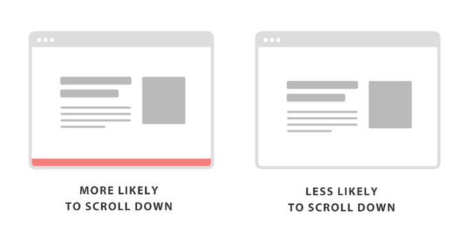
If you want users to scroll and explore the page, you can reduce the space between the sections or show a part of the next section at the bottom of the screen.

For example, when you design the home page, you can leave a part of the next section right above the fold to avoid the “illusion of completeness” – your visitors can’t help but scroll down to see what’s next.

tags: layout ux

Previous tip: Show respect to your own work
Next tip: Start designing in grayscale

Don't Miss Future Design Tips

Join 20k+ people who love good design. Get my best tips, resources, and strategies to elevate your design skills and grow your business.

© Copyright 2008 - 2025 Rafal Tomal.

Affiliate Program . Privacy Policy . Cookie Policy . License .

Follow me on Twitter, Dribbble, and Instagram.

DISCLOSURE: I may be an affiliate for products that I recommend. If you purchase those items through my links I will earn a commission. You will not pay more when buying a product through my link. It helps me to continue to offer you lots of free stuff. Thank you, in advance for your support!