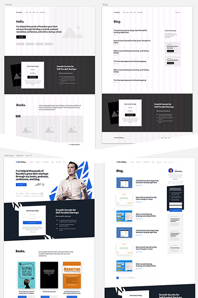
Never start your design with details.
When drawing, you start with simple figures and shapes to get the composition and proportions right first. Then you go into more detail and turn those simple shape lines into actual contours, then fill it out with shades, and finally polish your drawing and erase unnecessary lines.
For example, my process of designing RobWalling.com:

When designing a website, have first a plan and wireframe the general layout of your homepage and sub pages.
Don’t start with designing your homepage and making it pixel perfect before moving on to other pages. It may be that the layout doesn’t work for single pages or blog posts and you need to go back and redesign it.