This tip comes from one of my web typography lessons in the upcoming Design Class.
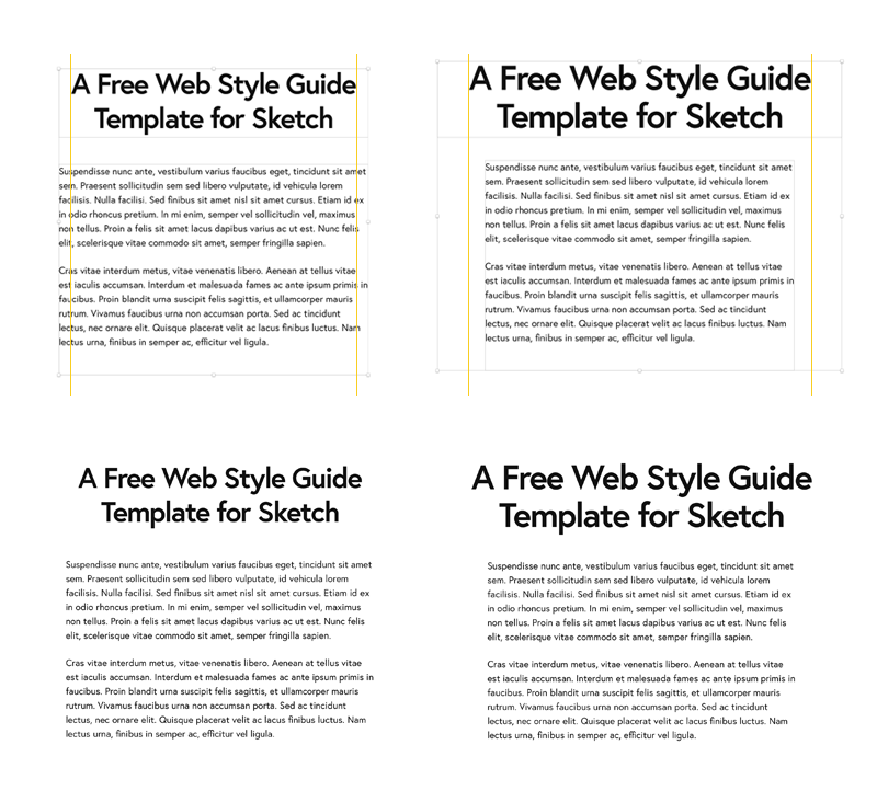
In the center-aligned text, space is distributed equally on the sides. If the following block of text is left-aligned, depending on how the headline wraps, the paragraphs can look like are wider than the headline.
If you want to have a center-aligned headline and left-aligned body text, adjust your design to make the headline area a bit wider than the content area.
