Using SVGs in web design opens up a whole new world of possibilities. It’s a great way to make your design unique and enhance the user experience.
One of the biggest advantages of SVGs that I’ve found is its flexibility and an ability to modify particular internal elements with CSS. That way you can create multi-color icons and illustrations and even animate them using CSS or JavaScript.
SVG files are vector, so they scale without losing any quality and are super lightweight if done correctly and optimized.
I don’t have too much experience using SVGs in real projects yet, but I started using them on my own site, and we used them for our illustrations in the recent StudioPress.com redesign.
So, today I wanted to share with you what I’ve learned so far about creating and using your own SVGs.
For the purpose of this article, I created a simple checkmark icon and animated it with CSS:
Let’s get started!
Creating SVGs
The easiest way to make your SVG is by writing the code; for example:
<svg width="100" height="100">
  <circle cx="50" cy="50" r="40" fill="black" />
</svg>
Of course, that’s a really hard way if you want to make more complicated shapes, so I would recommend using apps to draw your vector images and then export them to SVG files.
I use both Adobe Illustrator and Sketch for creating my SVG files, but there is a ton of other apps available (InkScape is free) and you can even find some online tools (vectr.com or editor.method.ac).
Adobe Illustrator is my favorite app for any vector work and most of the client logos or illustrations come as AI files, so I can easily open them and export to SVG if I need to.
Let me show you how to create your own vector image in Illustrator.
First, create a new regular web document:
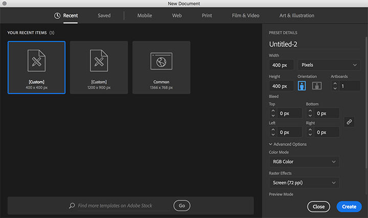
The canvas size is 400x400px. The size doesn’t really matter because it’s vector, but I would keep it around the dimensions that you expect it to be in the browser. It’ll be easier to maintain your stroke sizes and scale it down or up from the base size.
Then, you can create your icon using any shapes you want. I created my checkmark icon for the purpose of this tutorial:
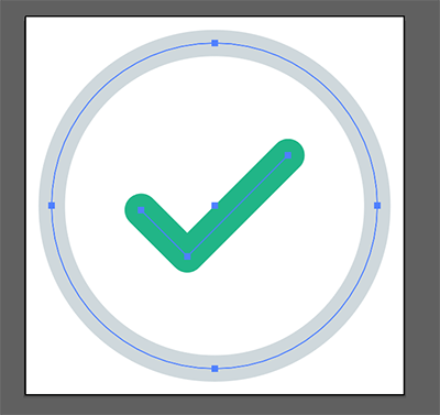
A good rule of thumb: the fewer points, the better!
Your SVG code will be cleaner and much lighter. I made many mistakes by making my shapes too complicated, especially when I used hand-drawn illustrations. Be smarter than me! 😉
It’s OK to use strokes, different colors, and even gradients. It’ll all be exported into SVG code.
If you’re planning to animate individual elements of your icon, you can name layers and groups:
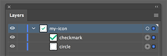
When you export it, those names will be turned into IDs. It can be really helpful for more advanced illustrations.
However, I would recommend changing IDs to classes for internal elements. You can still use ID for your main <svg> element, but it’ll be easier to manage if all of your paths and shapes have classes.
I’ll explain exporting options and dealing with the SVG code more in the next steps.
Exporting and optimizing your SVGs
Once you have your icon ready, let’s export it to SVG.
Go to File -> Export -> Export As…

If you want your SVG canvas to be exactly the size of your artboard or if you’re exporting multiple icons from one document, check the “Use Artboards” box. Otherwise, Illustrator will crop the canvas to the size of your content and will ignore the artboard size.
I would recommend always using your artboard size. It’ll be easier to maintain if your image has a specific size. Especially if you need to change or update your icon. You can simply export it again within the same artboard size.
Next, you’ll see a little box with some SVG code specific options:
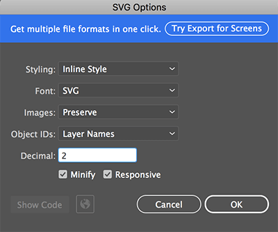
In the first dropdown you can choose the way how CSS should be generated. If you have only a few elements, then “Inline Style” will probably be your best option. For more complicated illustrations, you can go with “Internal CSS.”
If you don’t want to use your layer and group names as IDs, change the “Object IDs” dropdown to “Minimal.”
You definitely want to “Minify” your SVG code for production. The only reason you may want to uncheck it is when you’re working on your animations and want to have a cleaner code to work with. Once you’re done, export the SVG again and minify it.
After choosing my options, this is what my icon’s exported code looks like:
<svg id="my-icon" xmlns="http://www.w3.org/2000/svg" viewBox="0 0 290 290">
  <title>svg-icon</title>
  <circle id="circle" cx="145" cy="145" r="124.67" style="fill: none;stroke: #cfd8dc;stroke-miterlimit: 10;stroke-width: 20px"/>
  <polyline id="checkmark" points="88.75 148.26 124.09 183.6 201.37 106.32" style="fill: none;stroke: #21b587;stroke-linecap: round;stroke-linejoin: round;stroke-width: 25px"/>
</svg>
Like I mentioned before, I’m going to change the internal element IDs to classes, and add some attributes for better accessibility (learn more here). So, my final SVG code is:
<svg id="my-icon" aria-labelledby="svg-my-icon-title" focusable="false" xmlns="http://www.w3.org/2000/svg" viewBox="0 0 290 290">
<title id="svg-my-icon-title">Checkmark Icon</title>
<circle class="circle" cx="145" cy="145" r="124.67" style="fill:none;stroke:#cfd8dc;stroke-miterlimit:10;stroke-width:20px"/>
<polyline class="checkmark" points="88.75 148.26 124.09 183.6 201.37 106.32" style="fill:none;stroke:#21b587;stroke-linecap:round;stroke-linejoin:round;stroke-width:25px"/>
</svg>
SVGs don’t take much space and when used inline as a code, it doesn’t require an HTTP request, which can improve your page load speed. If you want to optimize your SVG files even more, you can try this great tool: SVGOMG.
You can upload your SVG file there and have a bunch of extra options to optimize it even more:
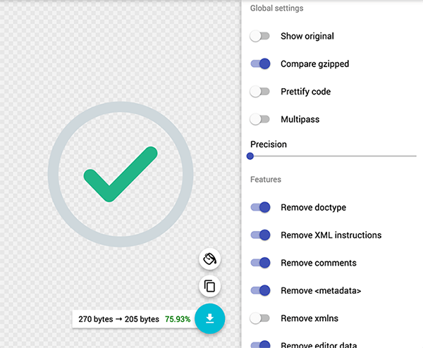
Just be careful because it can break your design if you go too far.
Also, if you already have some styling or animations, make sure you don’t lose any of your classes and elements after optimization.
Animations and CSS manipulations
After adding your SVG code to your page, you can style it like any other HTML element, for example:
<style>
#my-icon .circle {
  stroke: #21b587;
}
</style>
You can find many JS libraries (SVGJS, Snap SVG) that can help you with making some advanced animations. However, I found that for most of the cases you can achieve some interesting effects by using only opacity, scale, translate, and colors.
So, let’s see how I did it for the previously created icon.
First, I created a simple animation for the circle:
#my-icon .circle {
	animation: circle-animation 0.5s ease-out forwards;
	opacity: 0;
	transform: scale(0.9);
	transform-origin: center;
}

@keyframes circle-animation {
	100% {
		opacity: 1;
		transform: scale(1);
	}
}
It’s a simple scale animation combined with opacity. If you have more icons that have a similar circle, you can reuse the same code, which will save you a lot of time and effort. That’s why using classes for individual elements is better than unique IDs.
Now, let’s see the checkmark icon animation:
#my-icon .checkmark {
	animation: checkmark-animation 1s ease-out forwards;
	stroke-dasharray: 400;
	stroke-dashoffset: 400;
	stroke: #cfd8dc;
	transform-origin: center;
}

@keyframes checkmark-animation {
	40% {
		transform: scale(1);
	}
	55% {
		stroke: #cfd8dc;
		transform: scale(1.2);
	}
	70% {
		transform: scale(1);
	}
	100% {
		stroke-dashoffset: 0;
		transform: scale(1);
		stroke: #21b587;
	}
}
Ok, this one is a bit more complicated. I used stroke-dasharray and stroke-offset to create an effect of icon drawing. Chris Coyier wrote a great tutorial on exactly how it works.
I also used some scaling and changed the color of the stroke. As you can see, the code is very simple but the effect can be interesting.
Here’s the final icon and code when combined together:
<style>

	.icon-box {
		border: 1px solid #eee;
		padding: 100px;
		position: relative;
		width:200px;
	}

	.icon-box:before {
		content: 'Hover to see animation.';
		bottom: 5px;
		display: block;
		left: 0;
		position: absolute;
		text-align: center;
		width: 100%;
	}

	.icon-box:hover .circle {
		animation: circle-animation 0.5s ease-out forwards;
	}

	.icon-box:hover .checkmark {
		animation: checkmark-animation 1s ease-out forwards;
		animation-delay: 0.25s;
	}

	#my-icon .circle {
		opacity: 0;
		transform: scale(0.9);
		transform-origin: center;
	}

	#my-icon .checkmark {
		stroke-dasharray: 400;
		stroke-dashoffset: 400;
		transform-origin: center;
		stroke: #cfd8dc;
	}

	@keyframes circle-animation {
		100% {
			opacity: 1;
			transform: scale(1);
		}
	}

	@keyframes checkmark-animation {
		40% {
			transform: scale(1);
		}
		55% {
			stroke: #cfd8dc;
			transform: scale(1.2);
		}
		70% {
			transform: scale(1);
		}
		100% {
			stroke-dashoffset: 0;
			transform: scale(1);
			stroke: #21b587;
		}
	}

</style>

<div class="icon-box">
	<svg id="my-icon" aria-labelledby="svg-my-icon-title" focusable="false" xmlns="http://www.w3.org/2000/svg" viewBox="0 0 290 290"><title id="svg-my-icon-title">My Icon</title><circle class="circle" cx="145" cy="145" r="124.67" style="fill:none;stroke:#cfd8dc;stroke-miterlimit:10;stroke-width:20px"/><polyline class="checkmark" points="88.75 148.26 124.09 183.6 201.37 106.32" style="fill:none;stroke:#21b587;stroke-linecap:round;stroke-linejoin:round;stroke-width:25px"/></svg>
</div>
Summary
This is a very simple example, but it shows you the potential of using SVGs in your designs. There are also many different ways how you can use your SVGs and animate them. I showed you only probably the easiest way to do it.
If you want to learn more, here are some great resources:
https://www.w3schools.com/graphics/svg_intro.asp
https://svgontheweb.com/
https://css-tricks.com/using-svg/
https://css-tricks.com/accessible-svgs/
https://css-tricks.com/svg-line-animation-works/
Thank you for this, Rafal. I’ve been seeing a lot more use of svgs in place of font-awesome icons, for example, and had no idea how to go about creating them. I will definitely check out the Coyier tut, I’d never heard of dasharray.
Wow thanks, helped demystify the whole process from Illustrator-to-page for me, thanks!
Wonderful! I’m so glad I found your site.
Nice work Rafal, I thought it was a very tough work. After reading your article I think I can create animation and implement on my site.
This was amazing Rafal (Y). Adobe Illustrator is one of my absolute favorite applications. Thank You, Rafal for amazing guide.
Thanks for this! Fiddly but important.
I find Sketch3 to be pretty handy for SVGs, and exports are quite clean.
really good work rafal love your blogs keep up the good work.
Brilliant post !!
Very informative and helpful guide.
Thanks for posting !!
Keep Blogging !!
Amazing Guide. It explains the whole topic in details and its so easy to understand and learn.
Thanks for this informative and helpful post. I am grateful to gain this great knowledge from you.
Looking forward to learn more from your website.
Keep Blogging !! Have a Good Day !!
Hey, Rafal!
Thank you for this guide. We already have been working with Adobe Illustrator on creating SVG illustrations. But, anyway, I’ve found a few new useful tips for me. I’d like to learn how to create Animated SVGs so we can enrich our library. Maybe this will be your next guide:).