Figma has quickly become one of the most popular design tools these days. Its user-friendly interface and powerful features have made it a go-to choice for many designers.
What’s great about Figma is that it’s not just limited to professional designers. Even if you don’t have a design background, you can still use Figma to create stunning visual content.
In fact, Figma can be used for a wide range of design projects, beyond just UI/UX. You can leverage its versatility to design presentations, create simple logos for your side projects, or design quick social media graphics and banner ads. The possibilities are endless!
So, I wanted to create a super simple guide for non-designers like content creators, copywriters, marketers, and others who want to be able to create quick graphics on their own without learning all the advanced Figma features.
At the end of this guide, you’ll know how to create your own file in Figma, set up the frame (the artboard for your image) at the size you need, add some text and images, and export it to PNG or JPG.
Let’s get started!
1. File structure.
Let’s assume that you’ve already created your first Figma account as this is a pretty simple step. You have logged in to your Figma account in your browser or installed the desktop app.
Here’s the easiest explanation of the Figma file structure:
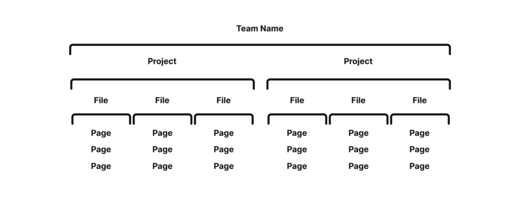
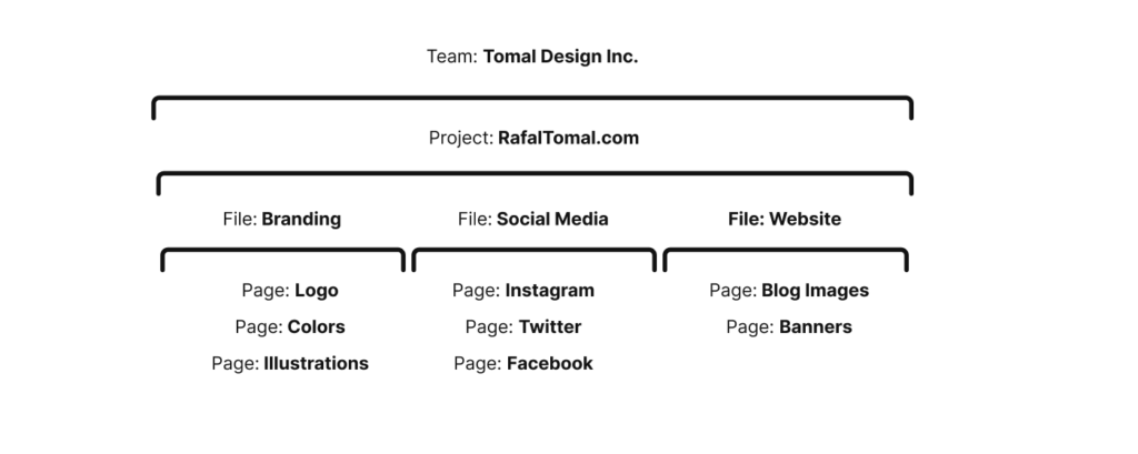
If you have a free Figma account, you’re allowed to have one team project with up to 3 files inside. It may not seem like a lot, but you can have as many pages as you want in each file.
If you want to use Figma just to control your brand and graphics for your website, your file structure could look as this:
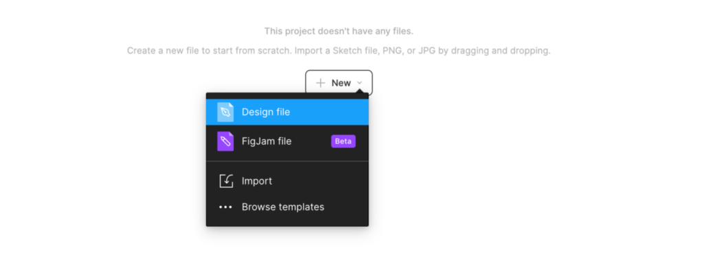
To get started, you need to create your first Figma design file. Simply click the “New” button and choose “Design File.”
2. Interface.
Now that you have created and opened your first file, let me quickly explain the editor’s interface:
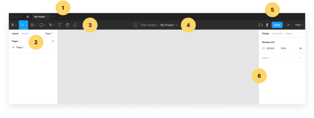
- Tabs – you can open multiple files in separate tabs. It works just like your browser. You can click on the “home” icon to go back to your projects.
- Layers and Pages – here you can see a list of all pages inside your project file. If you don’t see your pages, click on “Page 1” in the top right corner of this panel to unfold the list of pages. Once you start creating elements, you’ll see it as a list of all “layers” below the pages.
- Tools – these are the basic Figma tools. It’s best to learn keyboard shortcuts, so you never even need to use it, but we’ll get there later.
- File name – double click on the name to change it. You can also click on the small arrow next to the name to see some extra options like duplicate, export, version history, etc.
- Sharing – here you can see who’s looking at this file at this moment. If you see only your avatar, it means you’re the only person working on the file. You can click “Share” and share a URL to this file and let other people see it, but that’s a more advanced feature we’ll not be covering in this guide.
- Properties – here you’ll see all properties for the selected design elements. I’ll explain this in the next steps. You don’t need to worry about “Prototype” and “Inspector” options in this panel – it’s only for designers and developers.
3. Frames.
Consider frames to be your individual design files. To best understand it, imagine that every PNG or JPG you use on your website or upload to social media sites is a separate frame in Figma.
You can have as many frames in each page as you want. Let’s create your first frame for an Instagram story. You can choose the Frame tool from the toolbar or press “F.” Then choose the “Social Media” tab in the right-hand panel and click “Instagram Story,”.
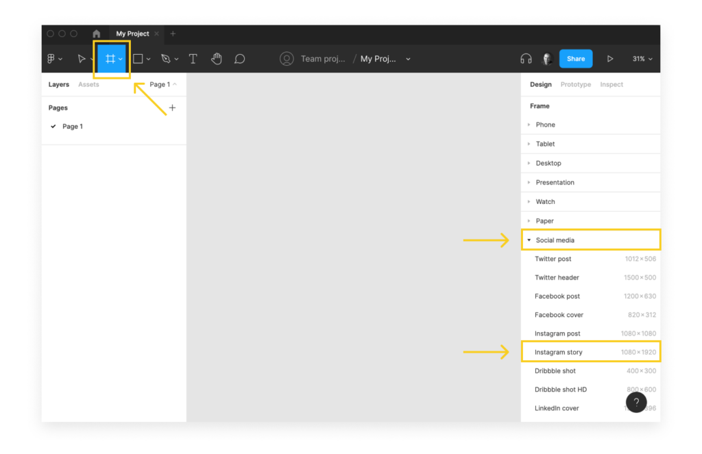
Now you’ll see a new Frame set at the 1080×1920 pixels size. It should look like this:
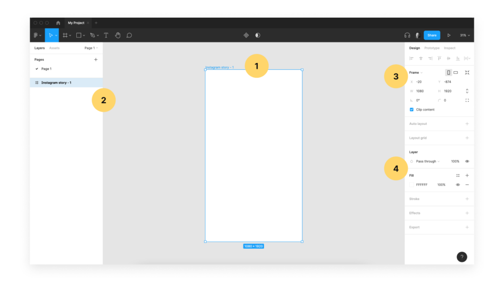
- Frame – click on the frame name “Instagram story -1” to select it. You can click, hold it, and move the frame around the page. You can also press “CMD + D” (or “CTRL + D” on Windows) to duplicate the frame.
- Layers – here you can see your new frame created. You can double click on its name to change it. Rename your frame to what you want the exported file to be named. When you export the frame, it’ll be named as “Instagram story – 1.png.”
- Frame properties – All you really need to know here is the size W and H. If you want to resize the frame a custom size, change these values to whatever you need.
- Fill – This is your frame background. You can click “change the hex code” here or click on the little white square to pick any color you want.
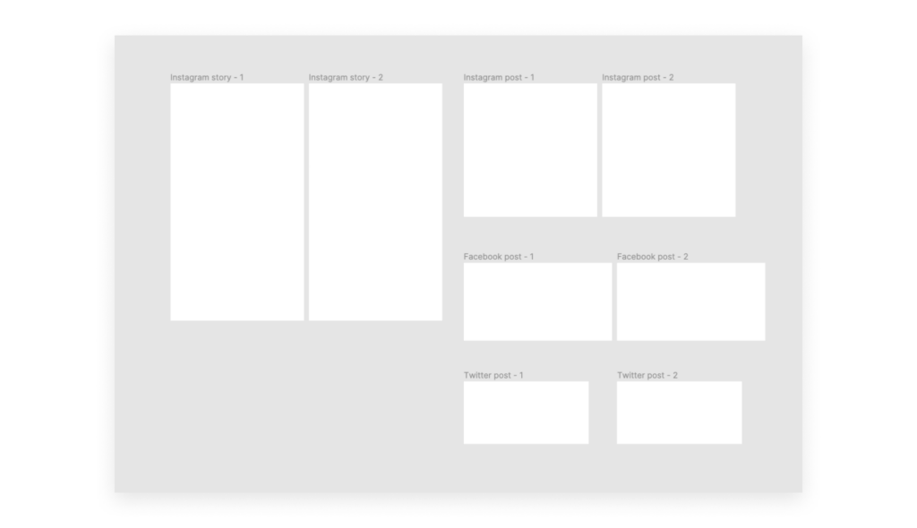
Go ahead and experiment with creating different sizes of frames and position them around the page; for example:
4. Text Layers.
Now, let’s add some first text layers to one of your frames. Click on the “Type” tool in the toolbar or press “T” on your keyboard. Then click anywhere inside the frame. Now you can start typing your text. Press “Enter” when you’re done and then you can modify text properties using the right-hand sidebar panel. See below:
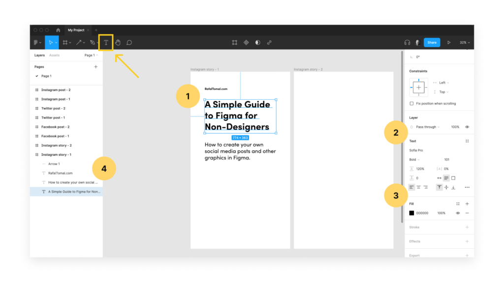
- Text layer – this is your text layer placed inside the frame. You can resize it to the desired size. Keep in mind that you don’t need to adjust the height of the text box and resize only the width, because the text wraps and the text box expands automatically. Click in the middle of the selected text and drag it to move the layer around the frame. You can also move the text outside the frame, but then it won’t be included when you export the frame.
- Text Properties – here you can edit your text properties. Change your font family, font size, line height and alignment. Play around with these settings to see how it affects your text inside the frame.
- Fill – this is your text color. Type in your hex code or click on the little black square to use the color picker. If you want to quickly pick a color from other elements in your design, you can press Control+C (or Alt + C on Windows) to turn on the color picker.
- Layers – notice that all the new layers you create are now visible here inside the “Instagram story – 1” frame.
Play around with creating multiple text layers, move them around the frame, or set a different size, color, or weight. Try to create your first text-only design!
5. Images & shapes.
Our last step is to add some images and shapes into our frame. As everything in Figma, it’s all incredibly simple and intuitive. Let’s start with a simple rectangular shape first.
You can click the Rectangular icon in the toolbar or press “R”. Now that you have the tool selected, click and drag the shape inside your frame.
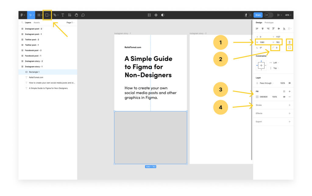
- Shape size – width and height of your shape in pixels. You can manually change the size and keep the proportions when the chain icon is turned on.
- Border radius – type in your number to change the border radius. Click the icon next to it to choose different radius for each corner.
- Fill – click the little gray square to choose a different color from the color picker or type in its hex code. You can add more color layers on top of it using “+” icon and change the transparency of the color by editing “100%” (a quick way to create a color overlay on top of the image).
- Stroke – click “+” icon to add a new stroke around your shape. From there you can control the color, width, and style.
You can use the shape as is or fill it with the image. To add an image, simply, drag and drop the image from your Finder window into the shape or copy image from the browser, select the shape, and paste it. Once you have your image in Figma, there are a couple of things you can do to adjust it to fit your design:
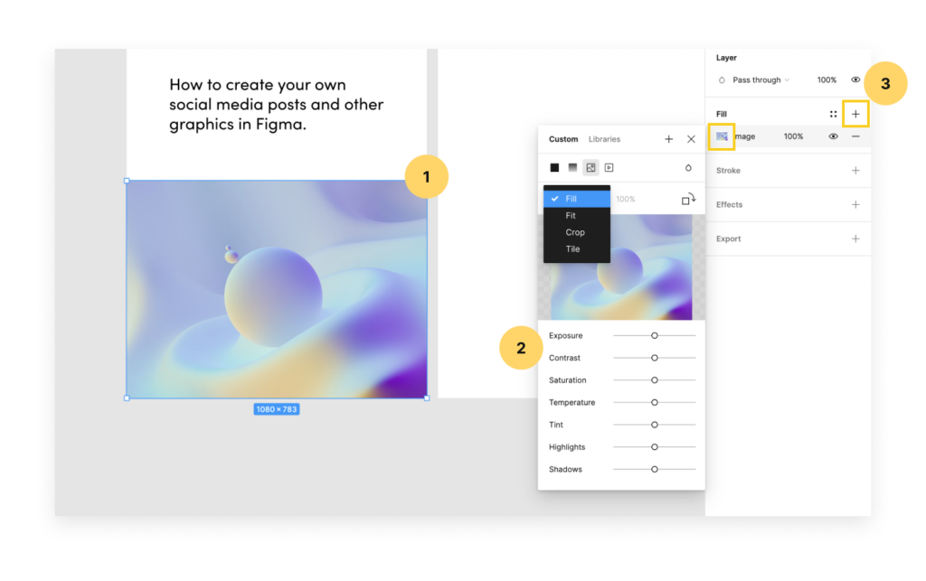
- Crop the image – the fastest way to crop the image is simply by holding Command (or CTRL on Windows) and draging one of the corners of the image. You can also adjust the image inside the frame by clicking the small thumbnail under the Fill settings in the sidebar. From here you can now move the image inside around the frame, resize it, etc.
- Adjust colors – from the same panel you can quickly adjust colors in your photo.
- Add overlay – click the plus sign to add a solid color overlay on top of the image.
6. Export & sharing.
All right! Now that you know how to create frames and place text layers inside, let’s try to export them as actual graphic files that can be used on your website or uploaded to social media.
You’re going to be amazed at how simple it is with Figma.
First, select the frame that you want to export and then click the “+” icon next to Export in the right-hand sidebar panel. Then you can simply click the “Export Instagram story – 1” button to save the file on your hard drive.
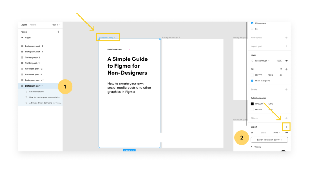
- Selected frame – You can select the frame by clicking on its name on the page or here in the layers panel. Make sure all of the layers that should be a part of this frame are actually inside the frame.
- Export properties – Here you can customize the export properties. By default, the file will be exported as PNG. You can click on “PNG” to change it to a different format like JPG, SVG, PDF, etc. You can click the “+” icon again to add @2x size for your website. When you click “Export,” it’ll save two files on your hard drive.
Also, remember that Figma is a very collaborative tool, so you can actually share your designs with other before you export any files. There are a couple of ways how you can share it:
- Right-click on any frame or page to copy the link.
- Use the share button to invite others or copy the link to the entire page.
That’s all I have for you in the first part of this super simple guide to Figma for non-designers. You should be able now to create your own frames, use text layers, add images, and export it to actual files that can be used on the web.
Experiment more on your own. Try to move and copy text layers from one frame to another. You can even place frames inside other frames or export individual layers as its own images.
Keep in mind that this was just a simple guide aimed for non-designers who needed to quickly find their way around Figma. We barely scratched the surface here. There is so much more you can do in Figma.
If you’re ready to dive into more advanced topics, take a look at my Design Tools for Figma.
Leave a Reply