Low-fidelity wireframes, high-fidelity wireframes, sitemaps, or user flows? Ask any designer and you’ll get a different answer every time.
After years of experimenting and working on various client projects, I found the easiest and most effective way to plan a simple website project.
Before we get to the point of this article, let’s look at some of the common website planning solutions we use these days.
What we usually use
1. Sitemaps.

Sitemaps are great to show the entire site’s information architecture, but they don’t show the flow and how these pages are connected to each other. It’s like a map of checkpoints but without the roads that you need to take to get there.
2. User flows and flow charts.
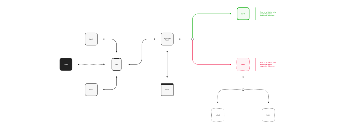
User flows focus more on the user’s experience and helps to plan all of the steps the user has to take. They’re used more in planning applications or more complex site functionalities.
3. Low-fidelity wireframes.

I’ve been using low-fidelity wireframes as one of my main methods of planning website projects for a long time. They help me quickly draw the page layout and work with the client or copywriter on the content. It’s not thattime consuming, so I can easily create low-fi wireframes of the most important pages. The problem is that doesn’t show the connection between the pages or the user flow.
4. High-fidelity wireframes.
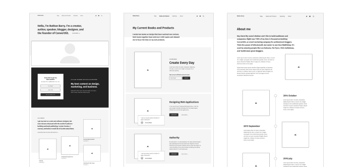
Sometimes I’ve used high-fidelity wireframes only for the home page or important sales pages to make sure we have the copy and all of the elements in place. However, it’s time consuming and I often end up just recreating the wireframe in my visual design mockup. I can’t show the user flow and creating high-fi wireframes for all of the pages can take too much time.
The problem
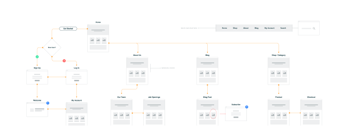
Sitemaps show only the information architecture of the site. Some of those popular user flow kits for websites look beautiful, but instead of focusing on the content they suggest page layouts in a form of tiny low-fi wireframes which can be confusing for the client.
Full page wireframes, on the other hand, focus only on single pages and often dive too much into the content and layout details.
The solution
So, how about we combine all of these methods into one that really solves the problem?
Note: all of the examples you’ll see below were created using my new sitemapping and user flow kit for Figma called QuickFrames. You can get it for just $29 (along with sample projects and video tutorials) and use for your own client projects.

Here’s an example:
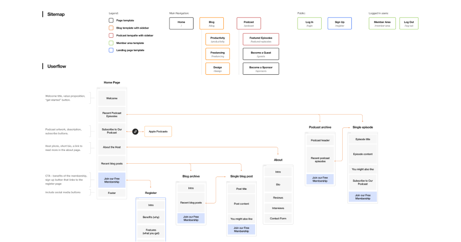
This method may not work for every website, but it passed the test in most cases I was working on (even for more complicated ones like the redesign of SmartPassiveIncome.com website that we’re working on).
The benefits of this system:
- It helps to have a bigger view of the entire website structure.
- It shows the user flow from the home page down the funnel.
- It gives you a simple content outline for each page.
- It doesn’t dictate any particular visual design solutions that have not been tested yet and that you would have to explain to the client.
- It supports the mobile-first methodology and presents the content in one column flow.
- It focuses on only the main user flow without going too much into details and visualizing the obvious connections.
- It shows the relationship between the website flow and the sitemap.
- It’s easy to understand for clients. No “lorem ipsum” and placeholder gray blocks. It lets you to work with the client or copywriter to determine the final content and make sure you don’t miss anything.
How to use it
Ok, let’s say you want to design your own personal website. You don’t currently have one. You’re starting completely from scratch.
Here’s the process I would take:
Step 1:
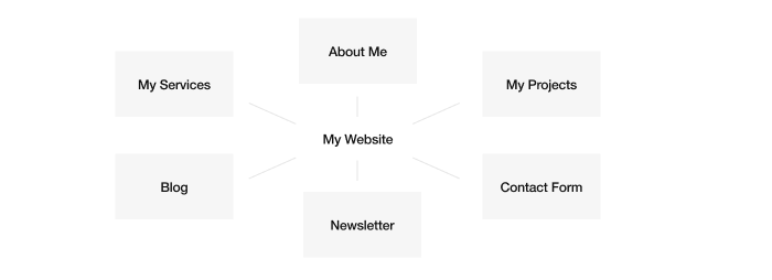
List all of the main content elements you want to have on your website; for example, about you, your services, your past projects, your blog, email newsletter sign up, and contact form.
Step 2:

Order these elements according to your priorities and the flow you want your visitors to take. Selling your service could be your #1 priority, but you can’t make it your first section on the home page, because clients want to get to know you first and view examples of your work. So, think about the ideal flow you want people to take before you call them to action.
Use a story format like this one:
- Welcome to my site! This is where you are and what you can find here.
- Let me introduce myself: this is who I am and what I do.
- See my previous projects and clients I’ve worked with.
- Let’s get in touch and work together.
- Not interested in working with me yet? Check out my blog where you can learn more about what I do and follow me on social media or sign up for my newsletter.
Step 3:
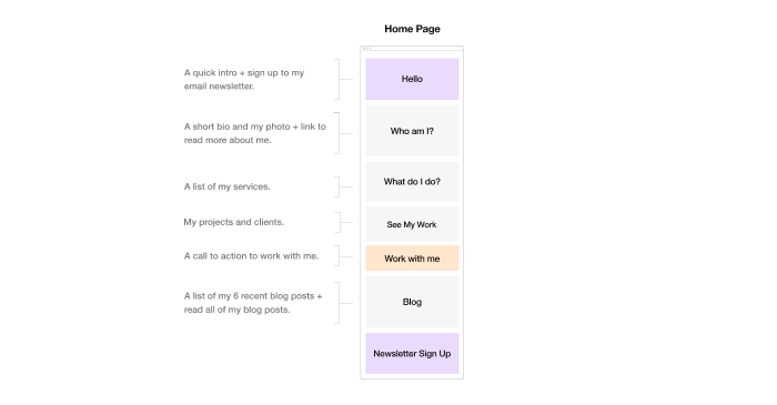
Create your homepage structure by putting together all of these elements. Think about the next action that you want visitors to take from each section of the page. Sometimes the next action is just scrolling down and sometimes there are multiple actions.
Step 4:
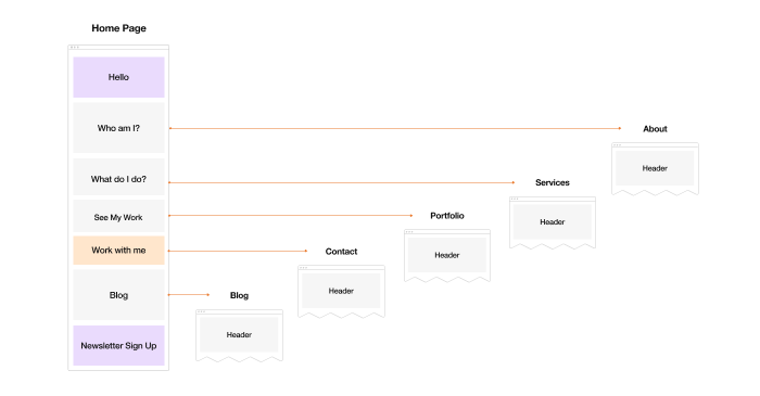
Connect each section with the next steps and add your annotations if needed. Start every page with the header and footer, and then plan the main content.
Step 5:
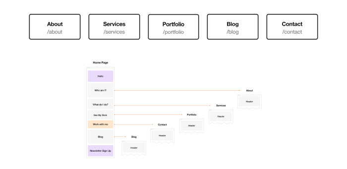
Create the main navigation sitemap according to your home page sections. Make sure it has the same or similar flow and order. If there are other pages that you need to have, but they don’t match your home page content structure and flow, then they probably shouldn’t end up in your main navigation (but you can still link them in your footer).
This is, of course, a very simple example but you can probably apply this framework to 90% of websites. Think of the home page as a guide page with shortcuts to the rest of the site that is organized based on your priorities.
Ecommerce websites need to follow different rules, but you could still build the home page based on the priorities and link from there to the most important categories or products you want to sell. Then you can list these products or categories in your main navigation and hide those less popular ones under the “more” link.
Some website content can be overwhelming to new visitors. It always seems like there is so much on the site and you don’t even know where to start or if you missed something.
Think about creating a simple story and walk your visitors through it. Make sure you keep the same order of priorities in your navigation as you have on your home page, so it’s easy to follow.
Get started with my Figma kit

I created my own Sitemapping and User Flow kit for Figma to fully support this method of planning and designing websites. Go ahead and check out QuickFrames and get more examples of different website plans and a detailed video tutorial on how to use the kit.
Leave a Reply