One of the first visual design lessons you probably heard was to make everything perfectly aligned, coherent, and equal.
It sounds logical. A well-aligned and balanced design should look right to our eyes. It would be perceived as more organized and professional.
Any design software and CSS code could even come in handy here and align everything for you.
However, the way humans see and process images isn’t always going in pair with what the numbers say. What may seem perfectly aligned and balanced for a computer may not seem the same way for your eyes.
We, as designers, should take that into consideration when designing the user interfaces. We can’t solely trust the computer to take care of it for us.
This might be one of the reasons why AI can’t replace a human in design work. Although, it’s probably just a matter of time…
So, as much as we have to follow all of the design rules, we also have to trust our eyes and our own instincts when it comes to making final visual design decisions.
Let me show you some examples of how to make your design better by correcting it visually and really upset developers in the process…
Aligning in typography
Making typography optically perfect on the web is a little difficult, to be honest.
Unfortunately, kerning and text alignment is based on metrics, and fixing it with CSS requires a lot of effort or external JS plugins.
The entire vertical layout is very dynamic and elements tend to have inconsistent spacing, so keeping a perfect baseline is almost impossible as well.
I can’t tell you one simple magic CSS trick that will solve all of the problems. So, I’m not going to give you any code solutions, but instead I want to focus on the concept of making design optically perfect. I’m sure you’ll find a way to tweak your CSS here and there to make that happen.
One of the most common problems I find in my work is “overshooting” left-aligned text. It’s not really an issue with smaller text, but it’s more obvious with large, bold headlines.
Let’s take a look at this large headline aligned to the left:
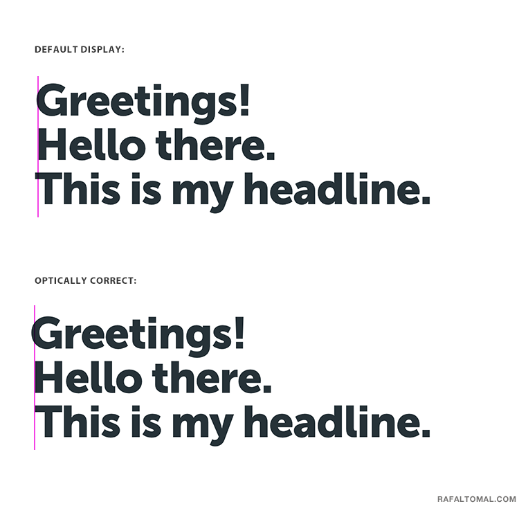
You can see that in the default browser’s display the ‘T’ letter was moved off the edge by a few pixels to visually correct it, but in relation to the other letters in this block of text, it didn’t really make sense.
How did I fix it?
First, I aligned all of the letters to the left edge. Then, notice that ‘G’ isn’t aligned with ‘H’ and ‘T’, but it’s actually going a few pixels off the margin. It’s all because of the round shape of this letter. I would do the same thing with C, O, Q, and S.
I may also do the same in the case of letters that have sharp edges or lines pointing to the left side like T, V, W, X, Y, and Z.
If the second line happens to start with a lower case, then moving ‘T’ outside the edge would totally make it optically better, like this:

Let’s look at another example to demonstrate the relationship between letters. I moved ‘W’ a few pixels off the edge to create a better balance with the following word.
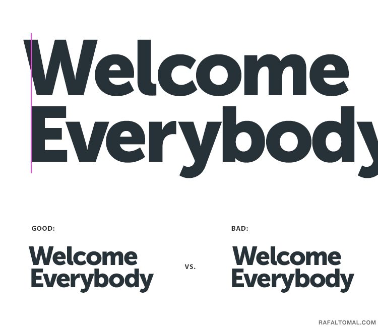
However, it all gets a bit more complicated, because it wouldn’t be the same if we switched these two words and put ‘W’ in the second line right after ‘E’:
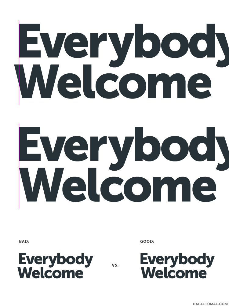
You can’t just assume that all lines starting with ‘W’ should go off the edge. It all depends on the relationship with other letters. That’s where we have to trust our eyes and instincts.
There is really no one rule here that can be applied universally. Everything depends on the text size, font style, font weight, typeface, and used letters.
Whatever feels good to you is the right way.
Now let’s look at center alignment:
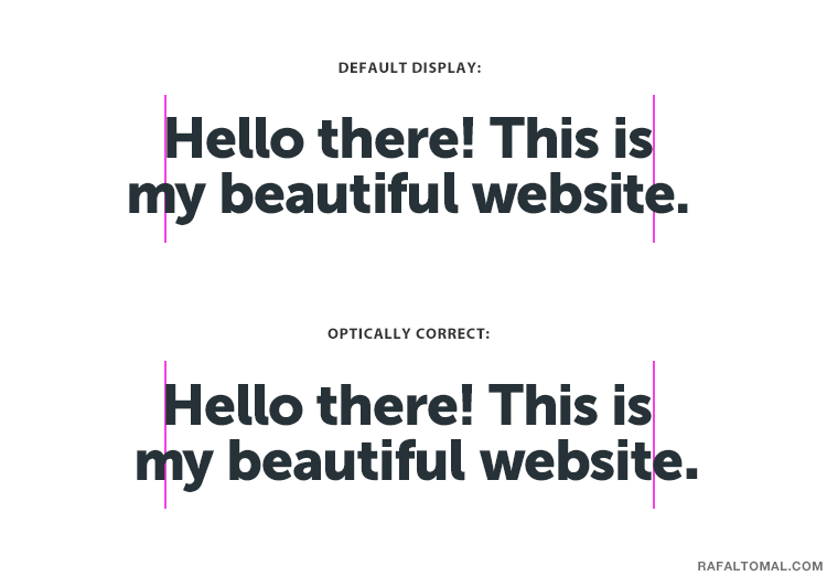
The second sentence here ends with a period. It makes that line longer and the browser aligns text strictly based on the length.
However, the weight balance isn’t exactly in the middle of this sentence. So, you have to move the upper line a couple of pixels to the left to satisfy your eyes.
It’s even more significant when you add quotation marks and serif typeface, for example:
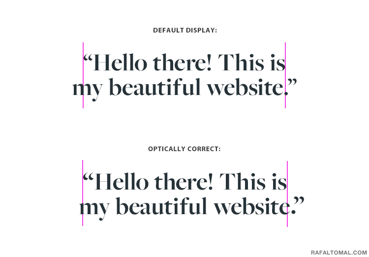
And if you want to align quotes to the left, you should leave the left quotation mark outside the edge to create a better visual appearance and flow:
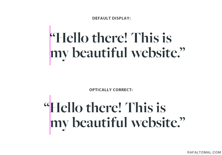
Hanging punctuation is something that has been around since the first printed book by Gutenberg, but then we forgot about it because computers needed a more streamlined way to display text on the screen.
Well, I think it’s time we bring some good typesetting habits back, but again, it often requires some manual CSS work, so I can’t blame anyone for skipping details like that.
It would be a good idea to at least optimize your home page or landing page headline where the copy is fixed, in order to make a good first impression on visitors.
Also, if you’re designing for print, a banner, a book cover, or a poster, then it’s definitely something you have full control of and there are no excuses!
Uneven spacing is perfect
Spacing is much easier to fix with CSS but I still don’t see many designers and developers caring about making it optically correct.
I think it’s very tempting to use equal padding from all sides because it’s easy to do and may even seem like the right thing to do. After all, spacing should be equal, right?
However, our eyes don’t see it like that. Again, let’s take a look at some examples:
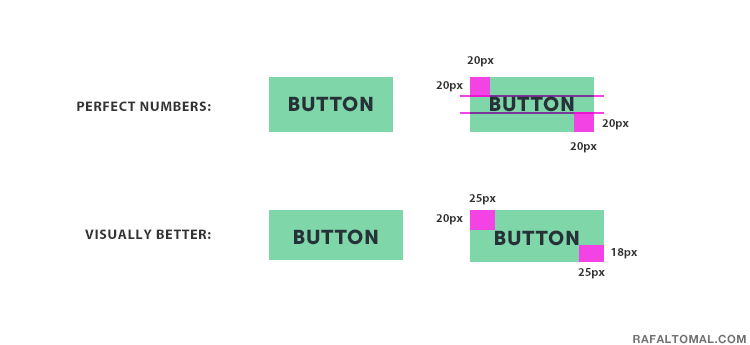
So, here we have two buttons with all-caps labels. The first one has an equal spacing from all edges around the text, but it actually seems a bit off, visually.
At first glance you may experience an illusion that there is more spacing below the text than above it. You won’t see that when you look at the image with guidelines.
To correct it visually I reduced the spacing by 2 pixels from the bottom and stretched the horizontal spacing by an extra 5 pixels on each side. Now the proportions are much better and it’s imperfectly perfect.
And again, it’s not always the rule because it all may differ depending on your typeface, font weight, size, etc.
Take a look at the same button with all of the caps removed:
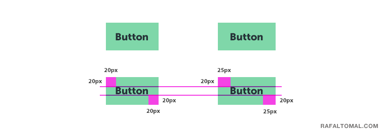
In this case, the vertical balance is better because lowercase letters draw your eyes more to the text baseline. The only tweak I made is adding extra padding from the left and right in order to keep better visual proportions.
You can correct the spacing in a similar way in boxes with a bigger block of text:
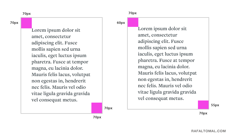
If you decide to stick with all spacing equal around the box, there is nothing wrong with it, but it’ll seem a bit off compared to a box where you reduce some vertical inner spacing.
Also, remember that the bottom spacing should be measured from your text baseline, not the descender. That’s why the bottom padding may be even slightly smaller than the top padding.
Another example could be positioning icons in a box:
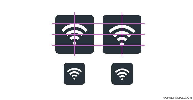
The icon on the left looks just fine if you looked at it with the guidelines on. Once you turn it off, you have an illusion like the icon is actually off-center (see the smaller icon below it).
The icon on the right, however, has been moved by a few pixels down and looks so much better without guidelines.
So, as you can see, you really have to trust your eyes more than you thought.
This article probably messed with your head a little bit and you’ll never look at spacing and alignment the same way again. Maybe you already hopped over to your design project and nudged all of the spacing by a few pixels to the left and right.
Optical adjustments are nothing really new in design. There is so much more to this subject. I only showed you some more common examples I found in my work.
If you’re interested in reading more about it, here are some very good articles I found while doing my research:
Rafal,
This is a great post. I love the explanations instead of the ‘quick fix’ code snippets. It’s important to understand these concepts. Frankly, I haven’t paid 100% attention to these. Definitely a reminder that polished work includes making these adjustments.
I adjust it when it’s possible without crazy coding involved or when I have fixed copy in place. I often skip little adjustments that are not even worth the time.
Awesome!
Ok, so I thought I was nuts. I usually try to fix these issues but didn’t have the knowledge you just dropped. I would look at something and think this just doesn’t look right! Thought I was nuts!
I have to be honest, I kind of stopped fixing them because I thought it was silly, no one ever talked about it anyways. Now I know I am not nuts, I will continue fixing!
Chris
All of these optical adjustments are not very often mentioned in design books. It’s a pretty common practice in typography, though.
Anyway, I still remember endless arguments with front-end developers about it when they didn’t get my spacing right. Some even said that my designs are not professional because I don’t always use equal spacing on all sides… 🙂
First of all I would say that the examples this blog is using are great and ads a solid example that we could use in our own website. Though I think that the concept of uneven spacing is a new thing for me as I didnt thought this could be a good tactics. So I am glad that I found this article through webdesignerdepot’s news of the week.
Very useful post. Well explained.
Thanks Rafal for bringing something so often overlooked into the public domain! I can now make fixes with certainty.
Maybe optical adjustments isn’t really a new concept, but it is in the sense of a ‘design term’. Should we expect a hype? 🙂
Great post!
Hi, Wonderful Post.. I really Like your post..This is a awesome tips.. Thanks for shring the good information..!!
Reading this is so validating. I had a boss who subsequently fired me because I rarely used Adobe’s alignment but opted to visually align my ads. I’d start with the software’s alignment and then tweak it manually pixel by pixel so that it felt right. I didn’t know this was a legitimate way of working but this is awesome! Thanks for this!