As you might already heard, we’ve recently redesign StudioPress.com website and launched a new product, StudioPress Sites.
It is one of the biggest projects that our company, Rainmaker Digital, has recently done. Not only did we introduce a whole new product, but we’ve also completely redesigned the main website as well as the member portal.
As always, I’d like to take you behind the scenes of this massive design project and show you how we’ve accomplished all of this.
Visual Brand
One of our first steps was to refresh StudioPress’s visual brand. Our goal was to give it a bit of a more modern and lighter look. We wanted to escape from some of the deep dark colors of the previous versions.
To avoid any too-drastic changes, we decided to keep the blue color exactly the same hex code, but use much more white, and give it a fresher look by changing the hue of the grayscale to a more blueish tone.
Because the new color scheme doesn’t have any black or pure gray colors, you can feel that it’s a bit softer and more balanced.
Compare the result here, if you can notice it:

And the entire new color scheme presents like this:
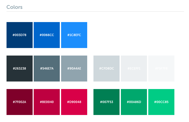
Every color has its darker and lighter version. It’s very helpful later when you move into designing UI and need colors for shadows or highlights.
It’s also important to have some colors for negative and positive messages that will accompany your main palette.
We also decided to update the main brand typeface and, of course, I chose my favorite, Museo Sans (available on Typekit).
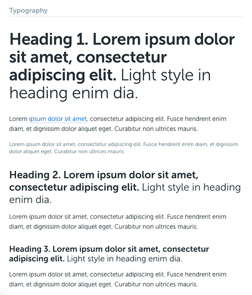
Museo Sans is a very simple, sans-serif typeface. It looks great both as headings and body text. That flexibility helped us decide to keep it all simple and stick to just one font throughout the entire design.
That change also lead us to update the StudioPress name in the logo and use Museo Sans:

It’s a very subtle difference when viewed on its own, but it’s important to maintain that visual consistency when the logo is used with other brand elements and designs.
If you’re interested in getting our new official color scheme hex codes, logo files, banners, and more, go ahead and check out our new public Brand Assets page for you to use.
UX, Wireframing, and Planning
As I mentioned in the beginning, the website redesign included both the main site, StudioPress.com, as well as the member portal, My.StudioPress.com.
We started by planning the entire website structure and user journey from the moment they enter the site to when they purchase a site, login to the portal, and set up their new site.
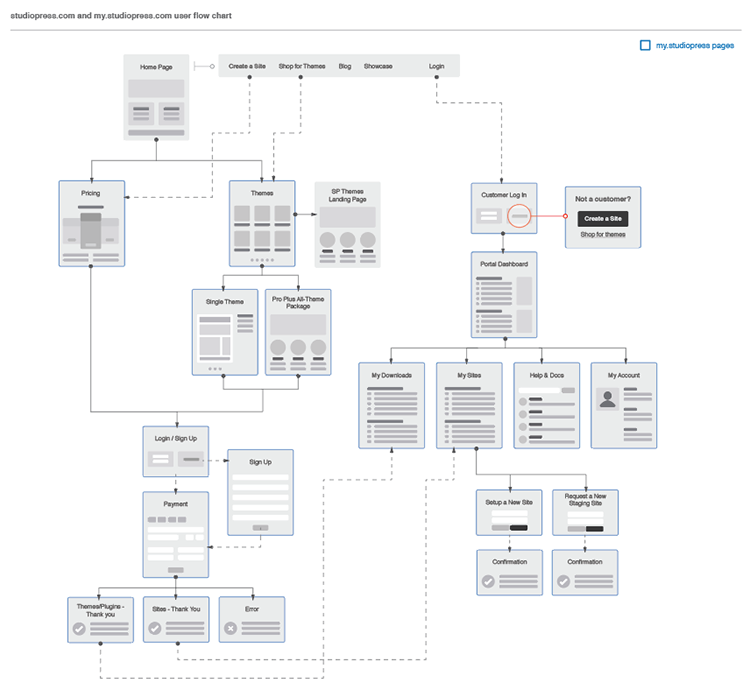
In all previous designs, the member portal served only users who purchased themes. This time we needed to add all of the functionalities to support the StudioPress Sites as well.
While managing themes is pretty simple because you can only download your purchased theme or view a documentation, managing sites came with many new options.
We made a lot of wireframes to document every user’s step and made sure it provided a smooth experience. For more complicated features, we put together wireframes into simple user flows to help illustrate the journey.
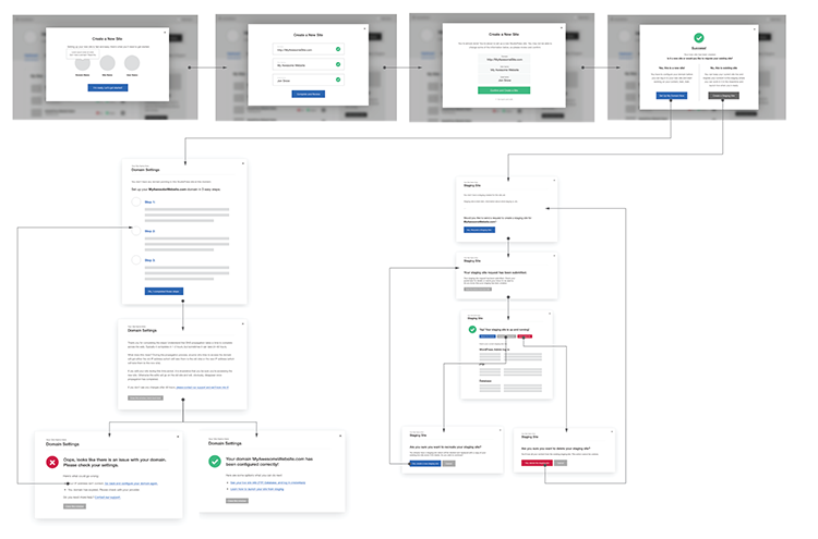
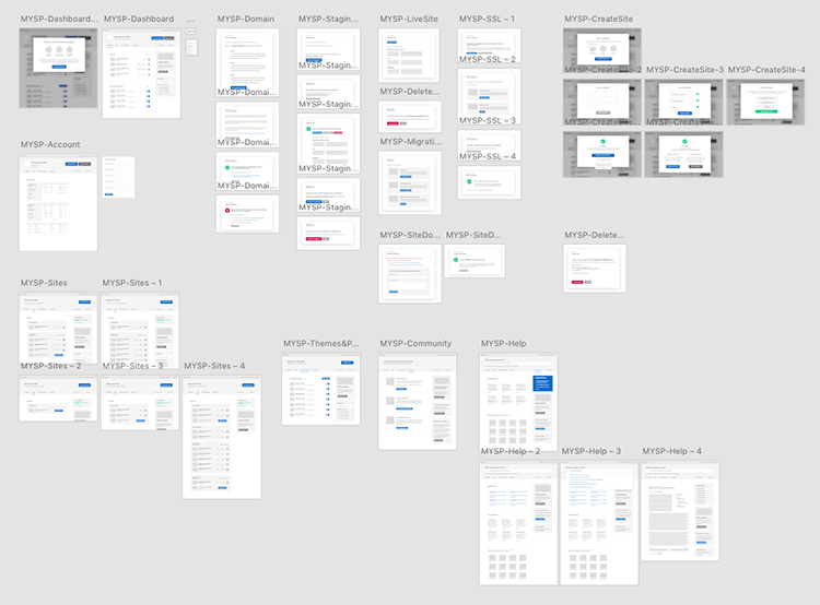
I worked only in Adobe Experience Design (read my review here) and Adobe Illustrator to create all of the wireframes and flowcharts.
Then I used InVision to share the design with the rest of the team, discuss it, and create interactive prototypes. So, we could actually click through almost all of the member portal wireframes and nail the user experience before we took it to development.
Not everything ended up exactly like it was designed, but that gave us a really solid foundation, and we knew exactly what to work on in the next phase.
Visual Design
At this stage of a project, I would usually open Photoshop and start working on some mockups. This time, however, because of a tight deadline, I chose to try a different approach and worked on the design right in the browser.
I’ve never designed a project that big in the browser, so that was a new experience. Having everything wireframed, and well-planned, of course, made that part of work much easier, as I could focus only on the visual part.
I started by coding a simple style guide and UI library based on a new color scheme and typography. I tried to include all of the basic user interface elements we needed, like buttons, form inputs, icons, etc.
The style guide page is quite long, but here are some more interesting UI parts that it includes:
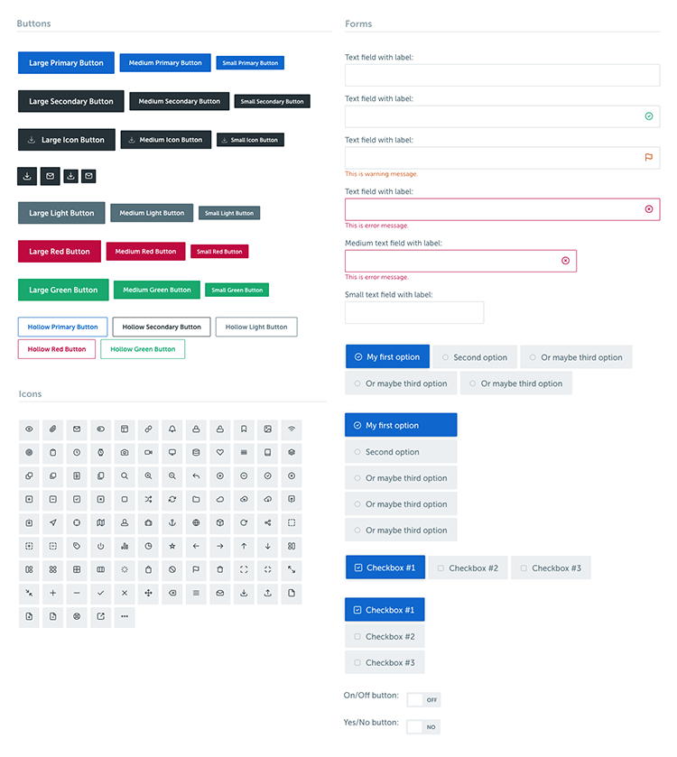
The entire style guide lives inside the WordPress theme under its own page template. It’s using exactly the same CSS files like the rest of the theme, so whenever we make some changes in the main stylesheet, the style guide automatically reflects it.
It really helps to maintain a unified visual appearance throughout the site. Having all of these individual UI elements and components ready and styled helped us to focus on building complete page layouts.
The entire interface is packed with little details that you would not even notice, but greatly improves the user experience:
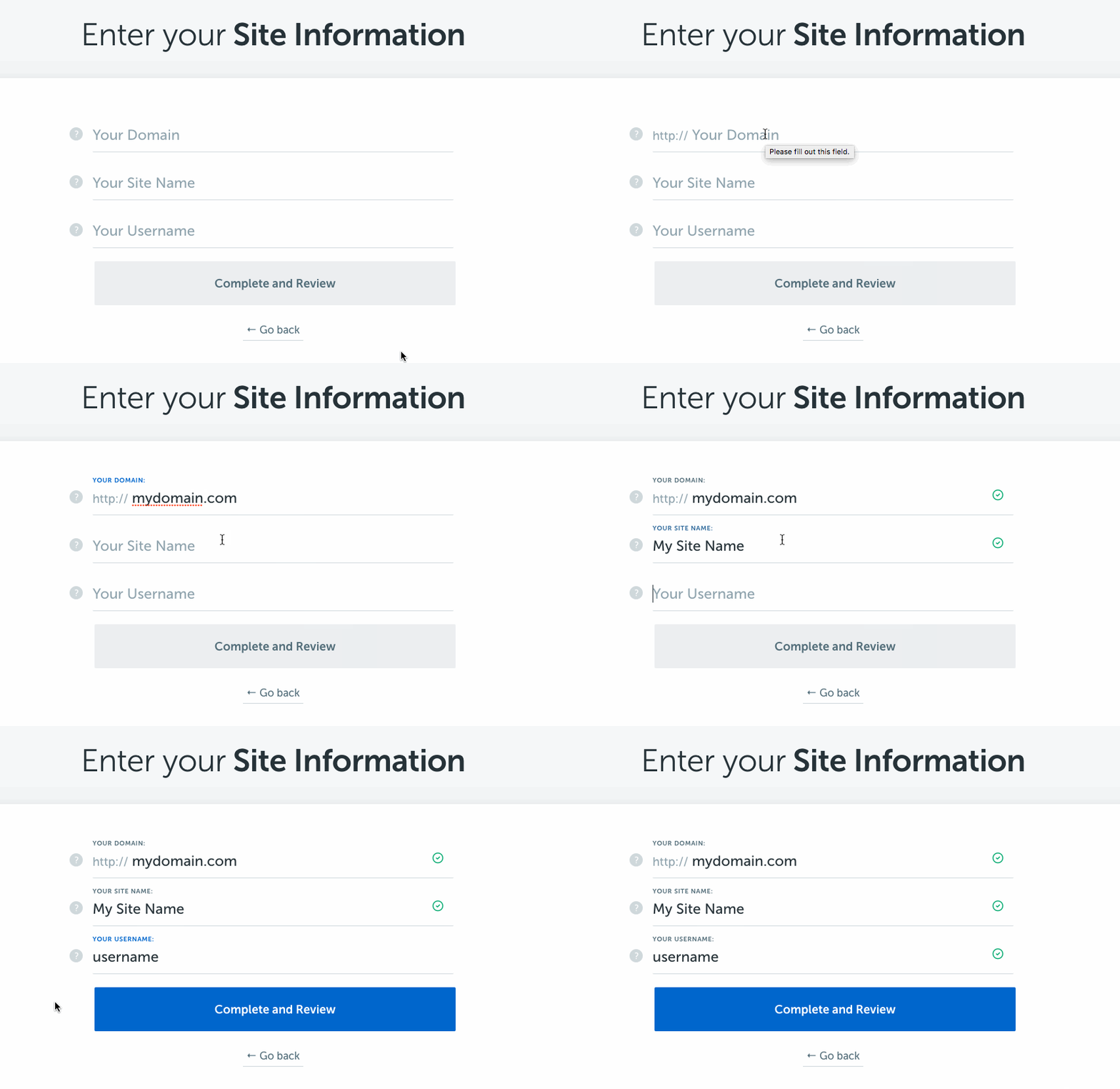
- We used the float label pattern (props to Matt) to make our forms look much simpler without hiding field labels, which are important for users.
- A domain field is often confusing for the users, as they’re not sure if should use “http://” or not. We solved this by always showing a fixed part of that label.
- All fields are immediately verified as you switch to another field, and the “Complete and Review” button is enabled once all fields are filled out.
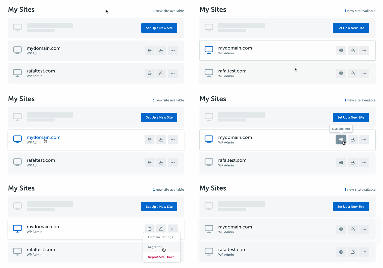
- The new available sites show up as new slots on the list with a “Set Up a New Site” button.
- Only most popular action buttons are visible and other options are hidden under the dropdown menu to declutter the list.
- The user can easily access both the front-end site by clicking the domain name or the WordPress admin panel by clicking the “WP Admin” link below it.
So, summing up, it wasn’t just another design project, and I tried some new, different approaches on how to design and code for a consistent experience on a website with a member portal.
Of course, you can only see my work on the surface of this project, but there was actually much more work done on the back end by our wonderful team including dozens of Starbucks meetings with Brian Gardner who managed this project.
Now, go ahead and check it out for yourself here: StudioPress.com
Let me know what you think about the new design. Looking forward to hearing your feedback.
I love the new site design, Rafal! Kudos to you, Brian and the team! And thanks for the awesome behind-the-scenes look into what it took to pull off such a large project. I especially love what you did from a UX perspective on “Enter Your Site Information.” LOVE, LOVE, LOVE!
Thanks, Pam!
Hello Rafal
I like the clean simplicity of the new site, it’s got easy to read fonts and lots of white-space.
I’m glad there are no great big photos, video backgrounds or sliders.
I like that there are just the three most important options in the top nav bar, so I can get where I want to go fast.
If I want to find other pages the links are in the footer, easy to find but out of the way.
The only thing I’d change is the way the top navbar fades to pale blue, with white text. If I had a magic wand I’d make it solid blue all the way across.
Congratulations on a great looking design, I think you nailed it!
Thank you for your comment, Phillip!
Awesome as always Rafal. It was great to see all those wireframes and how the site flows – so organised.
Thanks! 🙂
What does studiopress use for the checkout?
We’re using our own plugin from the Rainmaker Platform (http://rainmakerplatform.com).
I’m loving the redesign, Rafal. Nice work! It’s official: gradients are back. 🙂
Style changes also updating the built-in style guide sounds awesome. Is the style guide accessible as a section of the wp dashboard or on the front end of the site somewhere? Trying to wrap my head around the setup.
The gradient in the header is my favorite design feature. You’ve inspired me to implement something similar on my next project.
Thanks, Tony!
Is it possible to release the code for the style guide? Might be helpful to SP customers to include that template in normal themes to aid in styling our sites.
Love the new design, Rafal. You always keep impressing and inspiring me with your creations and designs.
And it’s great to see how you worked with the flowcharts and wireframes. Have just recently started using Adobe Xd myself, so it’s nice to see how you’ve used it in the development process here.
I also like the idea of creating an UI file to keep inside the theme. Need to do something like that in the future. 🙂 Is that an HTML file with a “skeleton” you keep inside the theme and link the UI stylesheet to, or how did you do that?
Sorry, re-read the section about the style guide and understand it’s a page template so no need to answer that 😉
awesome as always. love the new design
I just checked my rescue time dashboard for last week and I figured I spent over 2 hours on studiopress.com.
Most of that time was spent in chrome dev tools, trying to figure out why the design was JUST CRAZY GREAT.
But here, this right here is the real deal.
Blessings Rafal.
Keep inspiring with your every touch.
🙂
Rafal,
did the Material Design guidelines play any role?
For example,
1. the floating field labels that you mentioned,
2. blog posts now look like they’re on slightly elevated paper
3. when I mouseover a theme the card slightly bulges
Awesome work.Just wanted to drop a comment and say I am new to your blog and really like what I am reading.Thanks for the share
I really enjoy reading about how projects came to be – the redesign of StudioPress was no exception! Love how the project came together and that you’ve modernized the UI by using softer colors – I’ve got a long way to go as I hone my skills but luckily, I’ve got resources like this to draw some inspiration from.
Al – Web Designer
The redesign is clean! I really love studiopress and the Genesis framework
Awesome as always Rafal. It was great to see all those wireframes and how the site flows – so organised.
I enjoyed your concept of making studiopress. Nice to see this.