If you’re a Genesis framework user, you’ve probably noticed a new logo in the most recent 1.9 version. Today, I’d like to share with you some ideas behind the new Genesis visual brand and what direction overall in which we’re taking StudioPress.
The idea of redesigning Genesis appeared once we realized we’re getting closer to the big 2.0 version.
I had a couple of serious discussions with Brian Gardner on the future of StudioPress themes and the Genesis framework design itself.
Our first brainstorming session was more about the fundamental ideas of what StudioPress design is about.
Let’s get back to the core and define what the Genesis framework really is…
The Genesis Framework
If you have ever used any of our themes, you probably know they’re characterized with simplicity but incredible functionality.
There are not too many crazy custom settings or options that would control the visual aspects of the theme, but, on the other hand, it gives much more flexibility for designers and developers to customize the theme thanks to the way it’s coded.
From a technical point of view, the Genesis framework is very well optimized, fast, secure and modular.
The goal was to connect everything from what the Genesis framework is to its back-end as well as represent similar values in a visual area.
Of course, we didn’t want to just redesign the Genesis logo and let everything else take its own path. Our goal was to create a new trend that would become a common feature between all of our child themes.
Our codex of a good design
Here is a list of some core features we will try to include in our designs:
- Responsiveness – this means we’ll avoid static graphical elements that would require a special code to make it responsive. Making all elements flexible will result in less complicated CSS code as well as ensure an easier customization process.
- More spacing – we want to let our designs breathe by making them more spacious. We believe that white space is a well-used space.
- Readable typography – yes, no more 12px body font size. You’ll see increased font sizes and higher contrast in all our new themes.
- Flat design – making more elements flat means less CSS code and more flexibility in customization. It’ll also help us achieve a more simple and modern appearance. However, it doesn’t mean we’ll do all of our child themes completely flat. You may expect very subtle shadows or delicate gradients.
The Genesis logo redesign
The new Genesis logo was supposed to represent all of these features in one. We wanted to make the logo simple, flat, spacious and with a nice typography.
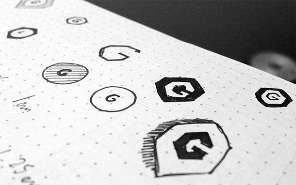
My first sketches looked like this:
What brought us to some quick design ideas during our meeting at Starbucks:
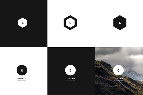
We chose a concept we liked and did a final version of it:
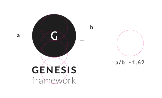
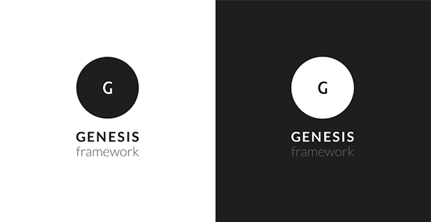
We chose “Lato” (created by Łukasz Dziedzic) as our main font of the new Genesis framework default theme and the logo.
It’s one of my favorite fonts on the Google Web Fonts and I’ve used it in various projects so far. It’s free, open-source and there are 10 styles from “Ultra-Light 100” to “Ultra-Bold 900” which gives you a lot of design flexibility.
Summing up
Branding is something more than just a pretty logo design.
Whenever you start a “rebranding” process, first think about the core values that you want to put behind your mark. Make a small mission statement of what your services or products really are.
Follow that path and you’ll be able to easily create a brand that will remain for years.
Bonus: Genesis 2.0
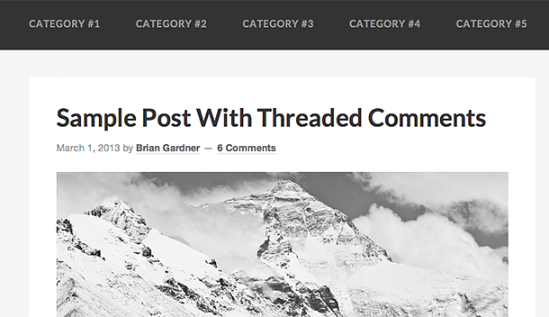
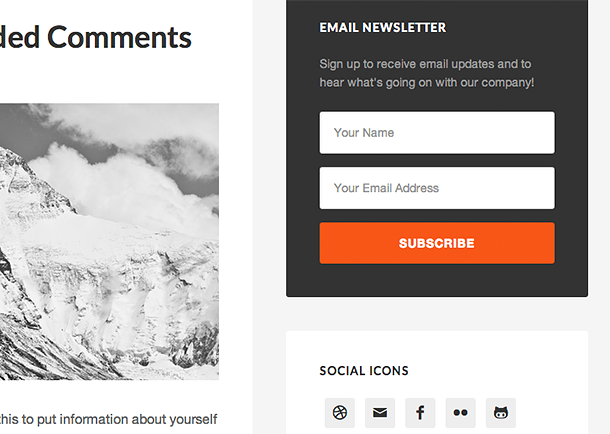
For those of you who read the article to the end, I have a small bonus. Here is a teaser of the future Genesis 2.0 default theme design that we’re working on:
This is great stuff. Very detailed and I love the thought process.
A mini mission statement is another great tip. Too many people are just after the look and not truly concerned with what it reflects.
Thanks, Matt! Yes, the actual design work is often less than 50% of the entire process.
Looks great Rafal. Yes, branding is so much more than just a new logo that looks nice. You really need to figure out what you want values and vision you want to communicate with the business before doing your design work. Then every step along the way you look back at your vision statement and ask “Does this design look like our vision?”.
Since you are talking about Genesis 2.0 I have a question. I’ve been developing WordPress websites for a while now, but I’m not very pleased with some of the other bloated frameworks on the market. I’ve tried Thematic in the past, but it ran slow and didn’t really fit my needs.
Right now I’m using the “Responsive Bones” starter theme by Themble and it really speeds up my development time.
So here’s my question: What would you say to me as a WordPress developer building custom small business websites of why I should use Genesis. I’m interested to hear why you use the framework, how it speeds up your workflow etc.
I’m a web developer same as you and use the Genesis framework to build both custom child themes for clients, as well as child themes for sale. I started using the Genesis framework before I even officially joined StudioPress team.
What I love about the Genesis framework is that it’s very stable and it provides all the basic functionalities that I need – no less, no more. I don’t worry about the next Genesis update because I know that our developers won’t make any crazy changes and I won’t have to change my habits. It’s constantly improving but the style I code child themes is still the same. I think it’s good to choose the framework that will last for years and will helps you save hours of your work.
I can still easily go to the website I created 2 years ago and update the Genesis framework, do some modifications etc. – it’s all without too much work.
Rafal,
Great post on the Genesis logo design. I am wondering- how much time did it take you to design the logo (right from brainstorming idea to the final output)? I know I cant compare this to the usual 10 or 20$ logo providers out there. but I’d like to know how these guys do it so cheap!
I did read till the end. Nice bonus! I am waiting for genesis 2.0 to hit the market to get my redesign done. Wondering if it will have some drag and drop functionalities like headway themes.
Adarsh,
It might be hard to estimate the total time we spent on it. We had some ideas and talked about this for some time before we actually met at Starbucks and started really working on it. We spend couple hours on creating different concepts, choosing different fonts and design style. Once we found the right concept, I spent about 2-3 hours on finishing it up by customizing the “G” letter and positioning it.
Dig it. Thanks for sharing the story behind it, Rafal.
I wish I had more time to share even more stories 🙂 Thanks!
The amount of work that goes into such a “simple” logo is incredible. Excellent writeup.
Thanks, David!
This is not only the best description of Genesis I have read but also why I use it
“If you have ever used any of our themes, you probably know they’re characterized with simplicity but incredible functionality.
There are not too many crazy custom settings or options that would control the visual aspects of the theme, but, on the other hand, it gives much more flexibility for designers and developers to customize the theme thanks to the way it’s coded.
From a technical point of view, the Genesis framework is very well optimized, fast, secure and modular.
Thanks to everyone on the team for a great product!
Thanks, Christine!
Loved seeing your sketches of the logo and a sneak peek of 2.0!! Thanks for sharing 🙂
I’m glad you liked it. Thanks, Heather!
I love the idea and the concept behind the creation of the new logo. I am about to rebrand myself and my team from just name.com to a cohesive brand. Thanks for the tip about what to think about. It is really a difficult process! Do you have any resources you could share that have more insight on branding? I’ve read a lot but just like info on the internet some of it just isn’t that great!
Thanks 🙂
Rachael,
I really liked some articles written by Jacob Cass: http://justcreative.com/featured-articles
There is a lot about logo design and branding on his blog.
I loved the new logo, but even more, I can’t wait to see Genesis 2.0! I love the Metro and Minimum Templates on my blog.
Servando,
You can expect more themes like Metro and Minimum in the near future.
Brilliant. Both you and Brian are good partners.
The sneak peaks of the Genesis 2.0 look great too, can’t wait for it.
Thanks, Rudd! 🙂
Thanks for letting us see the inner workings behind a simple design that will grace thousands of websites!
Branding is fundamental to creating a lasting impression, and will only get more important over time – thanks for addressing this important topic.
Can’t wait for Genesis 2.0!
Much ado about “The big G ” … love your work Rafal. 100% agree on why Genesis is the best choice for developers. The few theme options (colors background) are often the first I move to css only.
Really like the layout of your blog.. no sidebars.. just focus on the message, wish I could convince more of my clients to adopt that kind of directness.
Simple, elegant, refined – love the new logo & excited to see the upcoming Genesis 2.0
Can’t wait for 2.0 – Nice work!
You should make t-shirts with that logo. They would be awesome!
I am so excited about Genesis 2.0 now. Even though I didn’t know much about coding, these screenshots make me fall in love right at the first time.
I also love your story of designing the new logo. It’s simple, but it’s professional and attractive. I always love Genesis designs especially those coming from you, Rafal.
The logo looks very nice and I love learning the “why.” I’m gonna have to put the Lato font to use now.
Hey Rafal,
Great concepts for Genesis.
I have a question… how did you choose a winner from the above designs, – from your mind why go circular VS the diamond shape?
Great read, as ever!
Thanks for sharing.
Liam
The Logo itself explains great work quality , this logo shows less words can define your business better,,hats off to you mate
I like the simplicity of of logo. Thanks for share the story of behind the scene.
Hello Rafal,
This genesis logo looks So simple as genesis Framework Design but Getting the concept into reallity is dificult!!! Perfectly mach with Minimal Design!!!
Thank you for sharing story behind my genesis logo!
Such a beautiful work: Your works makes me dream a big dream.
Hey is Lato still the font used? If so have you transformed the “G” or has the Lato font changed? The Lato G appears to be skinnier and not have the horizontal line in it…
i like it.. i will tray make this information..!!1