I’ve recently released a Genesis child theme, Journal, that is available completely for free in the Designers Area on this website. So, if you haven’t seen it yet, go ahead and read more about it here.
It’s a very simple looking theme, but it includes some interesting non-standard features and solutions that you may have never seen in other Genesis child themes.
If you’re a developer, looking into the source code must be the first thing you do when you find something new. If you had a chance to check the code, but still want to learn more about how it was done, let me deconstruct the child theme’s code for you.
1. Custom header with a gravatar

As you may have noticed, the Journal theme doesn’t have a typical header. There is a user gravatar displayed right next to the site title and the “Menu” button on the right side.
This is the code that is responsible for that customization:
//* Custom header
add_action( 'genesis_site_title', 'journal_header', 0 );
function journal_header(){

	$gravatar = get_avatar( get_option( 'admin_email' ), 100 );

	if( $gravatar )
		echo '<a href="' . get_bloginfo('url') . '">' . $gravatar . '</a>';

	if( is_active_sidebar( 'sidebar' ) )
		echo '<a href="#" class="dashicons dashicons-menu menu-button">'. __( 'Menu', 'journal' ) .'</a>';

}
First I use get_avatar() function to get the 100×100 pixels avatar for the admin’s email address:
$gravatar = get_avatar( get_option( 'admin_email' ), 100 );
Then, I check if the avatar exists and display the image if so:
if( $gravatar )
	echo '<a href="' . get_bloginfo('url') . '">' . $gravatar . '</a>';
The last piece of this function checks if the ‘sidebar’ content area has any widgets and displays the “Menu” button if it does:
if( is_active_sidebar( 'sidebar' ) )
echo '<a href="#" class="dashicons dashicons-menu menu-button">'. __( 'Menu', 'journal' ) .'</a>';
I’ll use this button to trigger the slide in action for the primary sidebar in the next step.
2. Slide in sidebar

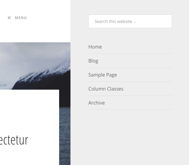
Another interesting part of this theme is the hidden sidebar. It’s a regular primary sidebar, but it’s hidden behind the screen and activated when the user clicks the “Menu” button.
This trick is made mainly with CSS and JS. Let’s look first at the CSS code of the ‘sidebar-primary’ element:
.sidebar-primary {
background: #eee;
	display: block;
	height: 100%;
	padding: 50px 60px;
	position: fixed;
	top: 0px;
	right: 0px;
	width: 400px;
	z-index: 999;

	-webkit-transition: all 0.5s ease-in-out;
	-moz-transition:    all 0.5s ease-in-out;
	-ms-transition:     all 0.5s ease-in-out;
	-o-transition:      all 0.5s ease-in-out;
	transition:         all 0.5s ease-in-out;

   	-webkit-transform: translate(100%,0);
	-moz-transform: translate(100%,0);
	-ms-transform: translate(100%,0);
	-o-transform: translate(100%,0);
	transform: translate(100%,0);
}
The position of this element is set to “fixed”, which means it’ll float on the screen in a desired position. Its top and right positions are set to 0px, so it’ll appear in the top right corner of the screen.
Now, CSS3 transitions and transforms do all the magic. If you want the animation to be faster, you can change the transition to 0.2s or to 1s if you want to make it slower.
Translate(100%, 0) means that the entire sidebar will be moved 100% of its width, so it’ll position itself behind the screen. You could use a fixed value to achieve the same result, but 100% guarantees that no matter what the sidebar size is, it’ll be always hidden behind the screen, which is perfect for other screen sizes.
So, the sidebar is now hidden, but how can we bring it back to the screen again? I added this small piece of CSS code for the ‘sidebar-primary’ element with a class ‘on’:
.sidebar-primary.on {
   	-webkit-transform: translate(0,0);
	-moz-transform: translate(0,0);
	-ms-transform: translate(0,0);
	-o-transform: translate(0,0);
	transform: translate(0,0);
}
It sets the sidebar at 0,0 position again.
Now, we need to only connect the “Menu” button click with the sidebar animation. That’s where JS comes in:
// Show/hide sidebar on click
$('.site-header .title-area .menu-button').click(function(){

	if( $(this).hasClass('dashicons-menu') ) {

		$('.sidebar-primary').addClass('on');
		$(this).removeClass('dashicons-menu').addClass('dashicons-no-alt');

	} else {

		$('.sidebar-primary').removeClass('on');
		$(this).removeClass('dashicons-no-alt').addClass('dashicons-menu');

	}

	return false;

});
The menu button icon changes depending on if the sidebar is visible or not. So, I check first if the button has class “dashicons-menu”, which means that the sidebar is hidden and if so, adds a class ‘on’ and changes the icon to ‘dashicons-no-alt’:
$('.sidebar-primary').addClass('on');
$(this).removeClass('dashicons-menu').addClass('dashicons-no-alt');
The second part of this script closes the sidebar and changes the icon back to the original one.
And now we have a functional slide in the sidebar.
3. Featured image behind the post content

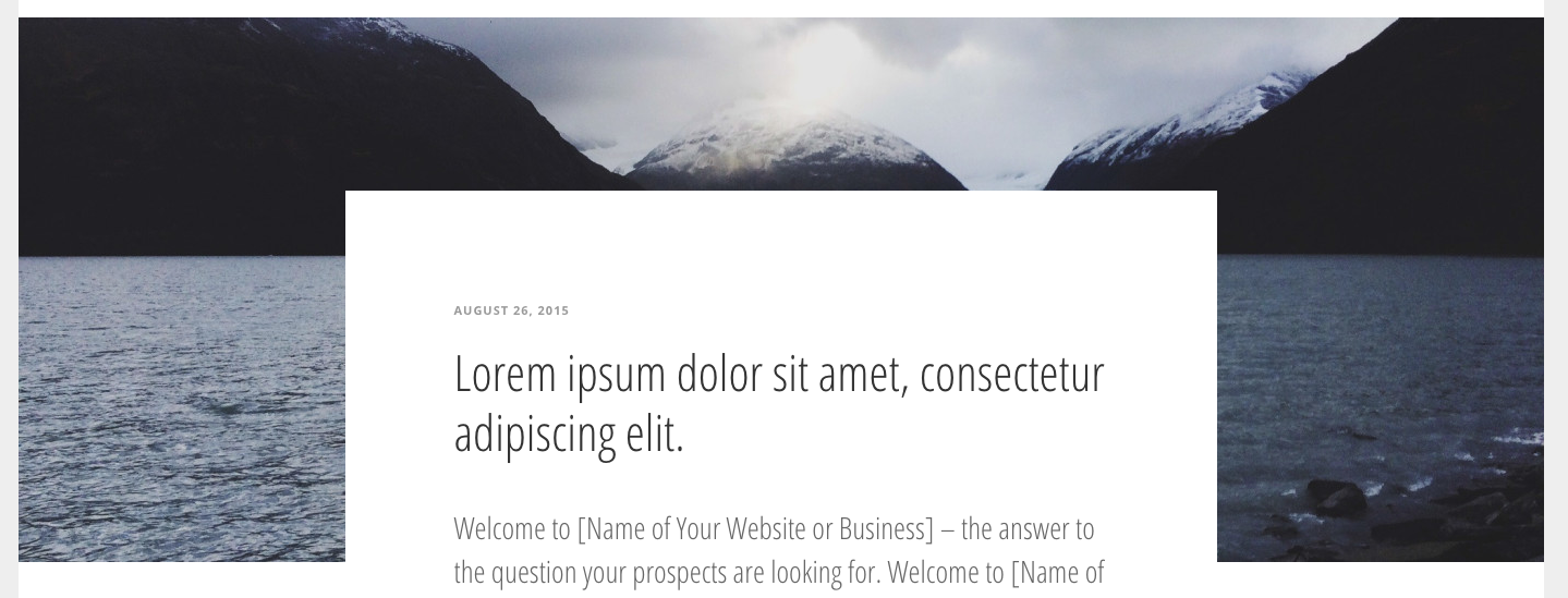
I received many emails with questions on how I placed the featured image behind the post content. I think it’s a very interesting feature and it just needs some simple CSS tricks.
First, I need to remove the featured image from its original location:
//* Remove the post image
remove_action( 'genesis_entry_content', 'genesis_do_post_image', 8 );
Then, I registered my own image size:
//* Add a post featured image size
add_image_size( 'post-image', 1400, 500, TRUE );
And I added my new featured image before the entry content:
//* Add featured image
add_action( 'genesis_before_entry', 'journal_featured_image', 0 );
function journal_featured_image() {

  	if( has_post_thumbnail() ) {

		echo '<div class="featured-image">';

		if( ! is_single() )
			echo '<a href="' . get_permalink() . '">';

		the_post_thumbnail( 'post-image' );

		if( ! is_single() )
			echo '</a>';

		echo '</div>';

	}

}
I used the has_post_thumbnail() function to check if the post has any featured images assigned. Then, I displayed my new image size using the_post_thumbnail() function and wrapped it in the “featured-image” block element.
Now it’s time for some CSS magic:
.single .featured-image {
	margin: 0 -400px -250px;
	position: relative;
	z-index: 0;
}
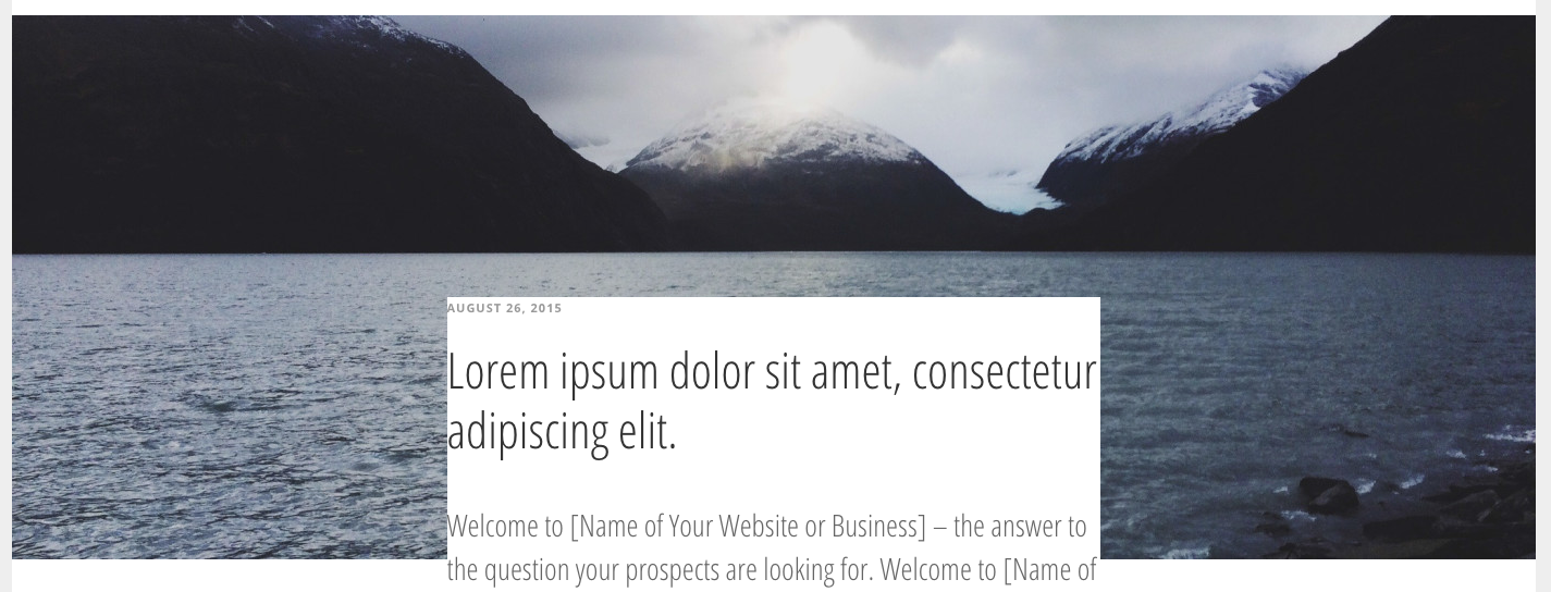
Using negative margins helps to position the image behind the content area, but it’s not perfect:

I needed to add some white space around the content without changing the original content area width. I used this little trick to place a big white block between the image and content:
.single .featured-image:before {
	background-color: #fff;
	bottom: 0px;
	content: '';
	display: block;
	height: 350px;
	left: 50%;
	margin-left: -400px;
	position: absolute;
	width: 800px;
	z-index: 1;
}
Ok, I have to confess that maybe it’s not the most elegant solution because of the use of some absolute positioning, but it was necessary in this case to achieve the desired effect.
It works like a charm after all! 🙂
This theme is no longer available.
Thanks for posting this and explaining the code. It’ll help as I make the Journal theme accessible. The bit of JS that hides/shows the sidebar on menu click is the hardest part.
Thanks for this post! I was wondering if you know of some js to hide the sidebar menu when you click outside of the sidebar. Im viewing on my iPad and it seems my brain has been trained to tap outside of a sidebar menu to close it. Thats what happens in a mobile first generation 🙂
Either way, the Journal Theme is awesome!
Great theme. I really like it for its simplicity and great features.
Hey Rafal! I think it’s great that you’ve shared a little behind-the-scenes look at how you put this theme together. Wish more theme developers would do that. 🙂 Love the aesthetics, too.
Interesting post and awesome theme. (And every time I come on your site I’m reconfirmed what an awesome font FF Tisa actually is.) Thanks for your generous sharing and inspiration.
Rafael,
Thank you, I actually get pissed of when I receive free theme thing from designers.
I don’t know what wrong with us, I’m designer my self so that includes me too. We always find a way to design things that we will not be willing to use them ourselves on our own projects.
You always find a theme especially free one it’s either too rushed or too complicated.
That’s why my first thought after I received this email was too click the demo link with one specific question in mind, will Rafael use this theme for his own project. Thank God, this free theme is careful crafted and it seems enough thought was put into designing this one.
So again thank you, to finally be one of those good one among us. ☺️
Very Easy step for making journal theme could be on very effective.
Thanks to Rafal! for share this cool article. I also saw your Child Theme it was too good. I also followed your creative Designing thoughts and those ware very effective. I appreciate your all works on designing. I will waiting for your next post. Thanks again.
Thanks for the article as well as the really cool theme – it looks superb.
These making journal theme was presenting many ideas and useful information.
Being a developer, looking into the source code must be the first thing that I will do do when I find something new. Thanks for deconstructing theme code child.
Superb Article! I like that you mention this coding information in steps because sometime coding details are available in paragraph and you know it’s really confusing. Thank you for this information.