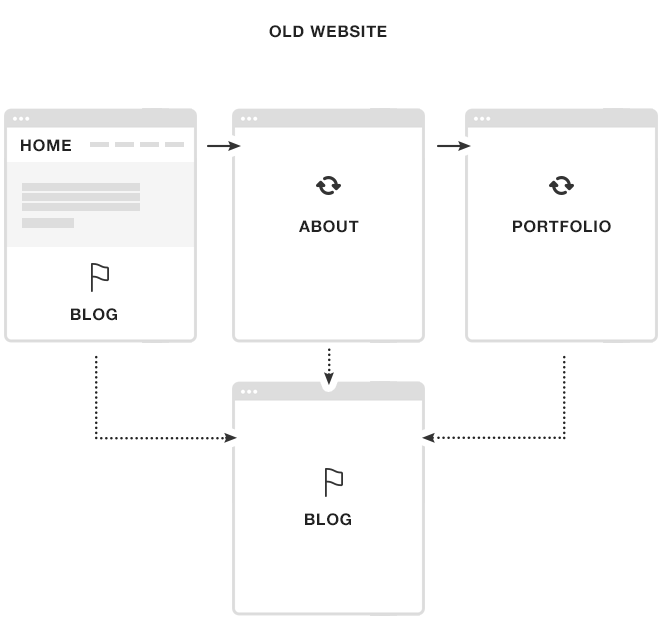
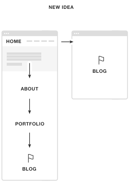
As you can see, I totally redesigned my site which held me up from posting anything new for awhile.
My new website is even more minimalistic and also cleaner than the previous design. In addition to the new look, I reorganized the content to simplify browsing. To create this new home page idea I dug into some data and studied my visitors’ behavior.
Apparently, with the previous design, most people who came to my home page didn’t click on any blog post titles but went to ‘About’ first and then to my ‘Portfolio’. My visitors wanted to know first about me before reading my blog. Having my blog posts listed at the top of my home page didn’t make sense anymore.
Also the bounce rate from my home page was over 60% which I wanted to reduce.

So my idea for the new home page is simple. I want the new visitors who come to my website and land on the home page to first learn a little about me, see my work and then go straight to my blog. I’m not selling anything here, so my mission is easy.

I want to reduce the amount of steps and any unnecessary page reloads. I made one long page where I fit both ‘About’ and my ‘Work’ sections just to give my visitors what they seem to want in an easy, straightforward way. After seeing these two sections, my blog is next and that’s the place where I want people to stay longer and read my content.
You can try your own simple website links tracking using events and goals in your Google Analytics. See what links people click on your website and if you reach your goals and use this information in your next redesign.
Web Design Resources
I got many questions on what books I recommend to learn design or where to look for inspiration and graphic design materials. I decided to put together all that info into one page and called it “Web Design Resources”. You’ll find some links there to stuff that I found very useful in my work.
I hope to keep this page growing and provide even more resources that you can use. If there are any sources that you personally find valuable, please let me know about them and I’ll make sure to add it to the page.
I’m looking forward to hear some feedback on my new design.
Rafal, I love the new design and animations! I’ve been secretly stalking your Dribbble page to see any glimpse of the new design.
Great write up on Data Driven Design.
Thanks, Jared! Keep stalking my Dribbble. I’ll probably post there more often than on Twitter 😉
Love the new look mate, it’s a winner.
Keep the newsletter updates coming!
Cheers,
JA
Hey Rafal, I really like your nav bar. I’ve found myself clicking things just to see them work again. I also like the previous/next post links in the margin. Did you custom build that?
Also, how did you decide to put the sharing options above the headline? I’ve always thought that it doesn’t make sense to give people an option to share until they read what they’re sharing. I suppose people decide whether or not to read a post based on the number of shares. Just curious to hear your thought process.
Nicholas,
Yes, previous/next is a custom coded feature.
Sharing options above the headline – I don’t see anything wrong with that but I know there were many discussions on this subject. I think many people tweet my posts before they even read it. I just want to make it as easy as possible.
Thanks!
Ah … you should totally spend your free time developing that prev/next feature into a free plugin that we’ll expect you to support (for free).
Or maybe you can add it to a future StudioPress theme.
The rest of your website is great. It shows off your skills nicely. I agree the layout you’ve used makes a lot of sense.
One small thing: “I’m the Lead Designer at Copyblogger Media living in the Chicago suburbs.” doesn’t really make sense when I think about it. (Sorry, I can’t help wanting to correct sentence structure and grammar problems when looking at an otherwise great website.)
I like your blog design a lot, but I found my eye being drawn to the logo animation as I scrolled down which I found mildly irritating.
I agree with Nicholas Tart about your navigation menu, and the next/previous links in the margin. But I think having the sharing options where they are makes a lot of sense. I normally wouldn’t hide the navigation and sharing options behind icons unless I knew for sure my audience would get the idea, but as your audience are probably savvy, I think it’s awesome. 🙂
Gemma,
Navigation – I want my visitors to scroll the home page and explore it. They’ll find everything there, so I think my top navigation is not that important here.
Thanks for your comments!
Looks great Rafal and thanks for sharing some of the thoughts/goals behind the redesign.
Thanks, Mike!
Love this design.
Loving some of new elements you put on this new design, esp the post navigation and top navigation.
Also, I must say the new StudioPress and WebSynthesis designs are superb, you’re such a very talented designer I’ve ever known.
Thanks!
Rafal,
just wanted to say that I always look forward to seeing your new work and this didn’t disappoint. Easy to navigate, clean and uncluttered, but not at all boring. Hard to get those elements right, but you’ve done it here.
Congrats!
Is the ‘Blog’ link on the pop out nav bar correct though – seems to be linking to the old style blog page design…?
Maybe it’s cached. I cleared my site cached once again but make sure to clear your browser’s cache too.
Thanks for letting me know.
Hi Rafal
Fabulous site and I’ll restrict my comment to one feature – the font!
That is one clear and easy to read font and the size is perfect for an old guy like me.
Yes! I like easy-to-read fonts and seems like 18px – 20px body font on big screens becomes a standard these days 🙂
I love it! It’s clean and beautiful. And stylish and functional. And it makes me want to redesign my site. 🙂 Inspired as always. And I agree with Keith’s comment above….love the font! And I love the blue color.
I’m glad it’s an inspiration for you! That’s all you need 🙂
Hey Rafal
I like the new design, though I’m not a fan of the collapsed “hamburger” menu.
(hmm, hamburger menu… makes me hungry…)
Anyway, I found the fading viewport animation quite inspiring, and the alignment of page elements very well executed.
Good, short read!
Oliver
Hi Rafal, how do you make those nifty flowchart kind of things with the website structure on it? Seems like a useful tool! Great site by the way!
Looks great Rafal as well as appreciate it for sharing many of the thoughts/goals powering the particular overhaul.
Looking good. I was waiting to see what you were up to when I saw your front page on dribble. I was wondering how it all would look when you were done and it looks pretty awesome.
I am quite amazed at the front page with just your intro message with a white background. I would have imagined it would be a darker background image of you but I´m amazed at how well just a single white background and welcome message works. I might use that idea. Having to rethink the redesign again is always awesome 🙂 But I do not have any good image of myself and I´m no good at writing smart introductions so yeah. Will probably stick with something else.
Thanks for the inspiration and love the new design. If I have one question I would like to ask it is about the front page. Is it widgets or simply custom code to output everything like this?
Such lovely use of the Photoshop! A really informative post. Thanks for sharing.