Most people can recognize good design from bad design, but have a hard time saying what makes that difference.
The devil is in the details and web typography is full of little moving pieces that have to be designed properly to make it look right.
Not that long ago I shared with you some tips on how to choose a body text font for your website. Today, I wanted to give you three quick fixes you can do today in order to improve your design right away (If you want to learn more, I covered it all in my Web Typography Course).
1. Increase the color contrast.
If I had a nickel for every time I’ve seen a light grey paragraph on a website, I would be rich.
Pay attention to the contrast between the color of your text and background. The easiest way is to use the color contrast checker and make sure it passes the test.
You can use lower contrast if the text is big or bold, but the smaller the text is the higher the contrast needs to be for comfortable reading.

High contrast designs look sharp and more professional. Just use very dark text on a light background (or light text on dark background) by default. You’ll help make the web a better and more accessible place.

2. Shorten paragraph lines.
This is a very common mistake. Designers fill the entire given content area with the text and that often makes the body text lines way too long.
Count the number of characters in your line and make sure it’s between 65 and 85 if the text is meant for extended reading on a desktop screen.
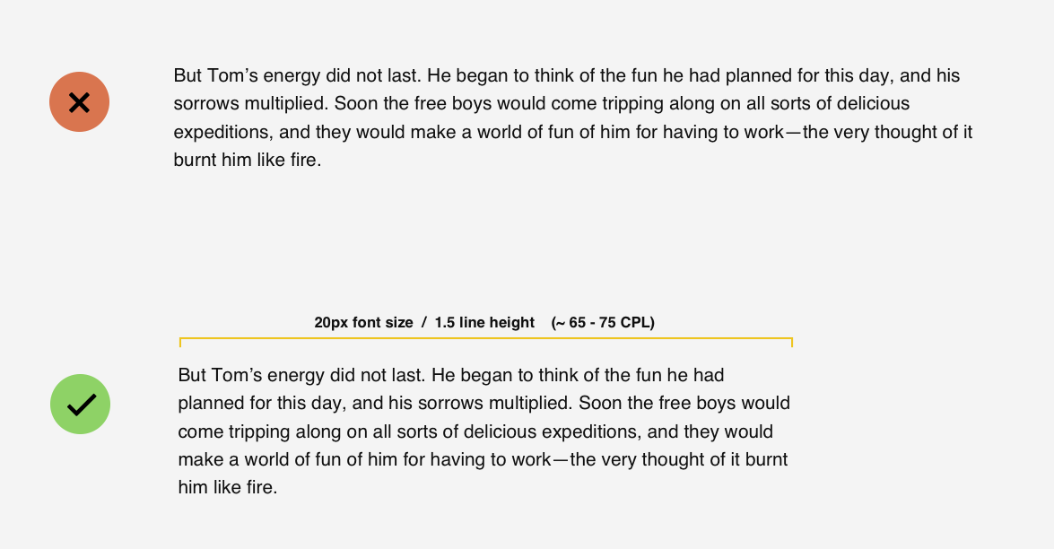
You can reduce the number of characters by reducing the content area width or by increasing the font size.
If you increase the font size of your body text, you need to also increase the space between lines or make the lines longer. If the content area shrinks, you should reduce the font size and line-height too.
Keeping the perfect paragraph proportions isn’t easy, but it’s the foundation of your entire design. I shared more tips how to get it right in my course.
3. Refine the headings.
Headlines are the most prominent elements on every page. There are two quick design adjustments I do in almost every design to make them look good:
1. Add more white space around the headings.

It helps make them more readable while avoiding content congestion if there is a block of text that follows the headline.
2. Adjust letter spacing.
Most of the fonts are optimized to look good as a body text by default. It means that there is a little bit more space between the letters, so the text doesn’t look squeezed when the font is small.
However, when you bump up the font size and use it as a headline, the text seems spaced and makes the headlines longer, which can then break into more lines.
If the headline is all in uppercase, I add a little spacing between the letters, otherwise I usually give it some negative letter-spacing in CSS, like -1px or -1.5px.
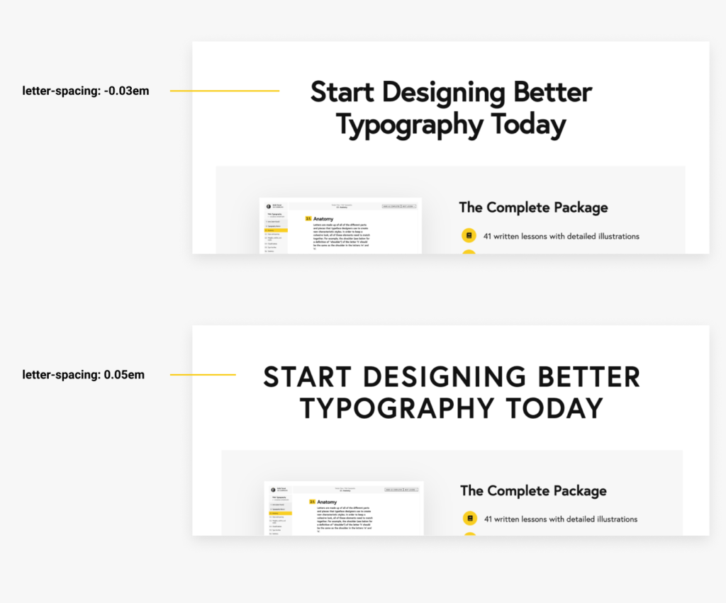
It looks much better and makes the headlines still readable.
Now, try to apply these three tips in your own design and you’ll notice the difference. We’re just scratching the surface here of what else can be done.
There is a lot to think about when choosing and matching your typefaces, how you format the text, and how to space the entire content so it keeps a good flow and supports the visual hierarchy, and much more.
It may seem like a lot of little variables that you have to take into consideration in your every design, but once you practice, it’ll become so natural that you won’t even need to think about it.
You’ll also start noticing all of these little details in other designers’ work and you’ll know what makes the difference between good and bad design.
If you’re interested in taking your design to another level, check out my Web Typography course to get my complete formulas and watch me designing a sample project.
Want to Learn More About Web Typography?
If you want to learn more, check out my Web Typography course and get 20% OFF using the WEB2020 coupon code at the checkout.
Leave a Reply