I love sharing my design tools. Some time ago I published all of my Photoshop design templates for free in the Designers Area. The web style guide template for PS was downloaded over 15k since I started counting it.
Since sharing my Photoshop templates, I’ve gotten a lot of emails asking if I am ever going to make Sketch versions. I hadn’t used Sketch too much until the end of 2016 when I started experimenting with different design tools.
First, I started using Adobe Experience Design more for wireframing and quick prototypes. Then, I looked at some other options as I wanted to see if there was anything that could be better for designing more complex user interfaces than Adobe Photoshop.
Figma seemed great, but it’s focused more on online collaboration which is something that I don’t really need at this moment as I usually work alone on my designs. On the other hand, Sketch is very popular, a lot of front-end developers know it, and it seems like it’s overtaking Adobe Photoshop in a big way.
I gave it a try and started slowly transitioning my entire work into Sketch. I still use both as I have older PSD projects and I like doing static graphics in Photoshop, but all my new UI projects are primarily done in Sketch now.
I’m still learning and exploring, so I’m not a Sketch expert (yet!) 😉
However, one of the first things I did was to redo some of my Photoshop templates. I began with a basic starter template and a web style guide.
You can find the new Sketch template in the Designers Area and download it for free.
Here’s a quick preview of what it looks like inside:
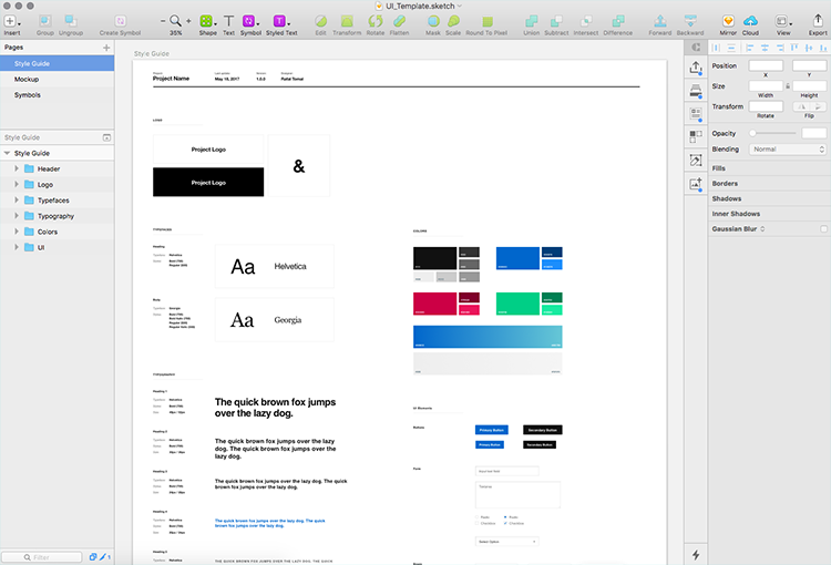
This file is no longer available.
Check out my other design tools.
Please note that this is just a style guide template and it’s not some sort of UI kit that comes with all the styles and UI elements. It’s meant to be used as a starter template for a new design project.
Feel free to customize it for your own usage. You may want to add more common UI elements or change the grid layout to match your CSS framework.
Let me give you a quick tour on a few particular sections and how to use them.
Project info
When you start the actual project, the first thing you want to change is the info at the top of the page:

It’s a good idea to update this information before you share this document with your client or other designers. That way if there are any changes made, you can always quickly compare that information in the header and make sure you have the most recent version.
It’s also a nice way to leave your designer’s signature in the project files. 🙂
Logo
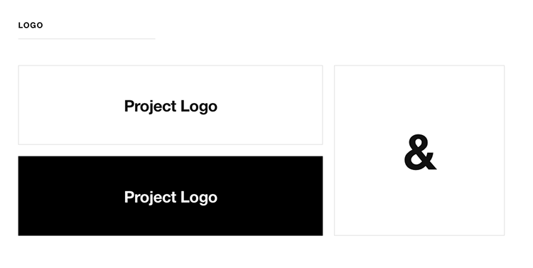
Add the main logo here and any icons or brand marks that should be used in this project. Turn them into symbols so you can quickly bring them anywhere in your design project and make sure they’re untouched from their original form.
Typography
This, of course, is my favorite section. Replace the typefaces with your own and follow the template to create a good typographic hierarchy.
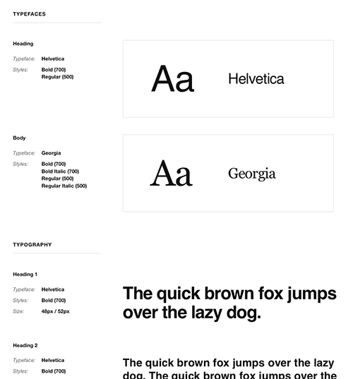
All styles are defined as “Text Styles,” so whenever you make your changes be sure to update the text style as well (that little refresh icon in the inspector panel) and have those changes made in the entire document.

Colors
Replace the blocks with your own color scheme. I usually use a primary color (sometimes a secondary too), a background color, and an accent color.
If you’re working on web app UI, you may want to add colors for messages like error, success, warning, etc. The color scheme section can grow to get pretty big here or can be very small, depending on the project.
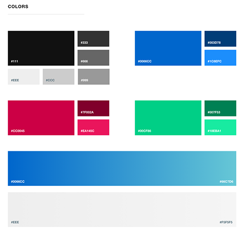
Similar to your typography, once you change colors, make sure to update the Shared Styles:

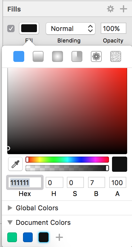
You may want to add them as your Document Colors as well so you can have quick access to them whenever you need to use them for text, border, or shadow:
UI Elements
This is the last section where you can add all common UI elements like buttons, form fields, boxes, icons, etc.
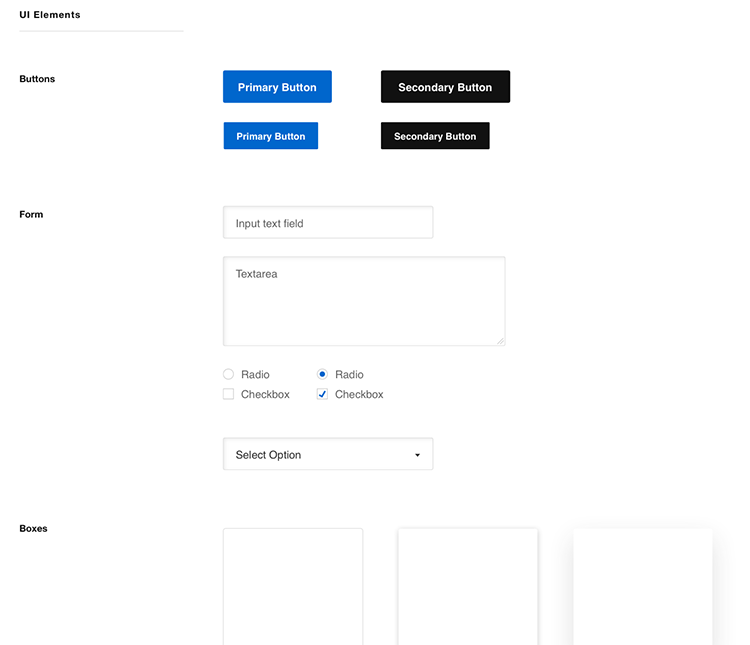
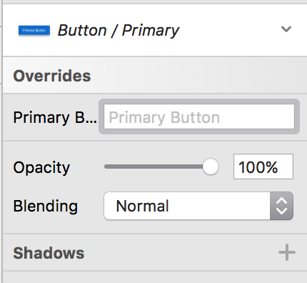
All of these elements are defined as Symbols and Share Styles, so they can be easily reused in the project. For example, if you want to add a button, just add a new Button symbol and you can easily override the default caption.
So, I think this template can be a good start and then it’s all up to you where you take it from here.
It’s minimalistic and focused only on the essential parts. It can be used for both small and big projects and I’m sure you’ll find your way to extend it and make it yours.
Feel free to do so and ping me with screenshots on how you use it for your own projects!
This file is no longer available.
Check out my other design tools.
This is so good and is coming at a perfect time. I love using Sketch for client projects. I had a very simple style guide template I had created. The problem is it what not very organized. Yours is much easier to use, with actual groups!
Thanks for sharing this awesome resource!
Chris
Thanks, Chris!
I also ❤️ to use Sketch for my design projects. Great post!
Thanks, Matus!
Hi Rafał,
first of all many thanks for Your effort and creating all the free stuff You gave us.
I’d like to ask why did You decide to ditch the XD and go Sketch? I’m currently taking more and more UX jobs and I’m quite happy with XD experience (although it lacks few crucial features, e.g. hover effect, area scroll etc.). Due to Sketch coming market standard I’ve started considering switching my workflow, especially when everyone write Sketch case studies and almost noone does it for Adobe XD.
About the Style Guide – I’m curious how do You approach scaling the elements for RWD, fonts to be exact. We’ve been researching this topic for a while and everyone seems to have their own way.
Paul
I loved Adobe XD but I feel like it’s still lacking some important features and sometimes even basic tools. I know they’re still working on it and I’m sure it’ll get better soon.
I needed to switch to something else as Adobe Photoshop stopped being efficient and Sketch is probably the best available option on the market now (my second choice would be Figma and then XD).
As for RWD, I don’t usually make responsive versions of my design mockups. I always have sketches of what the responsive version should look like but since I often code my own designs or I work very closely with a developer, I don’t really see a need to make responsive mockups.
I also never make my design mockups pixel perfect or care about too many details. I think you can be more productive if you finish it up in the code. I use mockups more to present the general concept and user experience only.
Great feedback, Rafal.Jared Atchison is a great friend of mine and he referred me to your website. I’ve subscribed to your newsletter but this is the first time that I’ve checked out your actual blog. Great stuff, keep up the good work.
Sketch is great for website design. I’ve been using it for the past couple of years for website and mobile design.
Definitely an up-to-date style guide is, or style manual is crucial to maintaining brand consistency for any company as it sets standards for the writing and design of print production or websites.
Hey Rafal,
Great article. It’s very helpful for me as I am starting my career in designing field.
Thanks for sharing.