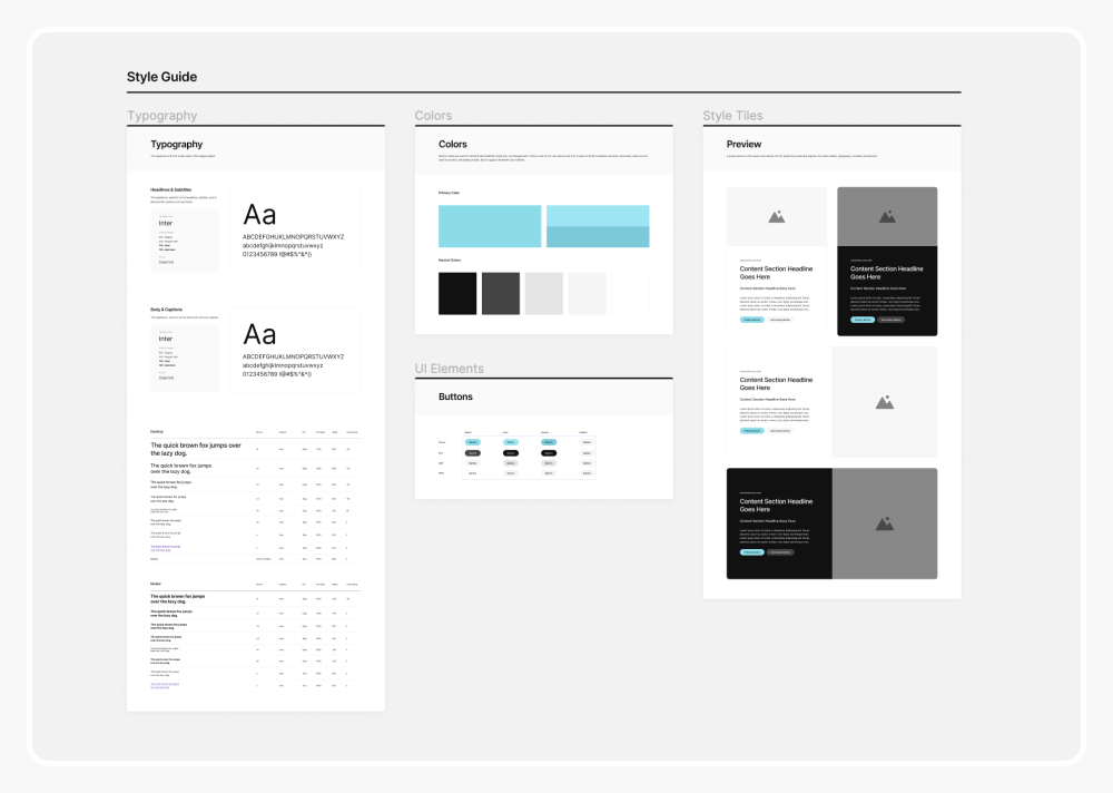
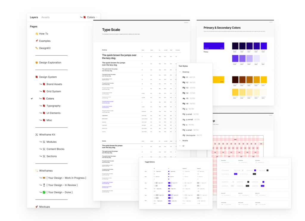
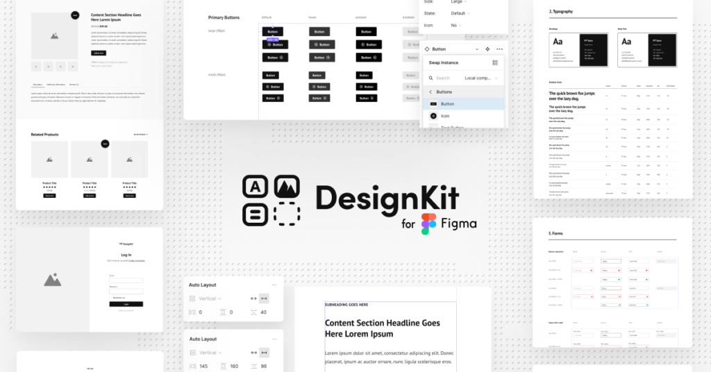
I’m thrilled to share something special with you: my free web style guide for Figma. It’s a simplified version of the design system we use over at DesignKit.us.

Get the FREE Figma Web Style Guide and Starter Templates
Check out my other resources for designers.
Think of this file as your design springboard. You can use it as a starting point for your own creations. Adjust the colors, play around with typography, add more UI elements, or expand the color palette to suit your needs.
It’s designed to be flexible and adaptable to your unique style.
Why Use a Web Style Guide?
Let’s talk about why a web style guide is essential for any design project:
- Reference for Developers: It acts as a fantastic reference point for developers, making the handoff smoother and clearer.
- Coding Mindset: It encourages you to think more like a coder – the site is built on a stylesheet, where every text and color is linked to a specific style.
- Unified Design: Following your style guide ensures that your design feels unified and cohesive.
- UI Element States: It’s a great way to list all different states of UI elements for quick reference.
- Experimentation: Test different color schemes and typography quickly and see what works best with the preview feature.
How It Works
Check out this quick video tutorial on how to edit the file and adjust your text and color styles. It’s super simple and I walk you through each step.
What’s Next
Once you get the hang of it, use this free web style guide to customize and adapt it to your own projects. And if you find yourself needing a more comprehensive web design system, don’t forget to visit DesignKit.us. It’s packed with resources to speed up your entire web design process.


Leave a Reply