As you may remember, I announced The Essential Web Design Handbook Challenge in April of this year. Today, I’d like to show you the results of the challenge.
I’ve received many great responses and designs from the community. I have to admit that I was amazed by the level of work and all the personal stories. I’m really happy that my handbook helped so many people to improve their design skills and reinvent the design process.
I also appreciate all of the submitted questions, because they help me to identify in which area most designers still have problems or some concerns. Thanks to that feedback I got some ideas for new blog posts and tutorials.
After reviewing all of the submissions and personally responding with my feedback to each designer, I’ve finally put together the entire page where all the projects are listed.
So, go ahead and check out all of the projects and designer profiles on the Design Challenge page here.
You can still join the challenge and submit your own project. Follow the instructions on the Design Challenge page and fill out the form.
I’ll personally respond to every submission and once in a while, I’ll pick a project and publish it on the page with the designer’s profile. So, you still have a chance to be featured on the challenge page!
A featured designer: Rachael Strode
Rachael has been a freelance WordPress designer since 2005 and has recently joined her church as their in-house graphic designer.
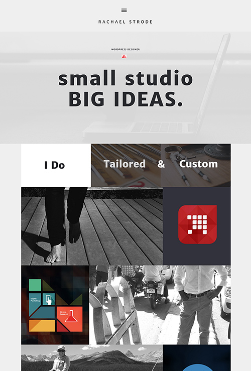
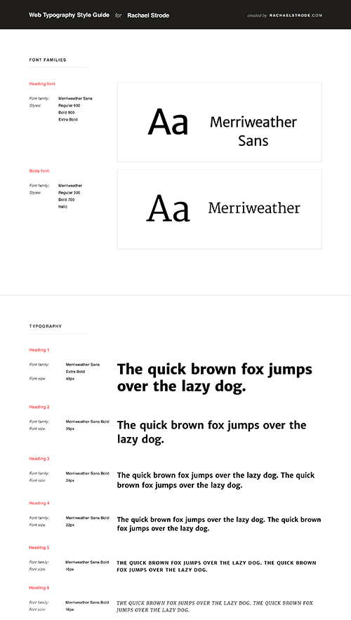
I was really impressed with the design project she did. She started with some great font choices by using Merriweather Sans for headings and mixing them with Merriweather for the body text. Then, she decided to create a very simple but effective and beautiful color palette by putting one accent color against the grayscale tones.
She put it all together in an interesting layout with a lot of white space and a really good vertical flow.
Of course I can’t take credit for her entire work, but I’m just happy by the way she used The Essential Web Design Handbook to incorporate the new design process in her work.
Here is what Rachael said about her previous design process and what she learned from the ebook:
I had been needing to go back to the basics for a while and revamp my process. I compare it to skateboarding. In order to ollie high you first have to perfect your ollie, so that’s what I did. I went back and perfected the beginning stages of my process. The Essential Web Design Handbook was exactly what I needed.
My process looked a little like Rafal’s process before he figured out a better one. I can get distracted very easily with fonts, colors, and second guessing myself. This book taught me to really lay out a process and stick to each milestone and not go back and second guess it.
There was a reason I chose that color scheme at that time and there was a reason I chose these fonts, so once I get to designing the .PSDS I am not going back and changing fonts and colors which can really send me into an abyss.
I loved how detailed the Design Handbook was. There were no holes, no area not explored. Any other web design book I’ve come across only covers one area. This covered ALL areas. It was like all the missing pieces came together for me.
Since changing my process to the method Rafal uses I have increased my prices and feel the quality of my designs has increased substantially. To be completely honest there was nothing I didn’t like. I would have paid 10x’s more just for this. It was like having Rafal right there with me helping me become a better designer.”
Go ahead and check out The Essential Web Design Handbook for yourself. Give it a try, take the design challenge and start designing your own websites in Photoshop.


Leave a Reply