When we design typography for the web we recognize two main types of content: body text and headings. Their function and purpose differ from each other and that’s why we may need different sets of requirements.
Most designers (including myself) start by choosing a body text typeface first. The fonts you choose will be used for long-form types of content and it’s the text that your readers will spend a lot of time seeing.
Therefore, your body text needs to be clear, readable, and without too much personality and visual features that could distract from the reading experience. It’s also important to test such typefaces in different situations like big blocks of copy, short sentences, small text, etc.
When choosing your body text font make sure it has these 4 main characteristics:
- Simple and clear character shapes.
- Decent x-height.
- Low contrast.
- Basic styles and weights.
1. Simple and clear character shapes.
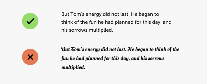
Your typeface should have clear glyph shapes, even spacing between the letters, and bigger open apertures to make single characters easily recognizable if set in a small font size.
2. Decent x-height.
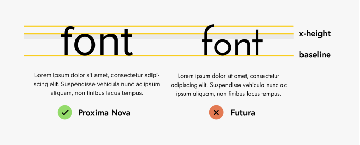
Choose typefaces that have a medium to high x-height. The bigger the contrast between capital letters and lowercase letters, the harder it may be to read it.
3. Low contrast.
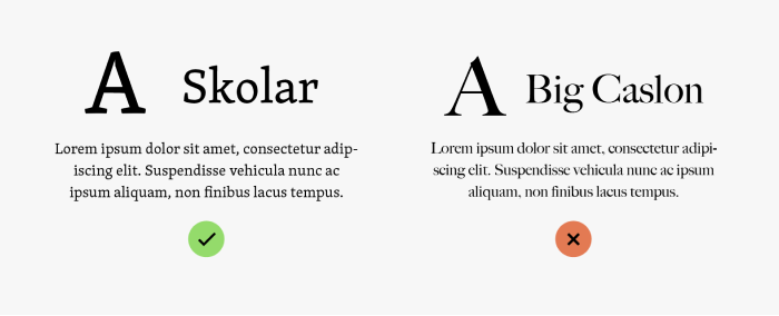
Look for typefaces with low to medium stroke contrast. High contrast lines of the letters can be harder to read when the font size is really small.
4. Basic styles and weights.
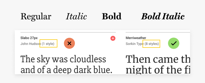
Your body text needs to come with at least regular, italic, bold, and bold italic styles. Browsers will force fake bold and italic effects on the text if the styles don’t come with your web fonts and they look terrible!
5. Final tip.
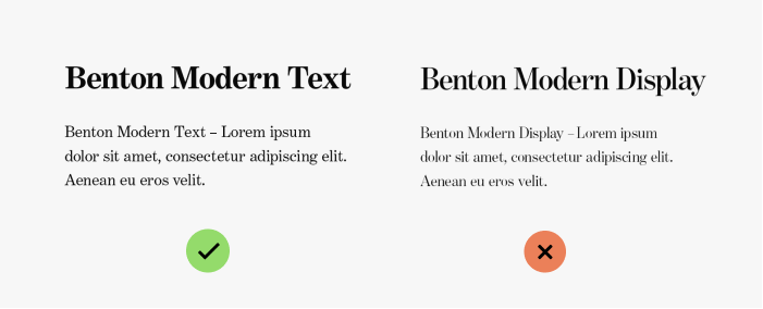
Avoid fonts with “Headline” or “Display” in name. They’re meant to be used in headings. Those typefaces that characterize with a higher stroke contrast very often come with an alternative version (Text) for better readability.
Want to Learn More About Web Typography?
If you want to learn more, check out my Web Typography course and get 20% OFF using the WEB2020 coupon code at the checkout.
Leave a Reply