This is a simple guide for all front-end web developers who are not familiar with Adobe Photoshop to help you make your job easier.
For the rest of you who already know Photoshop, I have some tips and tricks that might help you improve your entire coding process.
I think web developers should know as much about design as designers know about HTML/CSS. The designers who send you their PSD usually spend hours on choosing the right colors, designing spacing, typography and all visual effects.
You need to know what’s really important while coding the website and how to use Photoshop in order to correctly take all that information from the design projects.
Here is what I’m going to cover in this guide:
- Setting up the workspace – how to create an efficient environment for your work.
- Spacing – how to measure all spacings.
- Typography – how to take all information about used fonts and their properties.
- Colors – how to easily take any color code that you can use in CSS.
1. Setting up the workspace
Because I do both design and web development I have two different workspace setups in my Photoshop:
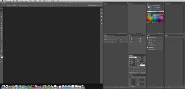
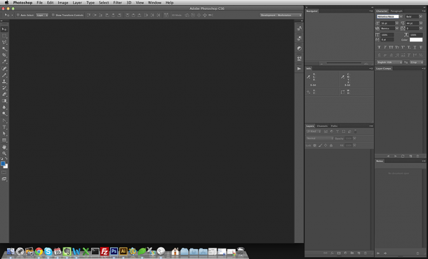
Creating your own workspace is super easy. First, let’s see what panels you really need as a web developer:
- Layers
- Info
- Navigator
- Character
- Layer Comps
- Notes
Now, turn off all the other panels and leave only those that you need by selecting/deselecting items under the “Window” menu. Once you’re done and have positioned all the panels the way you like, go to Window -> Workspace -> New Workspace. Next, name your new workspace, for example “Development.”
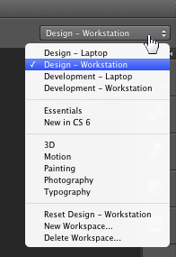
Now you can switch between the workspaces using the drop-down menu in the right top corner:
2. Spacing
Here are some tips on how to correctly measure all the spacing.
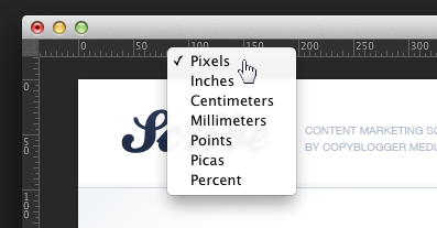
First of all, let’s make sure we are operating on pixels. Turn on the ruler (Command + R or CTRL + R) and right click on the ruler to change the units:
Next, let’s turn on the guidelines (Command + ; or CTRL + ;) which might be very helpful. If the designer used the guidelines, you’ll see all the invisible borders that may help you to measure the spacings and define the entire website layout.
The best way to measure the spacings is to use the Rectangular Marquee Tool (M) and Info panel. You can select any area you want and then look at the Info panel to read the dimensions (in CS6 you can read X and Y right next to your cursor which is even easier and faster):
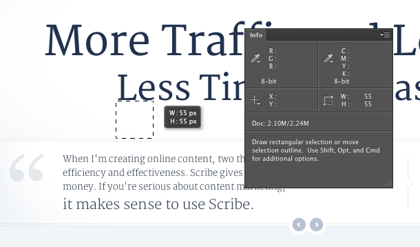
Press Command + D or CTRL + D to quickly remove the selection.
3. Typography
Respect the typography. Designers usually spend a lot of time planning all the font sizes and line heights. Make sure to take the right numbers and use exactly the same fonts in your CSS.
The easiest way to check the font size and line height is to use the Type Tool (T) and click on any text. Your Character panel will show you all the font info while editing the text:
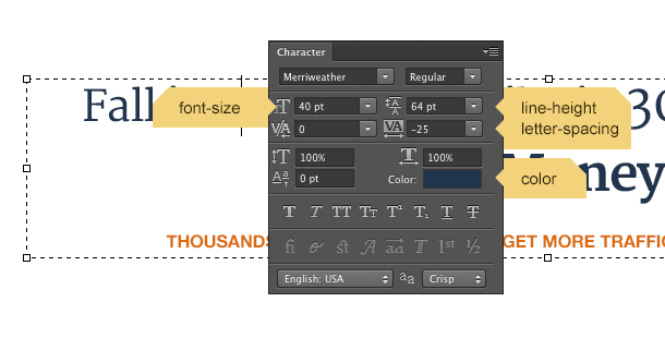
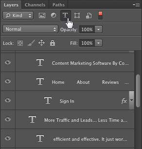
In CS6 you can easily sort the layers by any kind. If you want to quickly see only the text layers, check a small “T” icon in the Layers panel:
4. Colors
There is only one tip I can give you to quickly pick the right hex number of the color you need:
Using the Eyedropper Tool (I), right click on any color you need and choose “Copy color’s hex code.”
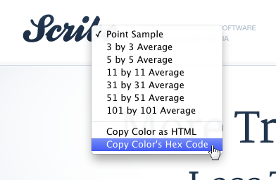
Don’t worry about the “Copy color as HTML” option. You will probably never need it, unless you still use HTML 4.0… 🙂
Bonus
There are two external apps/plugins that I found useful:
Slicy
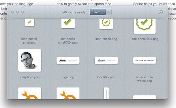
This app will let you quickly export single PSD layers to external files in PNG, JPG or GIF formats. It’s super easy to use and has many hidden functionalities (thanks to Brad Potter for pointing me to this app).
CSS Hat
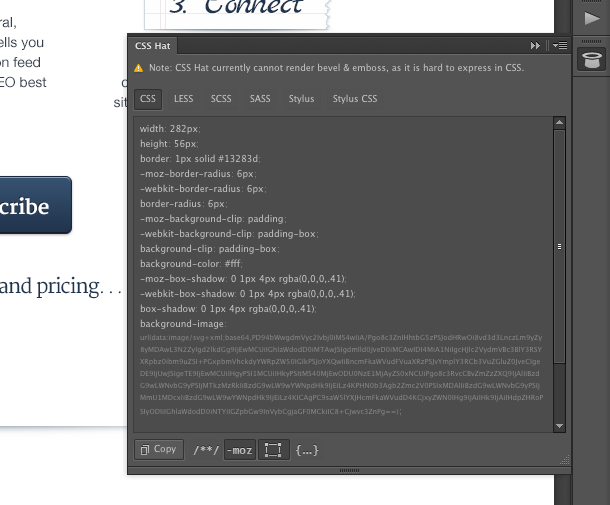
This is a Photoshop plugin that will let you quickly turn layer effects into CSS3 that you can copy and use in your code. The plugin is not perfect and it’ll slow down your Photoshop while using it but it’s definitely worth trying (thanks to Travis Smith for pointing me to this plugin).
Summary
The web developer’s role is to turn the design into a working website while keeping all the design elements exactly how they were designed and approved.
It’s not an easy task since there are many differences between how something is designed and how you can style it in CSS. However, you always want to make sure it’s as close as possible to the original design.
Do you have any Photoshop tips that make your job easier? Share your thoughts in the comments.
A couple of nice tips there, Rafal. Thanks for the post. There’s so much to forget in Photoshop, and we can definitely get stuck in our own personal work flows which are not always the most efficient. We benefited from your suggestion to use the Info Panel for measurements after selecting a rectangle with the Marquee Tool (M). No more using my screen capture utility to measure boxes and placements…(it sounds like CS6 got it right, finally, with the X and Y dimensions right next to your cursor!) Cheers, Steve & Sally
CS6 has many great improvements but it’s a bit slower than CS 5.5. Probably because of the new UI.
This is a great post for beginner intermediates. Thanks. But for me it really makes me wanna bite the bullet and upgrade to Photoshop CS6.
Yes, these are some very basic tips but I realized that some web developers don’t even know how to correctly check text font size, line-height and color in Photoshop. They often guess the numbers 😉
If your current Photoshop works slow on your computer, you may need to upgrade your hardware before switching to CS6.
^ Dude. I’m VERY guilty at guessing stuff… All the time. Bad developer, bad!! This was the article I needed. I just finished up a pair of photoshop to wp projects and I pretty much sucked at both and was pixel pushing until I was red in the face. Slicy and just the work space setup would have saved me time and same thing with the marquee tool to measure spacing. Brilliant.
Thanks Rafal, posts like this caused me to endorse your ninja skill on linkedin!
I learned about Slicy (formerly LayerCake) as well as CSSHat by stalking your Twitter feed. 🙂
Thanks Jason!
I don’t use CSS Hat that much, it’s a bit slow and causes some strange Photoshop behaviors… but I use Slicy every single time I need to slice PSD. Slicy is a perfect app 🙂
Hey, Rafal.
You should definitely check out this cut and slice tool as a free alternative to slicy.
Forgot to attach the link. http://www.cutandslice.me
Thanks John!
I’ll check it out.
You’re awesome. Thanks for sharing this!
Keep the photoshop productivity tips coming Rafal!
I just downloaded the CS6 trial and set up my workspace as shown.
Shame that Slicy is Mac only though. I’ll give cutandslide.me a try though.
Slicy is a cool app, too bad it’s on MAC though. Maybe you know any pc alternative like Slicy? Thanks for all of these PS tips!
http://www.cutandslice.me
Hi, liked the post about photoshop for developers, was curious if you could post some screen shots for the laptop version of your workspaces?
thanks.
Nice material for developers but, on typography, please don’t put kerning in 0. It looks horrible and completely trashes all the hours the type designers spent tweaking spacing between letter combinations. Use metrics or optical instead. It’s too much of a common mistake, even between designers.
Thanks, good point! I often use optical kerning in my designs. It’ll look nice in your Photoshop but there is no easy way to recreate this in CSS (without any tricks) on a dynamic text.
Great blog post. I’ve been working along in CS4, and finally jumped on the Creative Cloud band wagon to give the latest and greatest a try.
This is awesome sauce! I am definitely going to give CSS Hat a try!
I just completed up a variety of photoshop to wp tasks and I fairly much drawn at both and was pixel forcing until I was red in the experience. Slicy and just the perform area installation would have saved me time and same factor with the marquee device to evaluate area. Amazing.
Rafał,
Congratulations for all you have achieved so far! I am truly amazed and inpired by you, your work, your bold life decisions. And your tips are really great. My biggest ever thank you for time and headache saving solutions:)
Greetings from Poland:)
Loved the article! Do you have another blog post that’s similar to this but for web designers specifically?
I think there are a lot of guides like this for designers 🙂
You’re right – but I trust your word a bit more 😉
But, none is required. I managed to pick it out from the pictures.
Web Design:
http://i.imgur.com/vIX7sM0.jpg
Web Development:
http://i.imgur.com/k8ixrQ6.jpg
I think converting a .psd to html/css should be the designer’s job. The developer should not have to worry about kerning, line-heights, measurements etc. Most developers don’t have the design training to identify these things, and unless they inspect every little piece of text and layer (which very few do), the design will not transfer well to the web.
It’s a useful post. Thanks a lot. 2 questens:
1. I use Photoshop CS. when I click ruler a window come called “preference”. In the “unit” section I saw two options: “ruler” and “type”. I changed “ruler” in px. Am I need to change “type” in px? now it is in “points”.
2. Do you write any post on measuring elements position and spacing when making a web from sratch?
1. If you work on 72dpi, then px or pt for type doesn’t matter. However, if you work on 144dpi (for retina display) then you may want to use pt for type because it’ll let you see actual font sizes that you’ll be using in CSS.
2. No but it might be a good topic. Thanks.
Nice post Rafal. I Really needed this. Thanks!
Such a nicely written article. It’s very helpful!
I’m trying to better myself in Photoshop… You can’t imagine how much you’ve helped me. So… thanks for the article! Keep writing 🙂
Rafal, you’re definitely one of the best, yet is cool to learn how to improve the process of work with the client. I enjoyed very much this post.
Fantastic experience after reading your amazing blog with great info! I must say, everyone has learned something new from your blog. Great work dear! Keep it up…
Thanks for this awesome guide for photoshop for web developers like me. With your article alone, I’ve learned a lot of things that I didn’t know of before. Thanks a lot for sharing this amazing guide!