The year 2012 was definitely a great year for web design. We saw several new trends that have significantly changed how the web looks today.
We saw the rise of responsive design, more beautiful typography and various implementations of animations and effects using CSS3 / HTML5 / JavaScript.
In this article, I’m going to focus more on visual design trends that I think are going to rule in 2013.
1. Flexible design
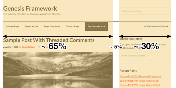
Today, when we design a new website, we already know it must be responsive by default. The responsive layout is not a feature anymore — it has become the spine of any website layout.
Instead of using extra big batches of code to make each screen resolution step separately responsive, we’re going to make our layouts fluid in the first place and let them automatically fit to all other screens.
Using responsive units like ’em’, ‘rem’ and % will help us to make all inner text and images flexible.
This is the end of static elements.
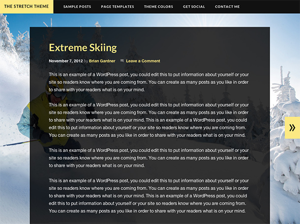
We’ve already done this in the most recent Genesis 1.9.
Go ahead and check out the CSS code.
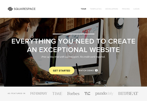
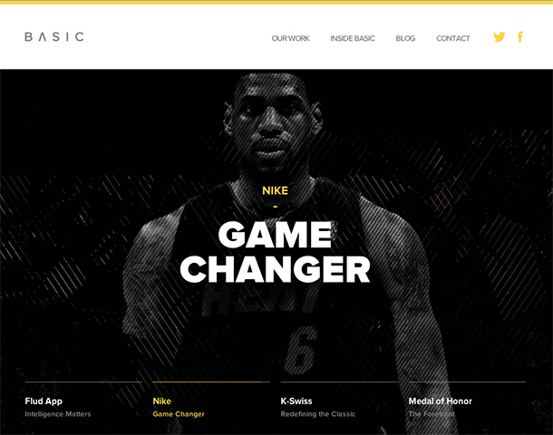
2. Flat design
Creating shadows, gradients, bevel and emboss effects with CSS is not a problem anymore. However, the new web design trend, what we can call “flat design,” doesn’t need it at all.
The flat design makes your website look sharp and clean, and it’s easier to maintain the visual balance.
We believe that Internet users are so well educated in 2013 that they don’t need a button to have that 3D dimensional-looking style in order to know that it’s clickable.
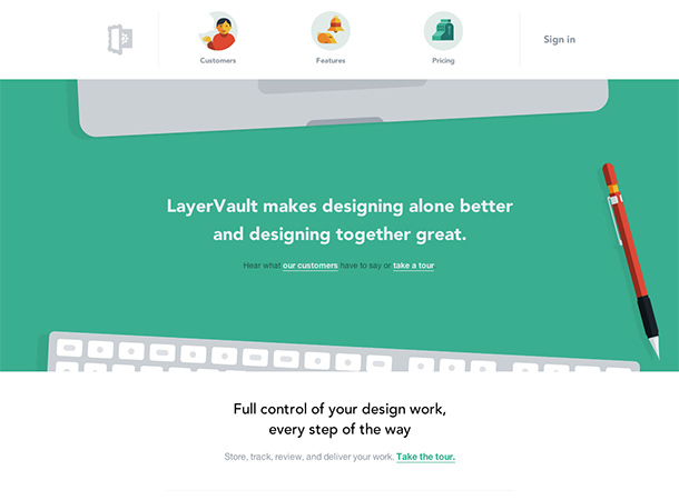
With the flat design, the user interface can still be intuitive and create a great experience. An excellent example of that can be LayerVault:
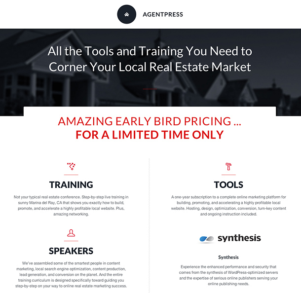
One of my most recent design projects, AgentPress, is all flat as well. See the results here:
3. Focus on typography
The database of web fonts grows every day.
We can now find hundreds of beautiful free web fonts on Google Web Fonts or choose some more unique and premium fonts from Typekit.
Typography became a really important part of modern web design and I believe it’s a foundation of any great design.
We can create the entire website by designing just typography and still make it unique and fascinating for the visitors.
Just look at some of these inspirational examples of wonderful typography in web design:
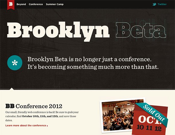
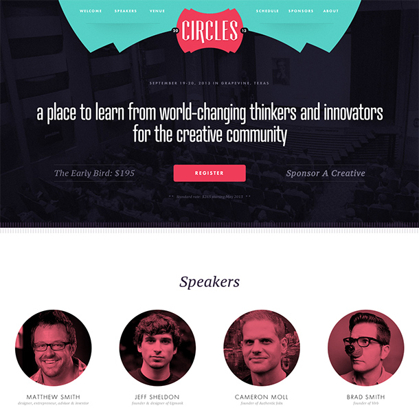
4. Long pages
People of 2013 can scroll! The old-school web design I learned had one main rule: “keep it above the fold.”
I heard it hundreds of times. Does it still matter? It’s obvious we want to keep some important things at the top of the website but “the fold” lost its meaning to me.
Instead of squeezing everything to the top of the website, it’s better to give it some space and let people scroll and explore the home page.
We’ve seen so many great web designs in 2012 with incredibly long pages that work just great.
People would rather scroll down the page than click and load to another page.
Scrolling is easy and we can even make it attractive and encourage people to take this action by using some effects like parallax scrolling.
Let’s look at some long page designs:
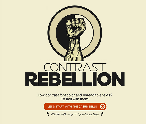
5. Big photos and detailed illustrations
Thanks to using more CSS3 and web fonts, we reduced the usage of many images in the web design. Instead, we can use images where they are really needed and we can use them in really high quality.
We saw that trend near the end of 2012 where we could admire huge full-screen photo backgrounds.
I’m really looking forward to seeing even more great pictures and extremely detailed, huge illustrations in the world of modern web design this year.
It’s all happening right now; see these examples:
Conclusion
Those are my five design trends that I think are worthy of special attention in 2013.
We’re definitely going to see more designs in this direction and there will be a demand for it.
Of course, we can’t stick to the trends and blindly follow them. We always have a chance to create something new and original.
We should also try to incorporate our own style into the current standards what will make our work unique and recognizable.
Which design style are you going to follow in 2013?
Nice list- I’m particular pleased to see that ‘flat design’ made the cut. I was never a huge fan of gradients and making things look 3D when they’re really not. Maybe my background in Maya is to blame? 😉
I’m a fan of everything that “works” 🙂 gradients and shadows help us recreate some real life visual experiences.
If I had to design a website for older people or people with a little internet experience, I would avoid “flat design”.
Good point.
Nice view…
Awesome list! I love Flat Design, and am so excited to see what other designers do with it this year. Most of my projects that I have started this year will be flat and incorporate large images.
Nice! I love the intro section on your website: http://www.mediacrazed.com
Thanks!
I’m a huge fan of “flat” design, and it’s something i’ll definitley be incorporating into more of my work going forward. It just looks so much cleaner, and it’s easier on the eyes!
Good stuff man!
I love flat design for its minimalism. Depending on a project, I still like subtle shadows and gradients.
Love the scrolling – and giving things more room to breathe. The flexible design is a work in progress for us but taking apart the genesis themes has been a great tutorial!
I love long pages and websites that tell us a story.
Great observations Rafal. As a designer I know it’s important to keep posted on these items as they become more of a focal point. I love to change these up as project scopes allow.
It’s difficult to be up-to-date with everything when your hands are full of work 🙂
Flat design is VERY hard to actually pull off. 99% of attempts just end up looking boring and unappealing.
It’s not that easy to make a flat design look great. It takes a lot of time to create a good color scheme.
Spot-on. I’ve noticed everything you’ve mentioned on plenty of sites, I just hadn’t taken the time out to research what the styles were called and what-not. Protocols are changing so quickly it’s harder and harder to keep-up.
RT – loved the teaser about Agentpress… please do give us more info on a release date… that look is definitely sell-able!
Well, you can already register: http://www.agentpress.com/offer
I agree with most of this article, particularly in regard to “flat” design, as it looks much cleaner and is easier to read/navigate.
However, I can’t help but feel that a lot of these “trends” are just that: trendy, fashionable things which will be looked at with disdain 5-10 years from now. Heck, I’ll bet you money that 20 years years from now pages full of animated gifs and blinky text will be the cutting edge of design again!
I really hope you’re wrong 🙂
Good design will always be good design. If good typography is a trend then it can last forever as far as I concerned. I am happy seeing web design aligning with great graphic design tradition.
Some of the things I like best about recent design trends are…
Choices in typography and “beautiful free web fonts” have radically changed web design for the better. Long scrolling pages allow more white space and make reading web pages much more enjoyable. They also allow bigger better and more detailed illustrations that help explain your message clearly.
But the most important thing is what you say in reply to the first comment, I’m a fan of everything that “works” 🙂
This is awesome Rafal…thanks!
great work. I love flat design as well. I think the drop shadows and gradients are becoming a little redundant, but like you said, it’s on a project by project basis.
I would definitely love to see more long pages. I used to work in a digital agency who built lots of campaign sites. The art director always wanted everything to fit above the fold, so we always ended up with tiny text and few images. The web page is long and tall, why try to fit everything into a browser window?
Great job–great design tips.
A question: Doesn’t the sharebar up above hurt your SEO?
The Franchise King®
Why would it?
I do love the look of the flat design much more then gradients or texture.
As for the big images they have always been my main weakness!
Nice roundup.. thanks for your insights.
What you call “flat design” is as much the result of low budgets and wanting to get results a fast as possible I think.
And if enough people do it it becomes a trend…
Nearly everytime I get a design with lots of dropshadows etc. it turns out that the designer spends most of his/her time designing for print.
That flat design looks nice!
Love your work man!
I have been incorporating just about all of these into recent projects. I find that when many of these are used in conjunction, it can be of a greater benefit to the design. In a recent blog post, I pulled together several examples of websites that do a good job of incorporating flat design with several of the other trends you mention. Take a look: http://blog.stationfour.com/flat-designs-trends-in-responsive-websites/.
Great post! Thanks for sharing…
Note: The two links under section one are dead, as of April 10th, 2013…
Hi, I think your blog might be having browser compatibility issues.
When I look at your blog in Ie, it looks fine but when opening in
Internet Explorer, it has some overlapping. I just wanted to
give you a quick heads up! Other then that, wonderful blog!
Wow, nice. I prefer flat design than 3D design. Like your work ^_^
Nice little list. However I think a lot of these have been used / are being used. It would be great to have a think about the next “big” thing.
I wonder what effect long pages will have on SEO as well, if the content of a site is all on one page, keyword dilution could be something of a problem.
Hi Rafal,
Thanks for utilizing BASIC as a best practices example and great job on this post. Iconography is also a popular trend right now that’s aiming to simply user experience and let designs breathe easier without giant clumps of text.
Very cool, thanks for sharing!
All points are right. web designers in 2013 is not so easy without considering these points. I agree with your point on the strength of typography. Thanks for these info.
Shruti
I will follow this design trends
Woah! I’m really digging the template/theme of this
site. It’s simple, yet effective. A lot of times it’s tough to get that “perfect balance” between user friendliness and visual appeal.
I must say you’ve done a fantastic job with this. In
addition, the blog loads extremely fast for me on Internet explorer.
Outstanding Blog!
Great article and great tips. I am going to put them to practice for sure. thanks mate.
Great list…I am a web designer and I am going to suggest some of these to clients next.
These designs look awesome, thank you for sharing.
Though it is now 2015, I guess these trends remains same as they have a lot of exposure.
‘In this tutorial, you show us how we can create best web design without the need of expensive software or plugins and get pretty similar results! Thanks for sharing.
Keep up the good work!