In most cases, changing the entirety of a blog’s design can be too overwhelming and expensive.
If you’re already happy with your blog’s layout and artistry, but still feel like it needs some additional refining, then this post will illustrate your options.
I have put together five tips that can be applied to your current design, significantly improving its appeal.
1. Enlarge headings
Most people will scan a blog’s content and read only the blog post subheadings. You can easily streamline this process.
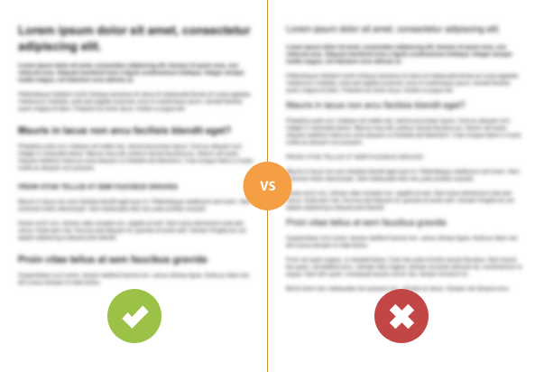
Make sure your headings and subheadings are large and clear. Remember the correct hierarchy – H2 is bigger than H3, etc.
Not only will your blog posts be easier to read, but they will also appear more organized and professional.
See the example below:

2. Increase the contrast
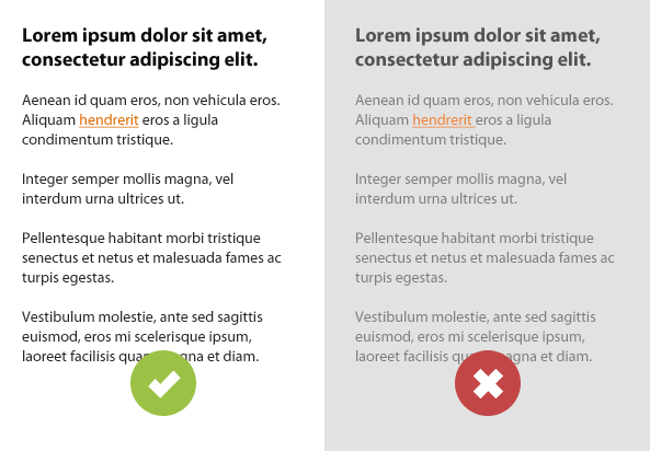
This is one of the most common blog design mistakes: a light gray body text may look nice aesthetically but it can be a marked problem for many people. Not only will persons with poor vision find the text difficult to read, but also individuals using small mobile screens and low quality monitors.
Try to make a clear contrast between the background and the text. Doing so will make your blog easier to read and your content look cleaner.
See the example below:

3. Add more space
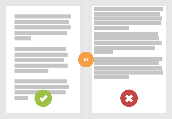
Don’t be afraid of whitespace! First, make sure you have optimal spacing between the main content and the edges of the page. There should be at least 20 pixels of space. I’ve been using 30-40 pixels recently as a standard page inner spacing.
This provides a clear separation between the text and other elements. It will also make the text lines shorter, which is easier to read.
Also, don’t forget about the “micro whitespace” within your blog content:
- around the images (at least 20 pixels)
- before and after the block quotes
- after the paragraphs (the ‘margin-bottom’ can be same as your body text ‘line-height’ to keep a nice text flow)
- before the subheadings
Look at this simple example:

I think I will repeat “more white space” frequently in my blog. Examining the whitespace can tell you a lot about the designer.
4. Eliminate distractions
Try reading a book while someone is flashing a light in your eyes. The experience is similar to reading text posted on a page full of flash banners.
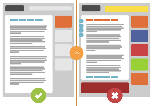
Choose advertisers who don’t use ultra flashy banners and try to reduce the number of graphical elements around your content. These are very distracting to readers.
Social media sharing buttons are also important. These can become irritating, particularly if you’re trying to force people to share your content in an overbearing manner.
Keep the social sharing buttons in well known places — at the top or at the bottom of the post — so everyone will know where to go to share it.

5. Make your blog easy to navigate
First, make sure you have a simple main blog navigation menu which is easily accessible. For instance, place the navigation menu at the top of the website. Your location on the website should also be obvious by highlighting the current page.
If you use many categories and sub-categories, using breadcrumbs can be very helpful.
A list of categories in the sidebar, or internal blog post links, are also a part of the blog navigation. Make sure your links look clickable. Do this easily by underlining the clickable text. You can also highlight links in a different color or add an inline background (as shown on my blog).
Summary
As you can see, there is no sorcery involved in a solid blog design. It’s all about keeping everything clean, well-organized, intuitive and user-friendly.
This is the age when we can do nearly everything on the web. There are very few technological boundaries. You can make flying pink cows (really?), with flashing buttons and fireworks in the background.
However, we typically won’t do that. We care about our readers and want to create a fantastic and pleasurable user experience. Essentially, less is more.
Hi Rafal
5 useful points, I particularly like “Eliminate distractions”
Blocks of bright colour can distract, but moving or flashing objects just drive me mad.. but people still use them!
Also got to mention the popup box that some sites use… what a turn off.
Spot on information as ever.
Keith,
I agree on the popup boxes. Good point!
I agree because pop ups annoy me as well but is that more of a personal preference? Maybe pop ups do better in different niches? I ask because Neil Patel at QuickSprout uses quite a few pop ups on his blog and I’m fairly certain that he knows what hes doing.
Whats your thoughts on his uses of it?
My golden rule is to keep things as simple as possible. I’m a huge fan of “less is more,” and the design tips you mention provide solid examples.
I’d say #4 is the most commonly overlooked, but the one design feature folks would benefit from the most. Great looking site, Rafal!
Thanks Tony!
Yes, #4 should be #1 on this list 😉
Thank Rafal
To be honest I have certain design errors mainly in terms of distractions, errors that I will correct based on this advices
Oscar,
fortunately, the distractions are the easiest to fix. It’s much easier to remove something than add new stuff.
I agree. Infact I tell many times on twitter that people should increase their heading and font size.
PS: I see that your site disagree with point pt 2 😛
(just kidding, I know the design part )
Ankur,
I don’t use black text on white background but the contrast is still pretty high. You may didn’t realize it but I’ve lightened up my content background twice since I launched this site. Then, I took a note about that change and used it later in this article.
I like the contrast and big bold headings on your site! Well done 🙂
Thanks for the solid advice Rafal. I love the fact that you spent the time creating examples to illustrate your points too. I’m subscribing coz I can’t wait for more articles like this 🙂
Thanks David!
I understand you’re talking about the horse at the top 😉
I found illustrating the examples much easier than writing about it. I definitely want to go more in this direction in my blog.
Thanks for subscribing!
Hi Rafal,
Nice and useful tips. I guess I have to work on my subheadings size. I really don’t have any idea, maybe some suggestion.
Thanks
Dragan,
you use “bold” for your subheadings. I would recommend to use H2 or H3 tags. There should be already styles for that in your theme.
I’d be careful about making the headings too large. As a matter of fact, I believe the headings here are too large.
Why?
Studies show that using extremely large fonts encourages people to scan your content as opposed to actually reading it.
🙂
Hi Derek,
this is a very interesting comment. You’re probably right because too big headings can be just another distraction.
I should say to make the subheadings bolder and relatively bigger than the body text.
Thanks for pointing this out!
Hi Rafal,
I’ve followed your advice and my site is indeed better now, thank you! This is my question:
When looking at this page’s source code, I’ve found you’re using a tag for your first paragraphs and I want to know if this is semantically correct or if it would be better to use some class instead.
Cheers!
Thanks for the tip! To make sure it’s correct I made it as a normal paragraph and just styled differently the first paragraph of the post content.
The comment form took away the tag I entered. It is the H5 tag.
Rafal, great post. We’re a marketing agency and always moving towards more UX centered designs. We find sites and blogs that are cleaner, more vibrant not only perform better from a user perspective but also in search naturally due to the increase in traffic, search benefit resulting from H1s over more conservative H5s/H6s. It’s fun to see texture move out and bold continue forward. Ha! In writing that I noticed an example of this in William’s post above.
— Cheers and thanks for your creativity 😉
“Try reading a book while someone is flashing a light in your eyes. The experience is similar to reading text posted on a page full of flash banners.”
What a great analogy! I’ve always had issues with overbearing ads that add noise and only cheapen a site (90% of content sites out there). That’s why it’s so refreshing to see sites like Copyblogger that get this. I suppose that’s the reason there are Carbon Ads and other ad networks that adhere to this philosophy. Great read BTW.
Hey Rafal: Great post with some really nice illustrations. Question: It does not seem possible to doing any embolding of the article heading at wordpress.com or am I missing something?
thanks for this advice. It’s hard to not clutter up my blog. Every week I see something cool that I think should be added.
Right on, could not agree more. I love how you have blured out the “Enlarge headings” picture. That’s actually one of the tests I do and I was impressed to see it here 🙂 I got to admit I love your taste.
Another test I do is convert everything to black and white and invert the colors, this helps seeing what unconscious eye scans.
This is a very well written ( and illustrated ) post. What I like most is that you have focused on the 5 items that will make a huge impact. I will admit that from time to time I get a little overwhelmed in trying to decide just want to put into a blog page design. This is helpful.
Thanks
Ed
Great article, Rafal! Really useful advices! I wish everyone knows these rules and makes cool websites!
its benificial for blog and a great advice for good posting.
Yo Rafal,
I’m really glad to see someone pointing out simple fixes like this for people to implement on their sites. The less seizure-causing horror shows floating around on the web the better it is for everyone. Keep it up!
I personally feel that a fixed top menu which is used on your blog and I have seen on several modern websites lately is a bit annoying at times, i don’t like to see the navigation menu that thick scrolling along with the page.
Very helpful post. It’s awesome. I was looking this. Thanks for sharing.
Great Article Post.
really love it and i use all of your tips to design my blog. Thankyou so much.
Your blog design tips is really fantastic. Your design idea is really excellent.
Excellent post. Really your design tips and idea mind blowing. I also following it step by step and getting good result
I followed your tutorial. And the tips are very useful. And it actually does improve our blog designs. Thanks for showing each procedure.