6. Finding Your Design Process
In the beginning, my design process was chaotic and I was easily distracted by random ideas or inspirations that could take my focus away from the main goal of the project. I often jumped right into Photoshop and started designing mockups before I had spent enough time understanding the project goals and requirements.
Following workflows is difficult for most designers. We like to chase the creative flow and we don’t want to put any limitations on what we can do and how we do it.
However, a really good process can actually help you find more creative design solutions by giving you the space you need and removing distractions on your way. It’s what truly makes you a professional designer.
Your design process should help you:
-
Be creative.
Creativity needs some space for intense focus. It’s hard to find creative solutions to your design problems when your process is chaotic. You’ll be the most creative when you limit all distractions and have a specific routine in place. -
Be flexible.
Not every project is the same and may not need the same amount of your attention. You should be able to adjust your work process and scale it according to the project you’re working on.For example, you don’t want to skip your research and discovery phase for smaller projects and focus all of the attention on the visual design. The time spent on discovery should be proportional to the time needed to complete your deliverables. This is the right way to keep up a high quality of work.
-
Be more productive.
By having certain repeatable tasks in every project, you can try to automate or optimize them and save yourself a lot of time.For example, you probably send similar emails to clients informing them about the current status of the project. You can have several saved templates and reuse them in your communication. You can have your project presentation deck saved and even have a specific script when showing your work to the client.
-
Stay on track.
Your process should be simple enough so you know exactly where you currently are on a project and what your next step is. For example, a Trello board (where each column is a different step of the project) can show you the stage it is in at a glance. It’ll also give you peace of mind. -
Get more approvals from clients.
If you split your work into smaller chunks, you can get little approvals from your client on each step. This works much better than waiting until the last moment and making one huge presentation and then expecting to get a speedy final approval.Your clients will be happy to see a steady progress of work and will feel like you are working together on the project. All of the final design decisions will make more sense too if they are well-explained from the beginning.
-
Document and present your work.
Save your notes and take screenshots of each step of your process. Having a more organized way of looking at your work will help you better present the process and write a good case study later for your portfolio.
What my current design process looks like
My current web design process is very simple and hasn’t changed too much over the years, but it took me a while to get there. In the beginning, I didn’t really believe in the process and had a tendency to skip steps even though I already had it all planned out.

I quickly learned that my best projects happened when I actually tried to stick to my workflow and complete all of the steps:
- Discovery and research
In this stage, I want to collect all of the project information, requirements and goals based on the scope and answers I get from the client. It often means asking a lot of questions and studying the client’s business and targeted audience, so I can better understand the needs.At the end of the stage I have a simple document with all of the project info, tasks, and milestones. It helps me to accurately estimate the project for the client and present the best plan to accomplish the desired goals.
It’s very tempting for creative people to skip this boring step and get right into the designing part, but once you’re more experienced, you’ll know how important it is to spend some time and do your homework.
Don’t over-research either! Some of your projects, especially in the beginning, won’t have a huge budget conducive to spending hours discovering. Always do just enough research.
- Design exploration

This is a favorite part of the process for many designers.
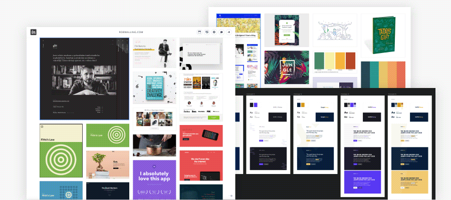
To begin, I create a mood board for the project where I collect all of my inspirations, sketches, and notes. You want to think visually. Sketching your ideas will help you to save all of your great thoughts exactly as you imagined them.
I often end this step with some visual design explorations where I try to do some very quick designs to test different ideas I have. I do it on a blank page in my design software and sometimes it’s just a sample heading + body text in a specific color scheme, and sometimes it’s a sample hero section with a photo and different design elements.
I don’t care about any details and making it pixel perfect. Speed is more important here than accuracy. All I’m looking for is the right feeling.
I put together some samples along with my descriptions and show it to the clients to see if it aligns with their expectations before I spend too much time designing the final deliverables.
- Style guide

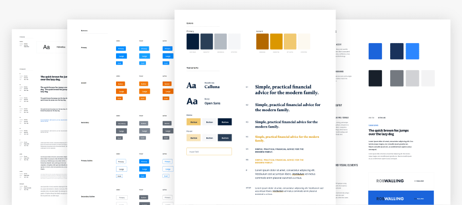
Once the general visual concept is approved, I start putting together a web style guide that includes typography, colors, and basic UI elements. Even if the project already has well-established brand guidelines, I convert it into my own style guide that I’ll use as a base in my design.
I usually start by defining a basic typography style guide that will be used as a cheat sheet for the rest of the project. The style guide includes the main typefaces along with sample headlines and paragraph styles. Some projects may require a really complex style guide, so take your time and plan your typography well.
Then, I choose the primary, secondary, background, and any accent colors. It’s helpful if each color comes with darker and lighter shades. Similar to typography, a well-defined color palette will help you to keep consistent schemes across all design files.
Finally, I create sample UI elements like buttons, form fields, boxes, etc. Depending on the project it can be just a few elements or the entire component library.
- Wireframes

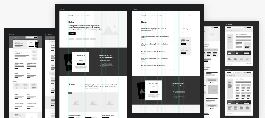
Now I finally go in and plan a layout of all major web pages and draw wireframes that will help to visualize website interface and make important layout decisions.
Even though the layout can be created independently from the visual style, I like having the style guide figured out first. It helps me to imagine what the website could look like as well as the feeling I want to create. It affects the way I think about the page layout.
I know a lot of designers prefer to create wireframes much earlier in the process and create their visual language later. It may depend on the project, and I usually do so for more complex projects like web apps where I’m trying to focus more on the user experience and functionality.
- Mockups

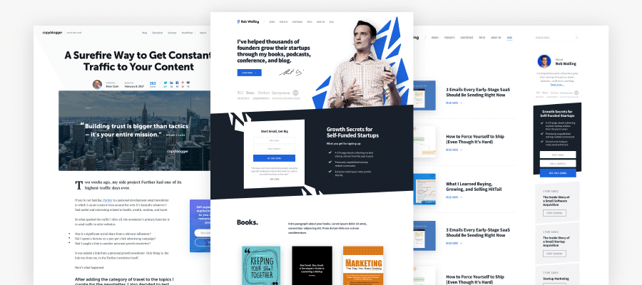
Now it’s time to put all of the design elements together and use the typography style guide, color palette, and wireframes to design complete website mockups.
It seems like a long way to get here, but note how many important decisions have already been made. Designing mockups seems like a formality at this point. If you get small approvals from your client on your ideas, visual style, and wireframes beforehand, it’ll be really hard to undermine the final product now.
I expect a few rounds of revisions and smaller changes, but the entire design project is really solid and I can feel very strongly about it.
Of course, my current process is not perfect and it’ll never be. However, I have found it to be the most effective way to design websites and I’ve been using it for a long time now with some great results.
Maybe you have your own habits that work for you and that’s fine! Treat my process just as a suggested framework. Feel free to customize it with your own methods and improve upon it.
Start building your own process
So, how to find what process is best for you?
- Document your process.
Take some notes about your current process. See where you struggle and where you feel like you repeat the same tasks. Create a visual workflow of what it looks like for you.
- Split it into milestones.
Group your tasks into separate milestones that will be your checkpoints. Make it feel like each milestone could be done by someone else if this was a team effort.
- Follow and improve.
Stick to your process, take more notes if something isn’t working well or if you had to break your workflow. Review and improve it.
—
Organizing the way you work can really help you become a better designer. Keep in mind that every project is different, so it’s also important to be flexible and scale the amount of work you do.
What you need is just enough of research, exploration, and visual design, so you can deliver the project without going over budget.
Great, Some extremely valid points made to give me a better process and way forward, thank you.
Thanks so much for this. Quite often I find myself starting the site without a plan in place.
Very valuable content. I don’t know how I would have a business today if it wasn’t for what I learned from Rafal.
Is that it! wow!! your process is really simple and straightforward. Although I do wireframe first then create the style guide. I’m really learning valuable things from you.
How do you show interactions like link or button hover state?
I document and list them in the style guide.
Do you create your mood board inside your design software as well?
I’m using https://www.invisionapp.com for mood boards. I’ll list all the tools I use in the next lesson.