4. Creativity and Art in Web Design
Design is absolutely more about science than art and most of the decisions are often directed by business goals, but some of the best design work happens when science actually meets some art.
Science research and design thinking have a lot in common. They share a similar approach of observation and validation through testing, metrics, and iterations.
Therefore, design by definition should be more objective, evidence-based, and results-driven. Contrary to art, design needs a function. That function is often dictated by the business and market needs.
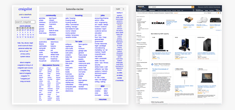
On the other hand, art is all about the look and feel. It’s subjective and based on intuition, gut and a need for expression. It doesn’t require a function and has no constraints.
Design is a solution to a problem. Art is a question to a problem.”
However, if we really want to base our design on science, we should know that emotions play a very important role in how website visitors make their decisions.
While you can create the most proper design according to all of the research, data and scientific facts, it may be lacking in that little imperfection, weirdness, or intrusiveness that spark some emotions.
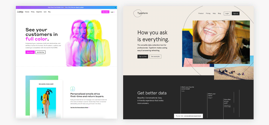
So, perhaps adding some art to your design can actually be an intentional science-based decision in order to create more engagement and connection with the audience.
Benefits and risks
Being creative when designing websites is important if the goal is to solve problems and improve functionality. We call designers creative when they can come up with an elegant solution that is simple, functional, serves the user, and doesn’t break already established patterns.
Being creative just for the sake of visual experience and bringing some forms of art into design comes with both some benefits and risks that we need to be aware of.
Benefits:
-
Make your design memorable.
Like we mentioned in the first lesson, “The Real Value of a Good Design,” the first impression is important. People will better memorize your brand and website when their emotions are involved. -
Better connect with your audience.
Some creative visual ideas (we’ll definitely talk more about those later in Design Class!) can help you enhance your story-telling and communication with the audience by providing a richer brain event. -
Evoke some extreme emotions.
Art doesn’t necessarily have to be visually attractive if you want to go after more extreme feelings. It can be risky, though. You can still surprise, intrigue, or even shock your visitors while using only positive emotions. -
Stand out from the competition.
If every designer would follow the data, all “Add to Cart” buttons would be orange. Being different can be a good thing and help make your design more prominent.
Risks:
-
Missing your audience’s expectations.
Your design can be too creative for your audience. If most of your users are older people and you’re trying to create a piece of art to surprise them, it won’t work. Always research the audience you’re designing for and match your design decisions accordingly. Design for the users first, not the current trends. -
Breaking the functionality.
If you’re trying to be creative and reinvent well-established web conventions, you can easily break your website’s basic functionality. All users have certain patterns and habits learned from their previous experience. There are many other ways where you can be creative. -
Adding too much complexity.
Experimenting with different layouts, illustrations, or visual elements can bring some unnecessary complexity to your design. Users prefer simplicity and layouts that are familiar and even see them as more visually appealing.
One thing is for sure — that there is really no risk of not being artistic in your design. A functional but not aesthetically pleasing design is always better than a non-functional but beautiful design.
When to use your creativity and art
All projects have different requirements, goals, and risk tolerance. Some brands take risks all the time and try to be creative and shock the audience. The new Dropbox’s brand design is a good example of that. It absolutely shocked everyone in the industry with its weird new look.
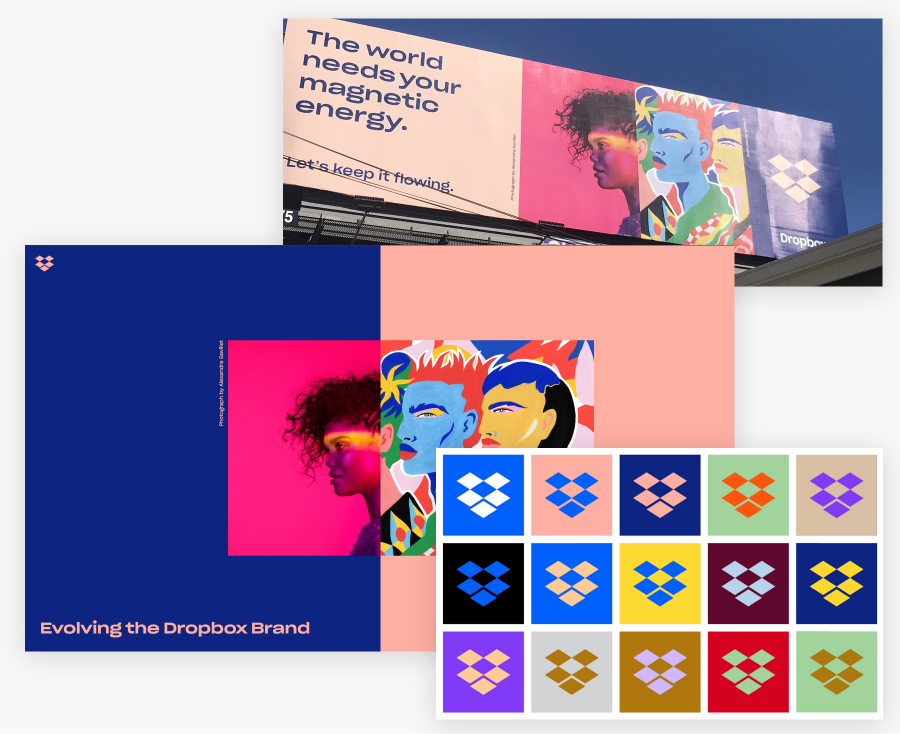
Some people said it’s not visually appealing at all and not consistent with Dropbox’s already established brand, but the announcement made a tremendous ripple effect. All of the tech blogs wrote about it and a lot of designers discussed it by taking different sides (it doesn’t matter if I liked the design or not; I already mentioned it twice in this course so far).
It’s probably exactly what Dropbox wanted to achieve at this moment and, to me, it is a form of art incorporated into their design. It definitely sparked some emotions and discussions around the web.
A well-known designer, Milton Glaser, once famously said:
There are three responses to a piece of design – yes, no, and WOW! Wow is the one to aim for.”
Let’s look at some ideas on how you can let your creativity enhance your design and bring some art into it:
-
Illustrations and icons
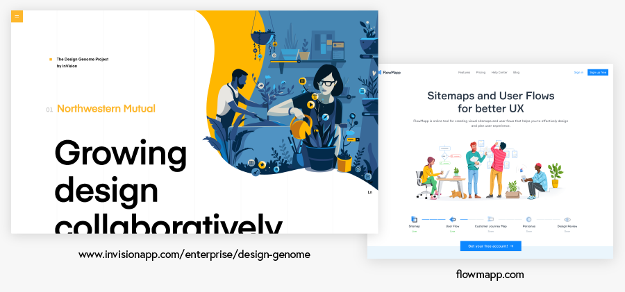
Illustrations and icons are a great example of connecting function with art in design. A single illustration can explain a lot about the product while conveying its own message, artistic style, and feelings. Designers have full control over the style, colors, and the composition.
Illustrations can also be easily animated which gives even more possibilities and can entertain the audience. You can be very creative in using them without affecting the basic features of your website.
-
Animations and transitions
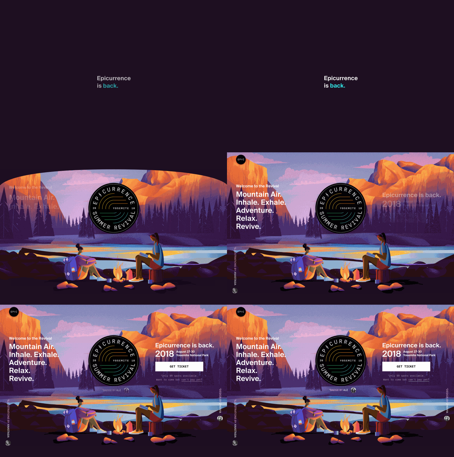
Non-intrusive interface animations can let you do something differently without affecting the functionality. You can add some amusing transitions on scrolling (parallax) or hover effects on elements.
-
Visual brand
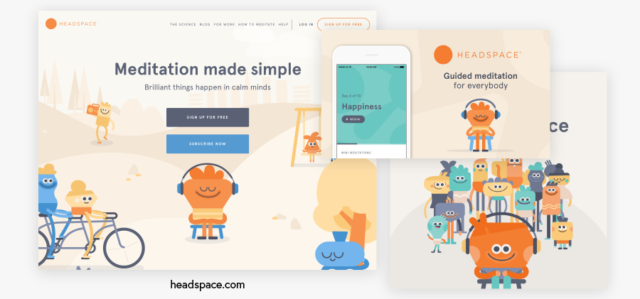
Your visual brand is more than just logo – it’s also your colors, typography, and even elements like patterns, photos, illustrations, and icons. It’s popular for online apps to create their own mascot or character and give their brand more personality and make it unforgettable.
-
Content marketing
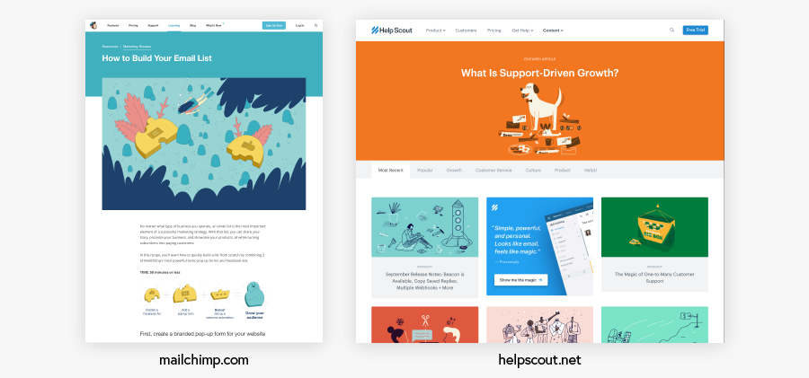
You can create interesting infographics, article illustrations, podcast artwork, and more. Original visual content is great to grab the audience’s attention. You can even try to present articles in a more engaging form that is still based on a conventional post layout, but with creative ways to enrich the story.
-
Social media marketing
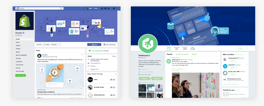
Social media is busy with information and visuals that all are trying to grab attention. You can design eye-catching ads, post images, or profile covers. Be creative and break the pattern with your own message.
Summing up
Is design the right outlet for your inner artist? Definitely not. Design is more about science and business than it is about art and it always will be.
However, I believe there is a room to have a ton of fun with it. It’s exciting and challenging to create something that is simple, functional, and used by people in their everyday life that is meaningful to them.
We have a chance to create something that really matters.
You don’t have to be ‘artistic’ to be creative. You can use creativity to find simple solutions to complex problems and that’s what design is all about.
Leave a Reply